Refreshing the Tech Landscape with Intention-Driven Accessories and Seventh House
BRAND, INTEGRATED
CLIENT
Seventh House
SERVICES
Competitive Analysis
Identity
Art Direction
Visual Design
Illustration
Packaging
Project Managment
Presentation Design
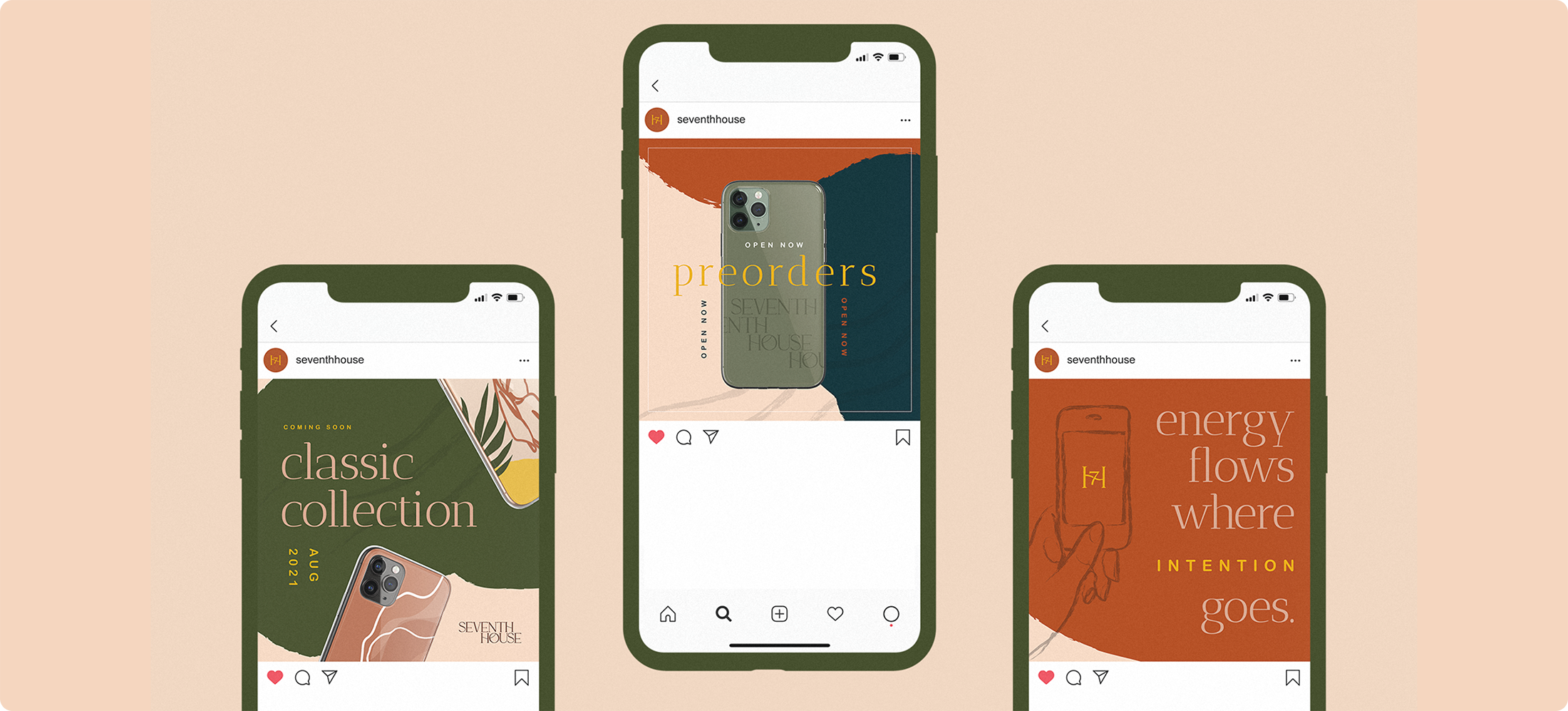
Social Media Design
Template Design
BACKGROUND
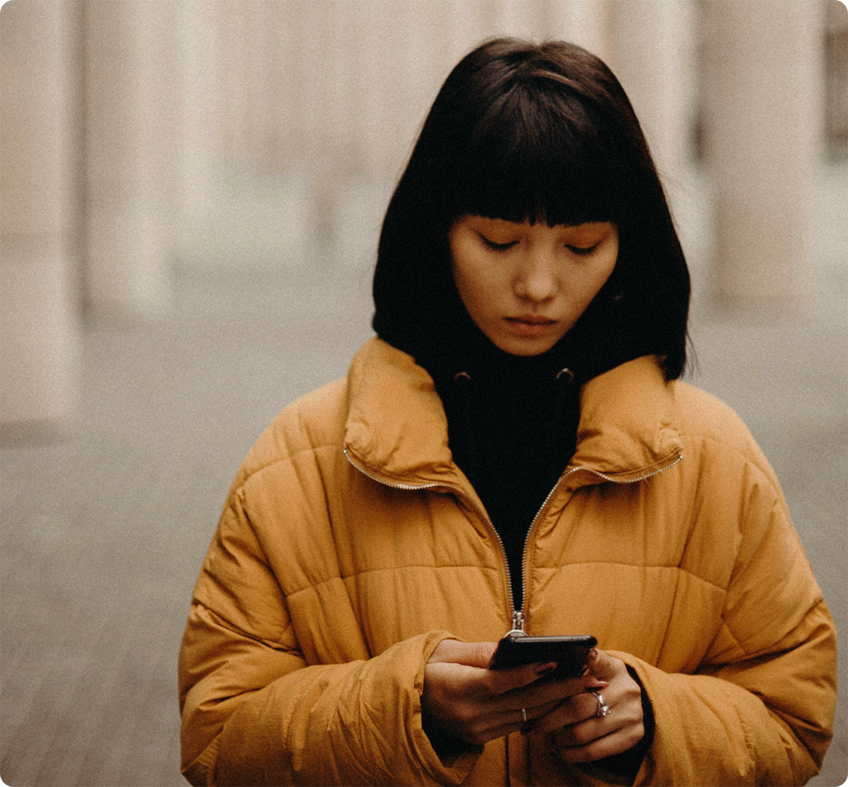
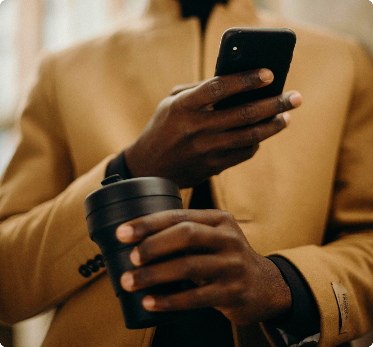
With 93% of millennials using their cell phones as their primary method of communication, Seventh House rethinks the way the world interacts with everyday products.
CHALLENGE
Consumers need accessories that resonate with their intentions and contribute to a positive energy everywhere they go.
APPROACH
Lead with intention and feel-good design, giving hand-held accessories more aesthetic and emotional value.
✁
How might we hand-deliver a curated experience to users who want good vibrations in their lives and in their hands?
PROCESS
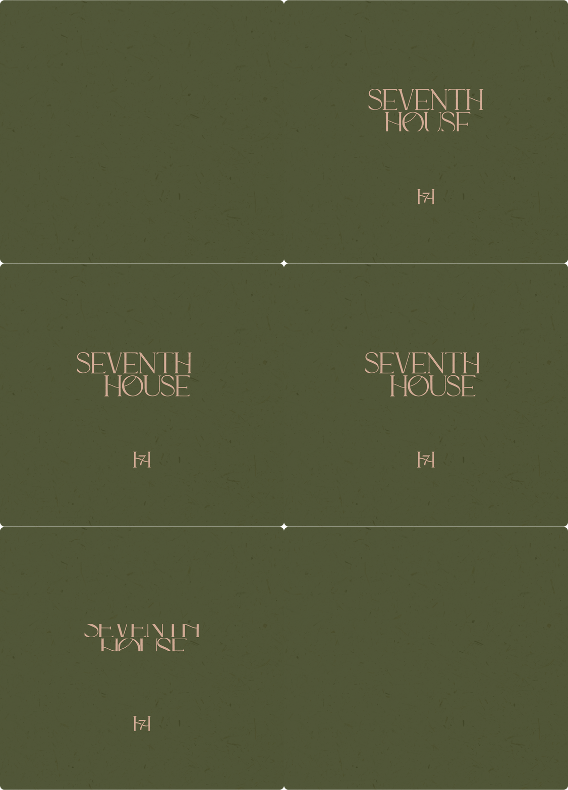
The project consisted of three main phases: brand strategy, identity design, and implementation. In starting completely from scratch, we spent the most time in phase two, honing in on the nuance of marks, type treatments, and illustrations as the foundation for the brand.
RETHINKING THE RELATIONSHIP
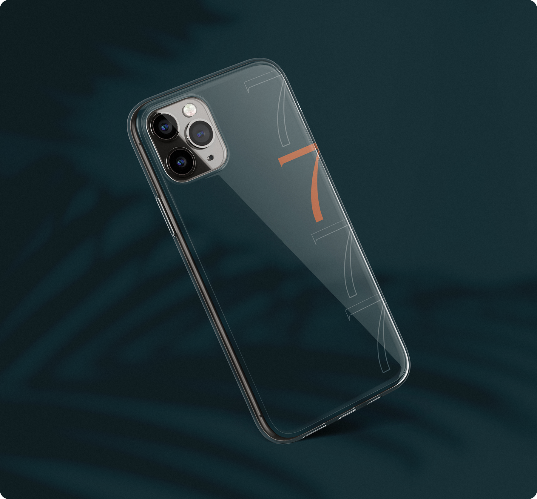
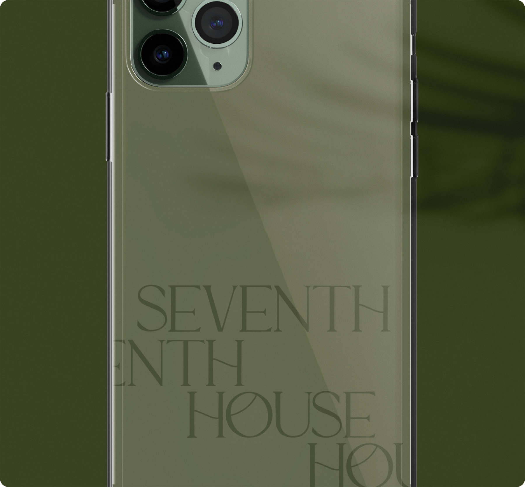
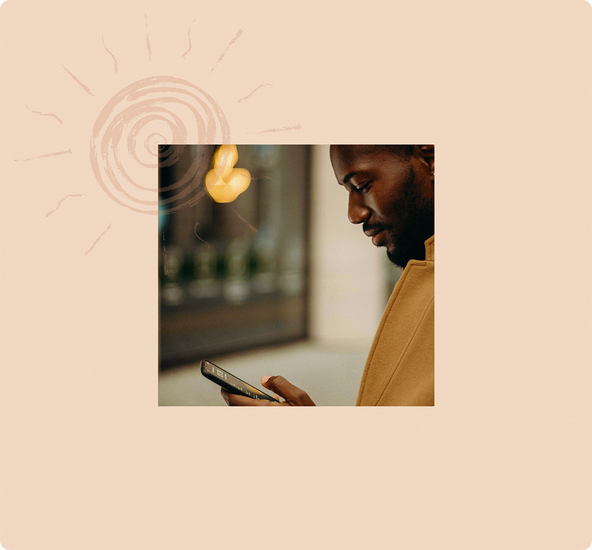
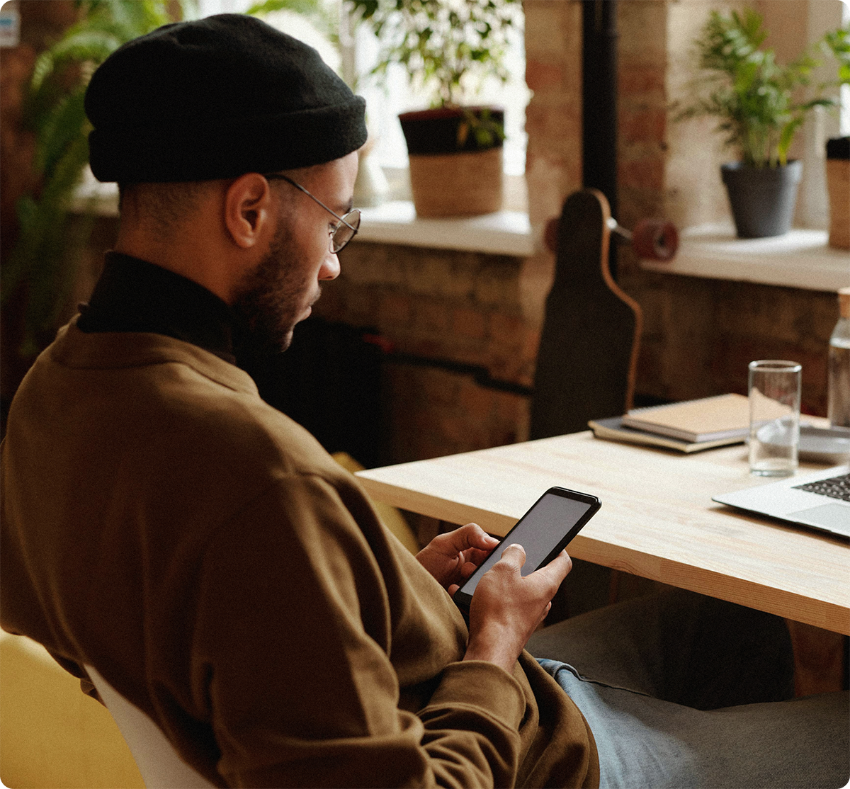
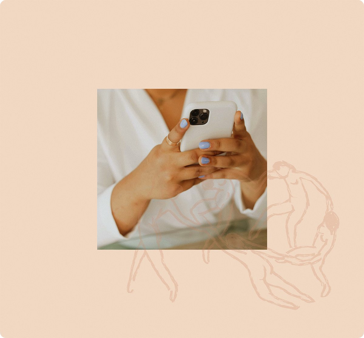
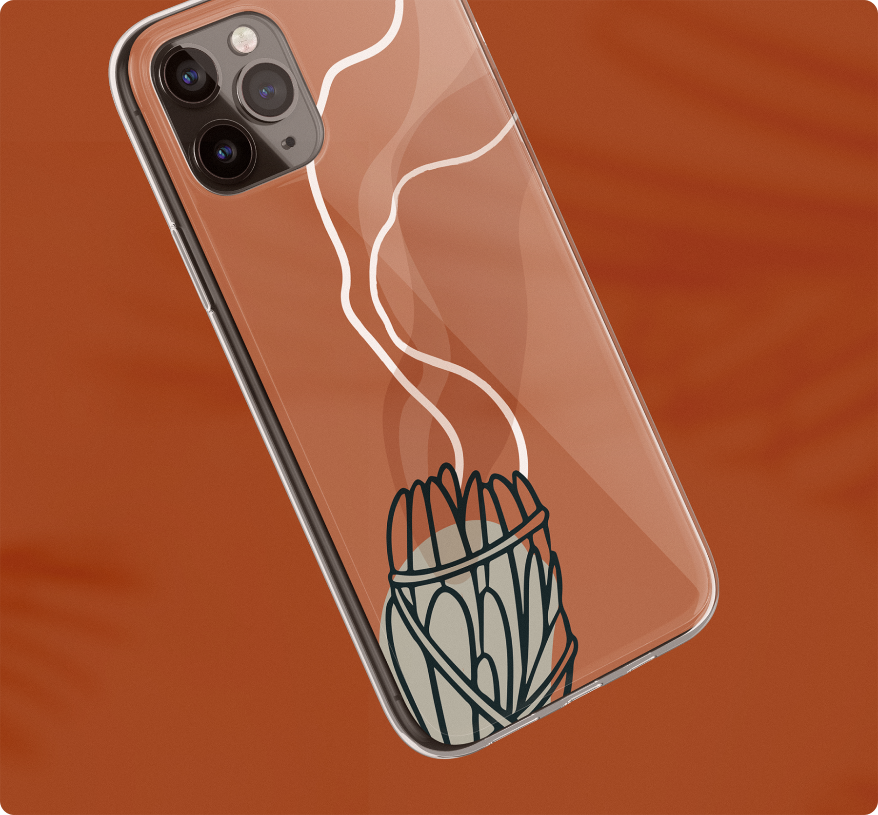
With 93% of millennials using their cell phones as their primary method of communication, 7H wanted to emphasize their dedication to intentionality and connecting with the world in meaningful ways. This was achieved by way of their premiere product: phone cases that are designed to be unique but also are set with the good vibes that their audience needs in their day-to-day.
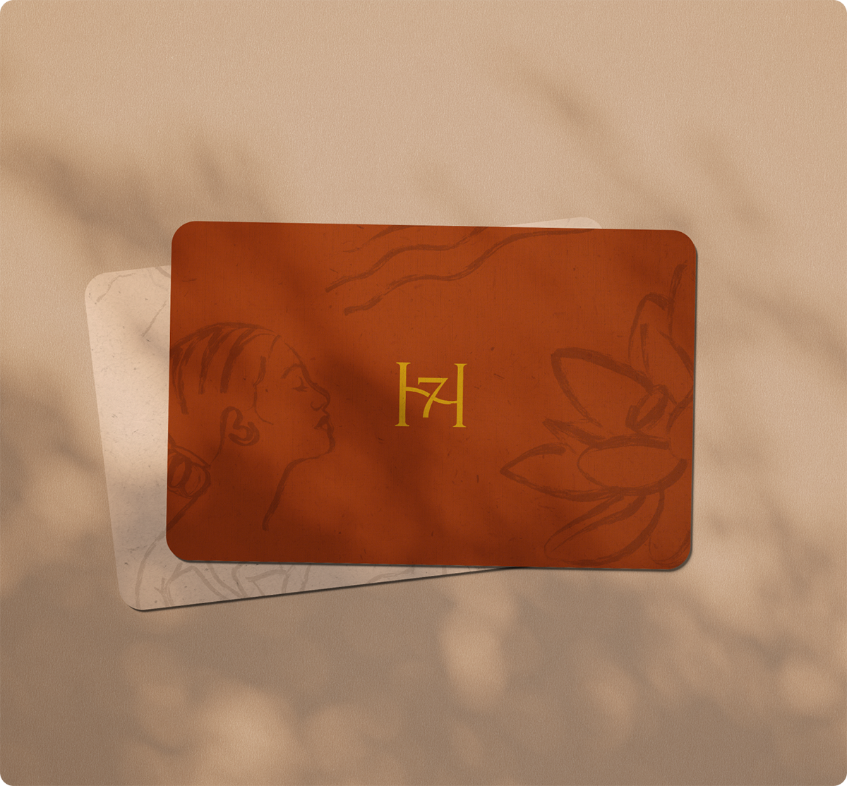
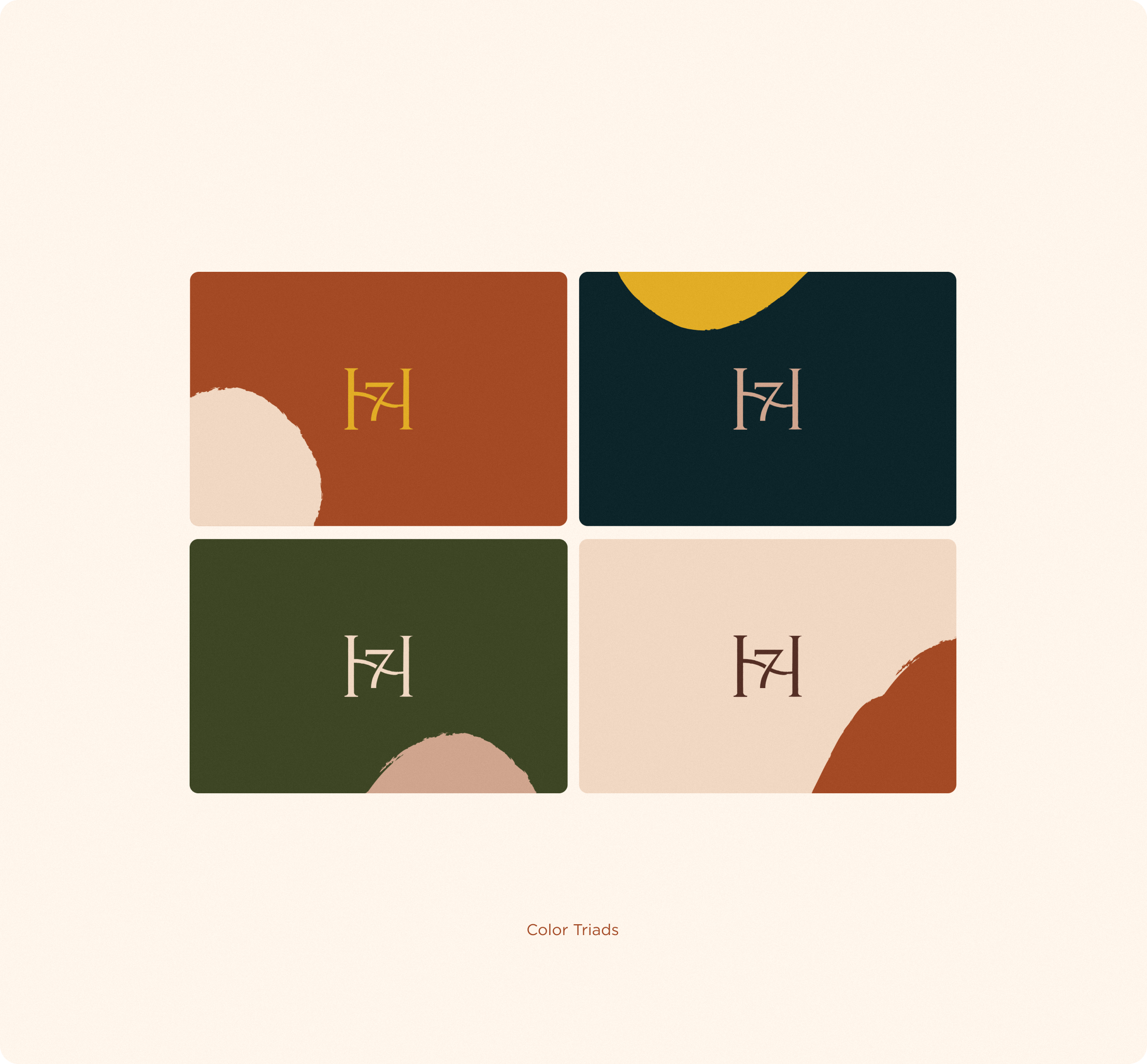
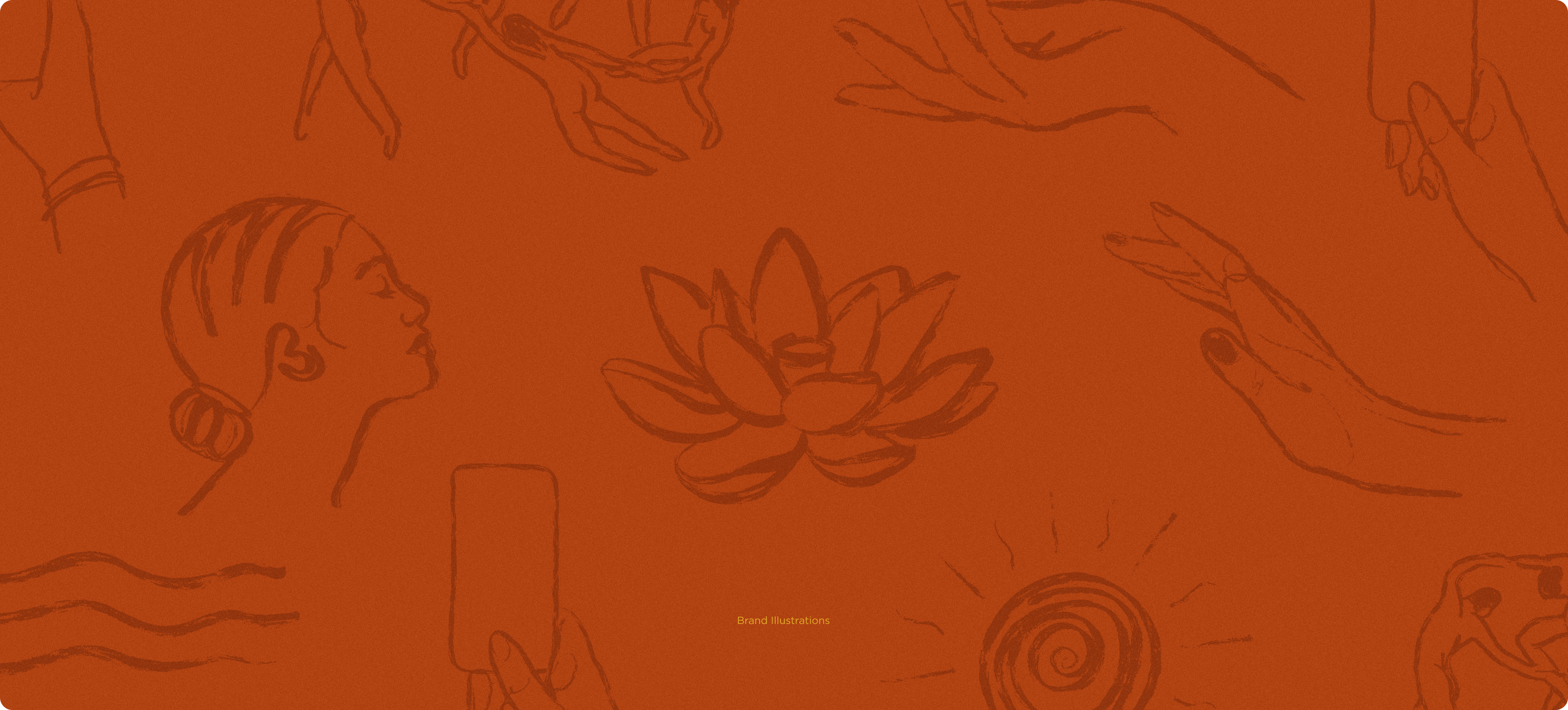
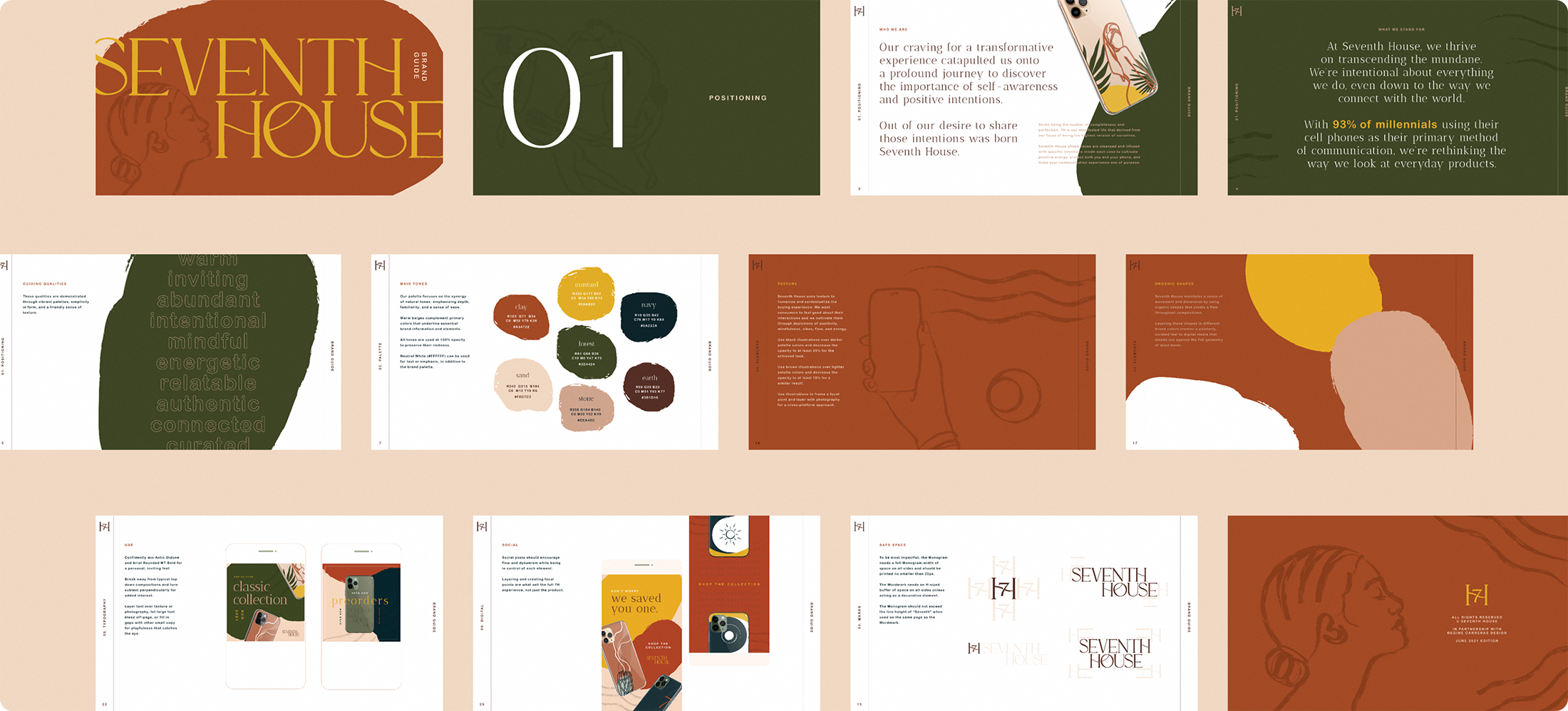
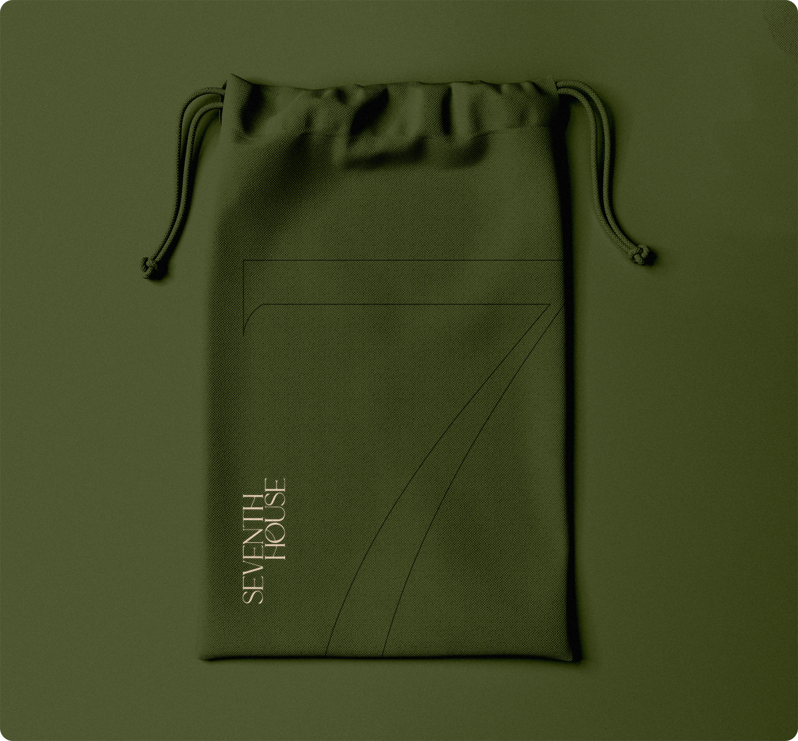
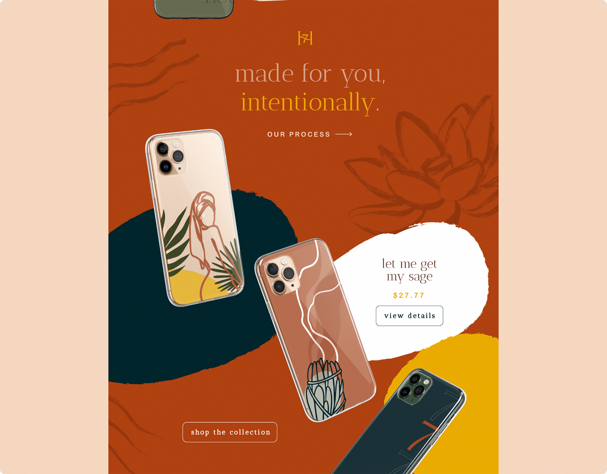
The 7H palette focuses on the synergy of natural tones: emphasizing depth, familiarity, and a sense of ease. Texture helps to humanize and contextualize the buying experience. 7H wanted consumers to feel good about their interactions and we cultivate them through depictions of positivity, mindfulness, vibes, flow, and energy.



PURPOSE-DRIVEN DESIGN + PRODUCT
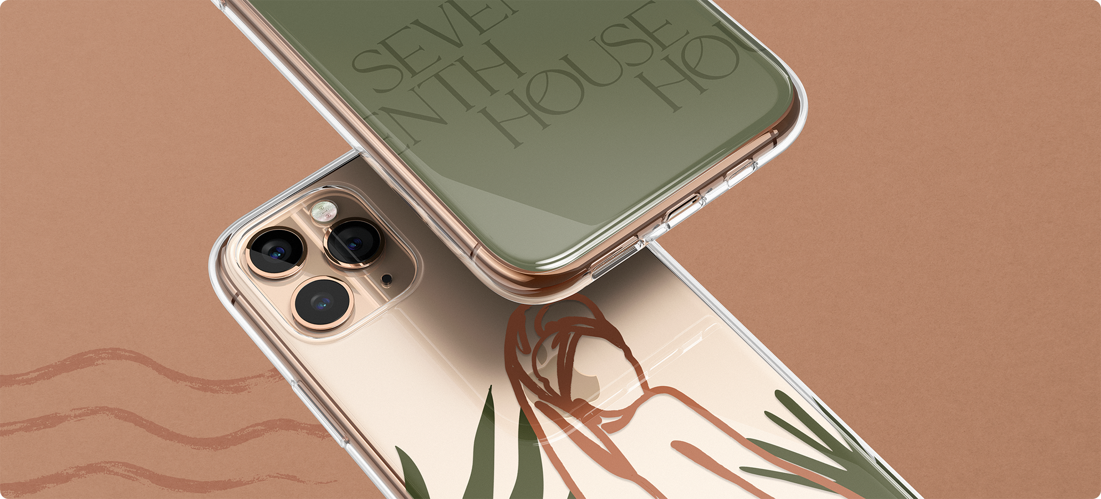
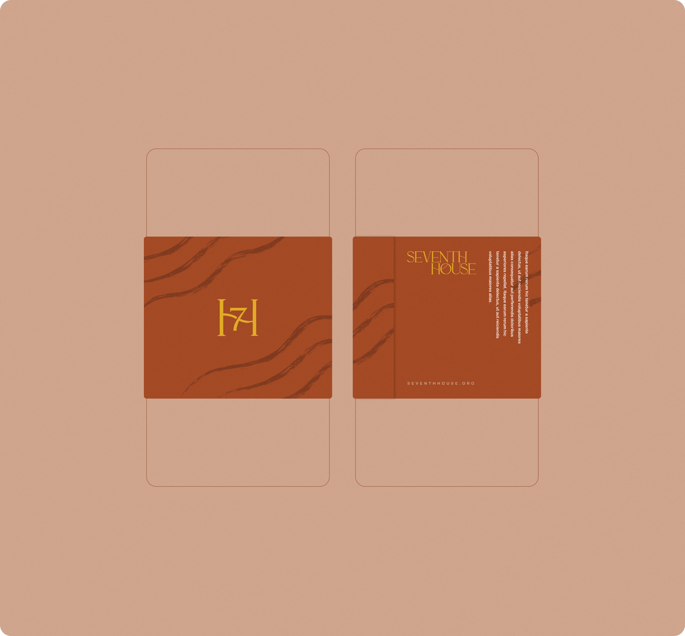
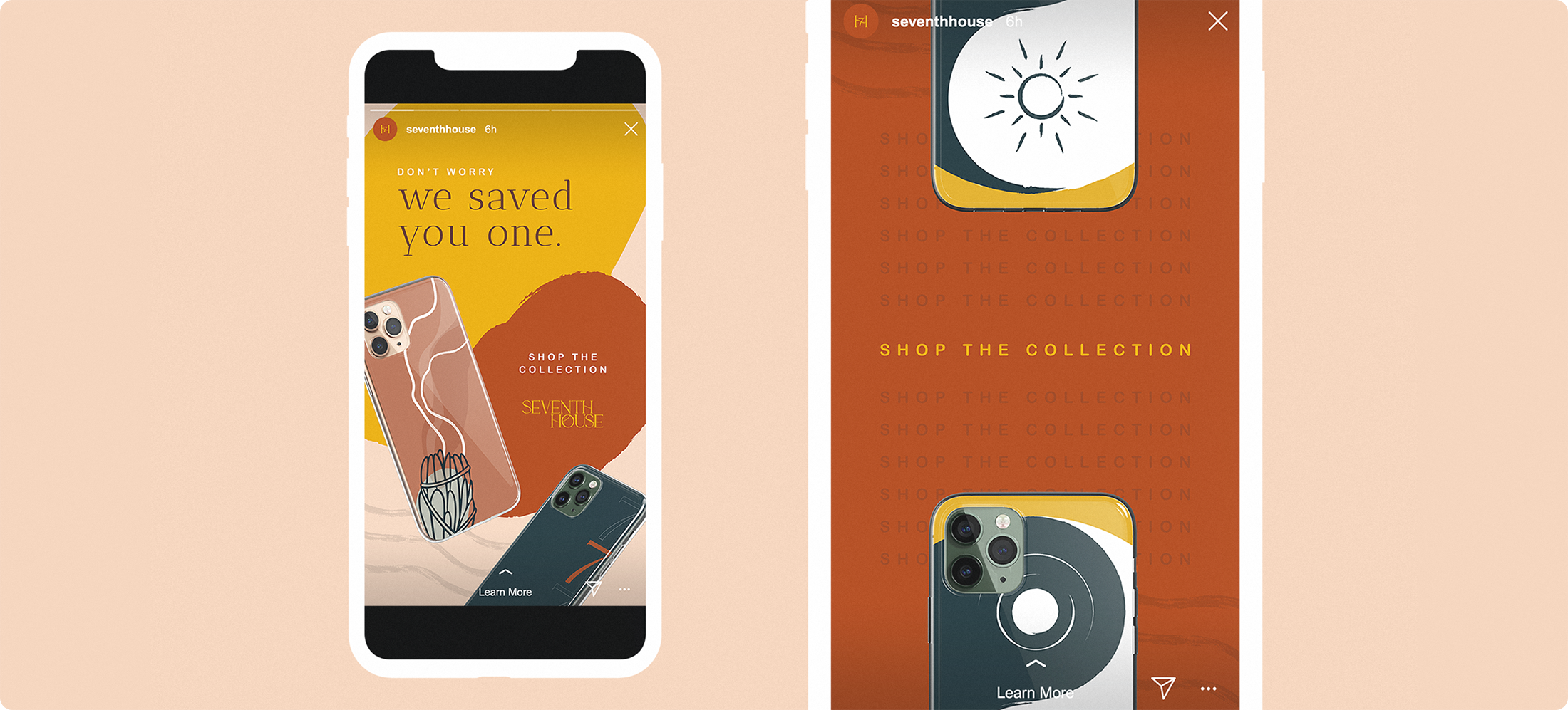
Seventh House maintains a sense of movement and dimension by using organic shapes that create a flow throughout compositions. Layering these shapes in different brand colors creates a painterly, curated feel to digital media that stands out against the flat geometry of most feeds.
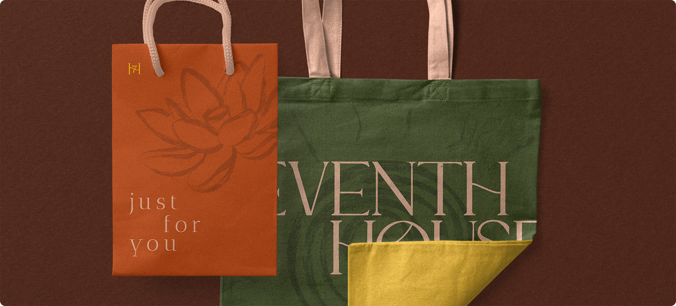
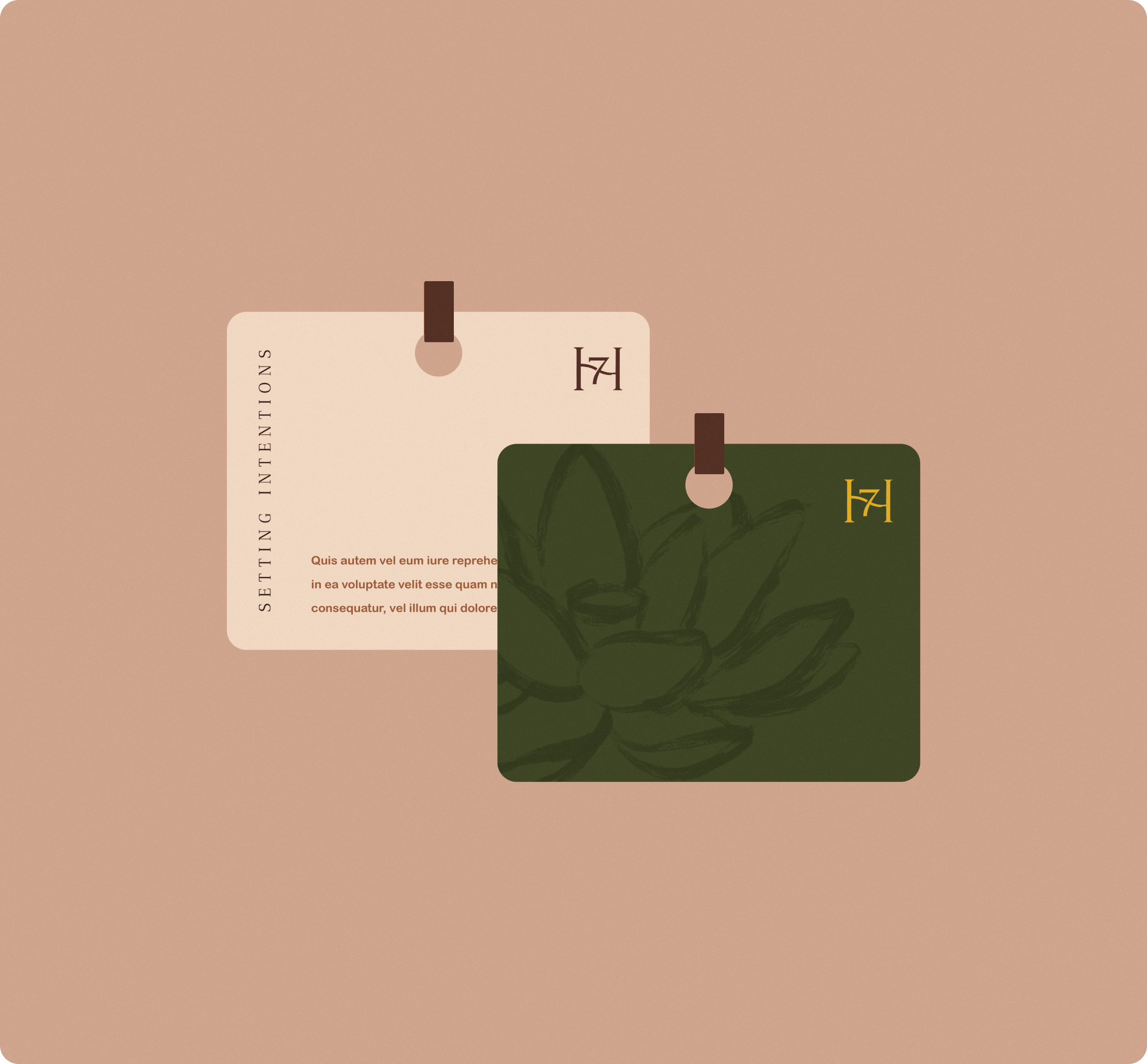
Seventh House phone cases are cleansed and infused with specific intentions inside each case to cultivate positive energy, protecting both you and your phone, and making your communication experience one of purpose. By pairing intentions with experience-focused design, 7H transcends traditional tech accessory reaches by promoting a lifestyle of positive-thinking and living beyond the hand-held.
LET'S WORK TOGETHER
COLOPHON
This site uses Spline Sans and Spline Sans Mono for headlines and body. Chromate Roman and Italic are used for display.
ALL RIGHTS RESERVED
Régine Carreras
Design + Direction
Made with 🤍 in Maryland
© 2025
Never tell me the odds ⏺
