
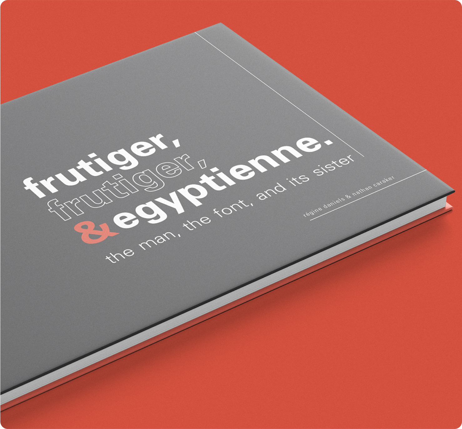
Visualizing the Legacy of the Swiss Typographer and his Works in Frutiger, Frutiger, & Egyptienne
EDITORIAL
CLIENT
Self
SERVICES
Research
Content Writing
Art Direction
Editorial Design
BACKGROUND
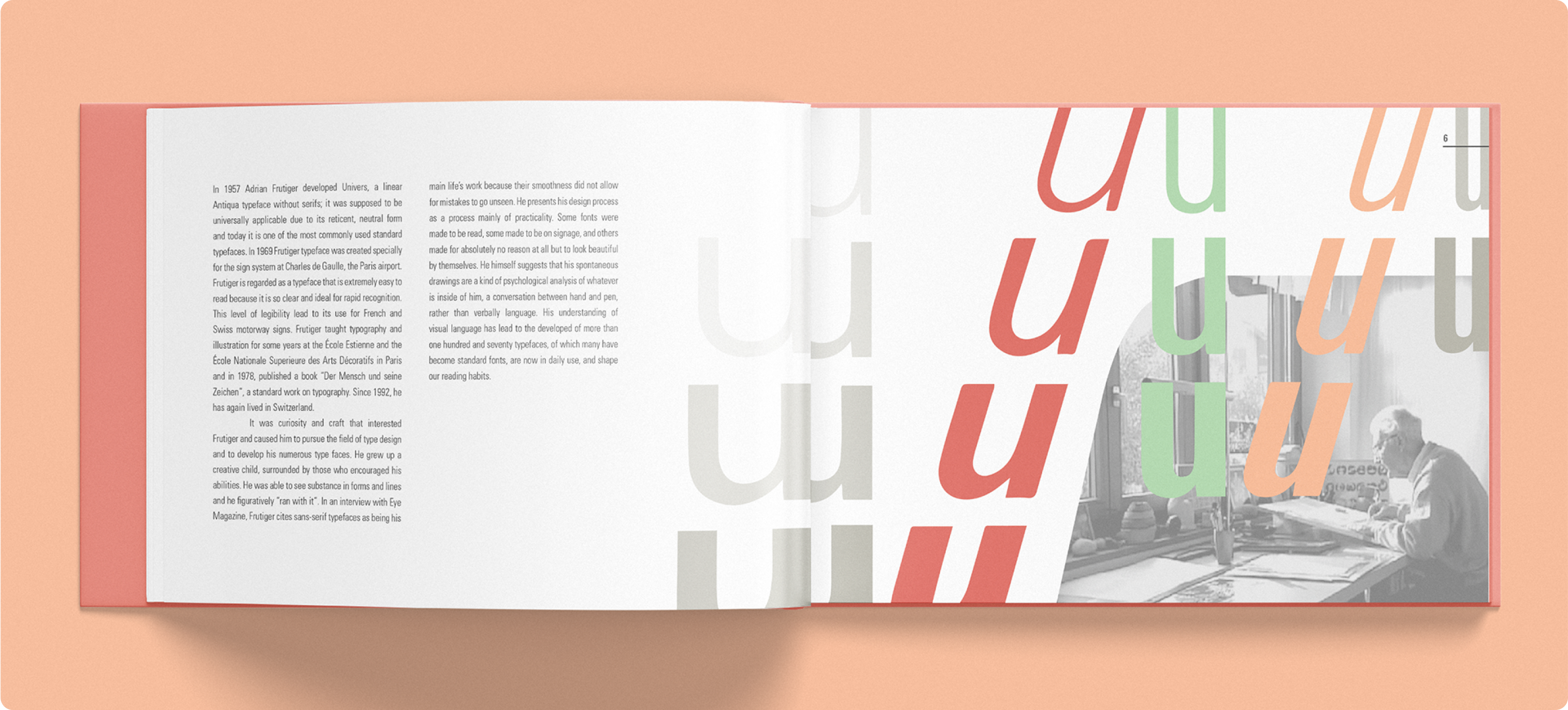
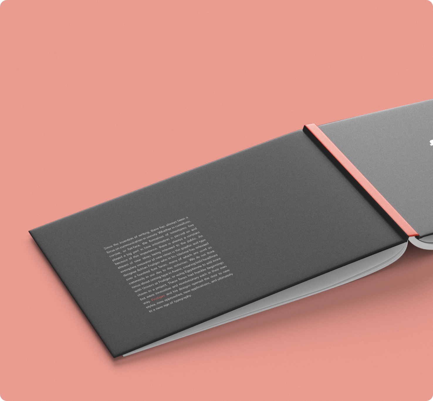
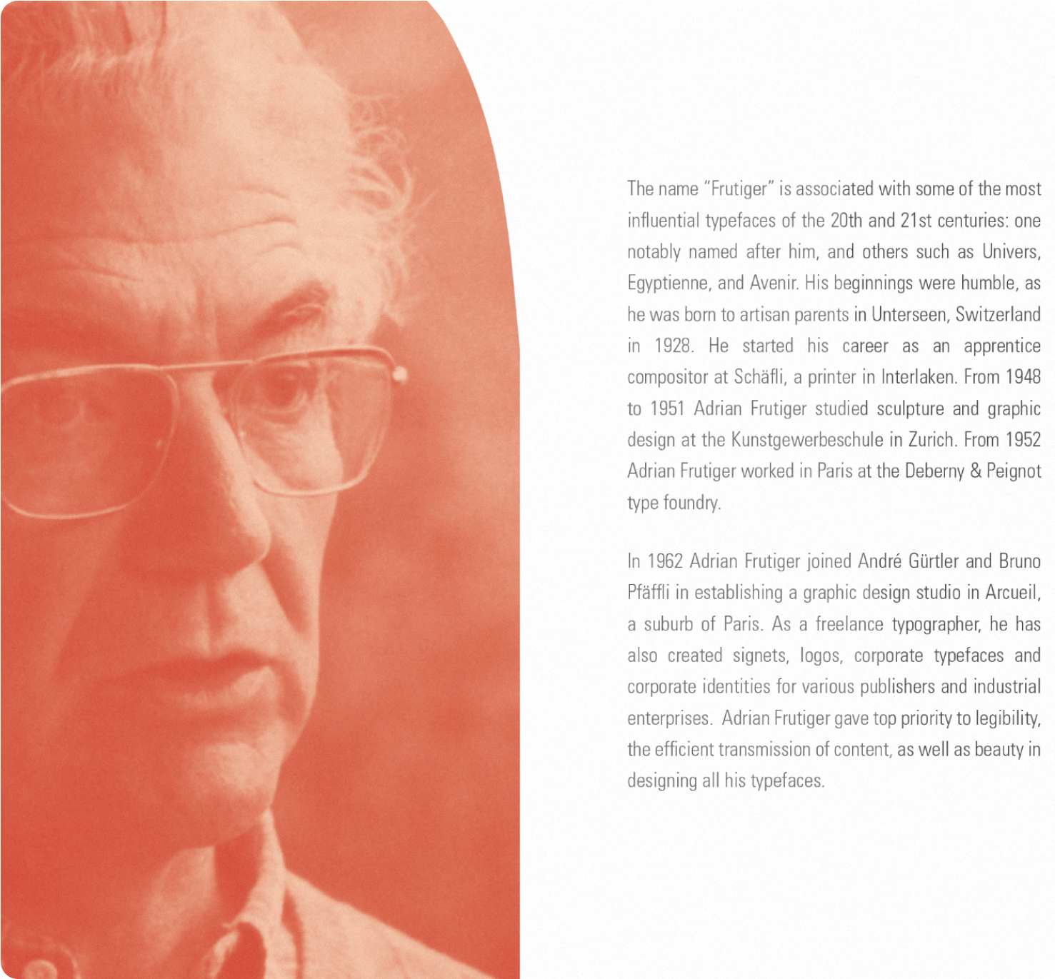
Adrian Frutiger was one of the most influential Swiss typographers of the 20th century. His work, exemplified by the Univers typeface, was a precursor for the way typography is approached today*.
*HouseofSwitzerland.org
CHALLENGE
The modern world utilizes the work of Adrian Frutiger in a variety of ways — from wayfinding to all forms of design — but doesn't have the full picture of the artistry and intent behind his typography.
APPROACH
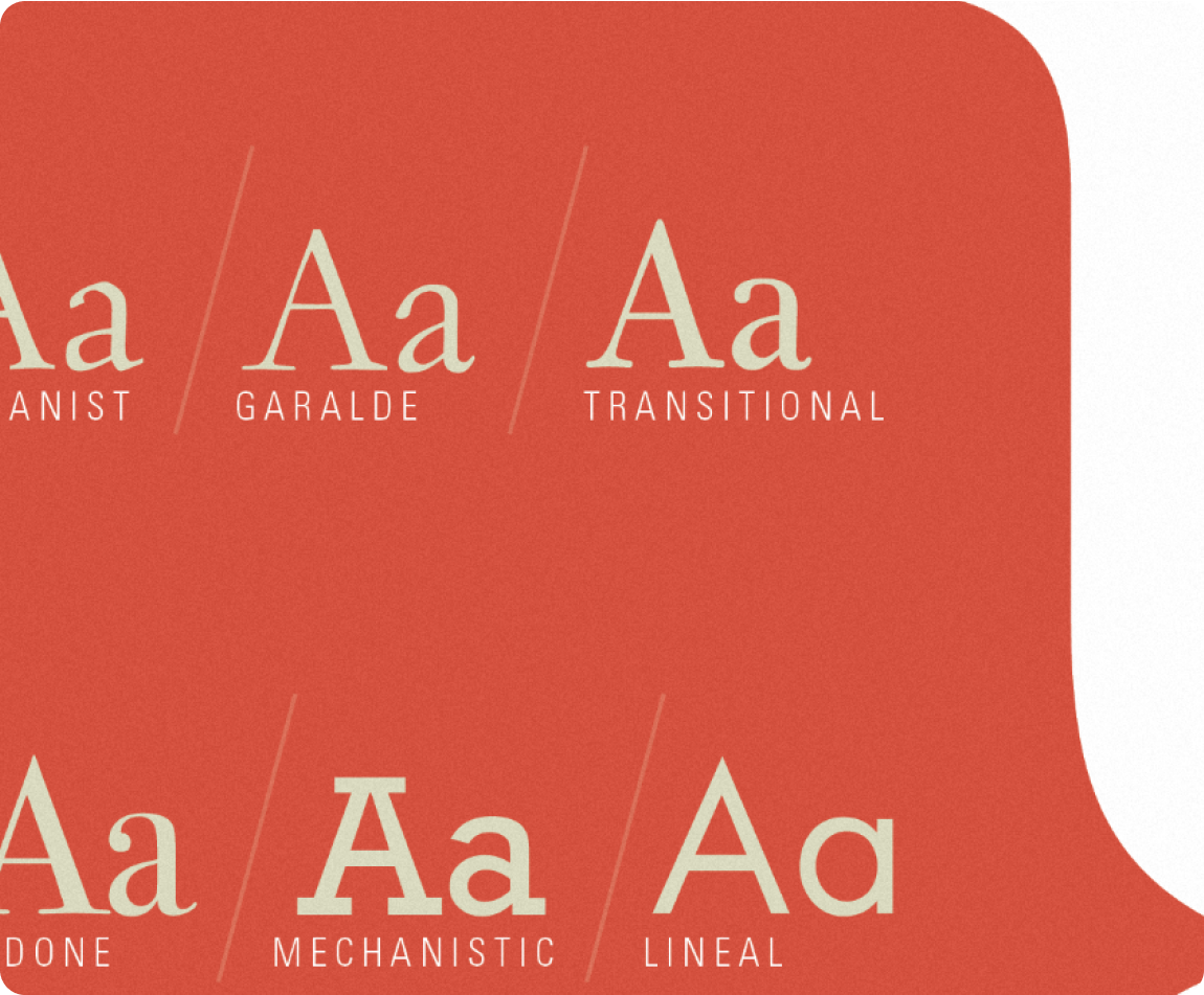
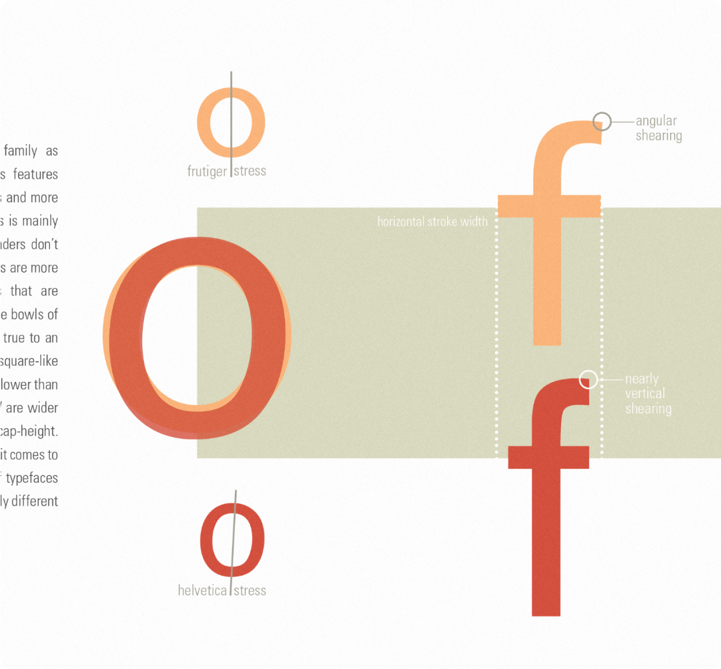
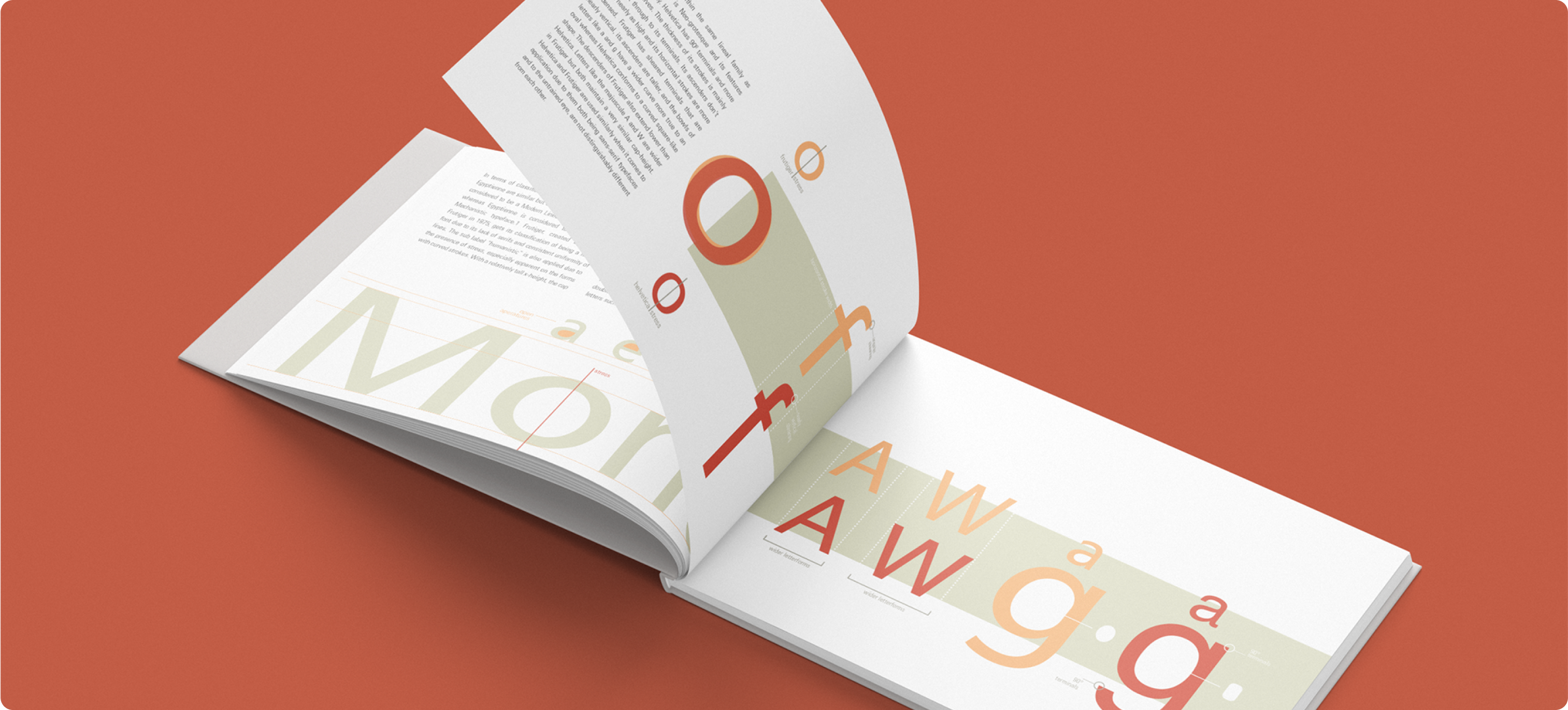
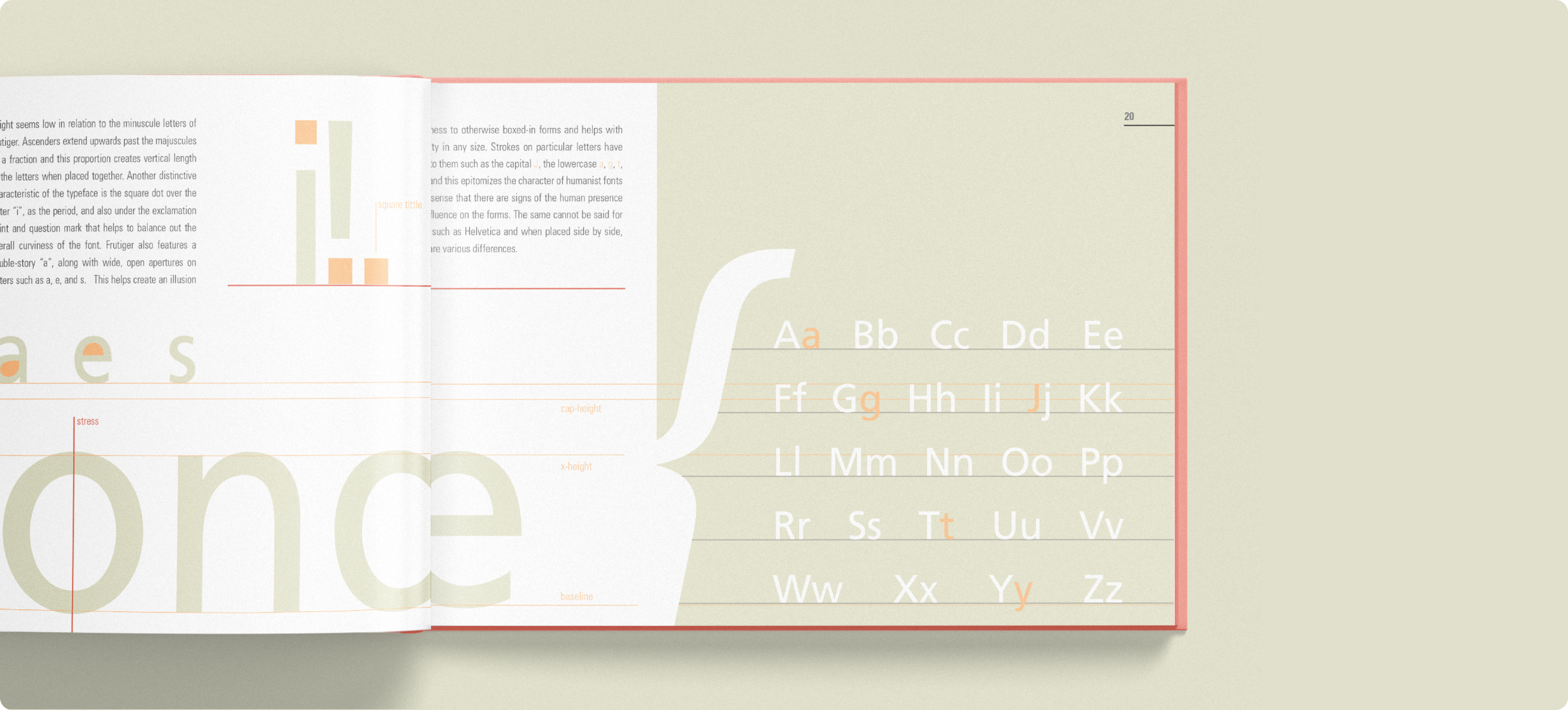
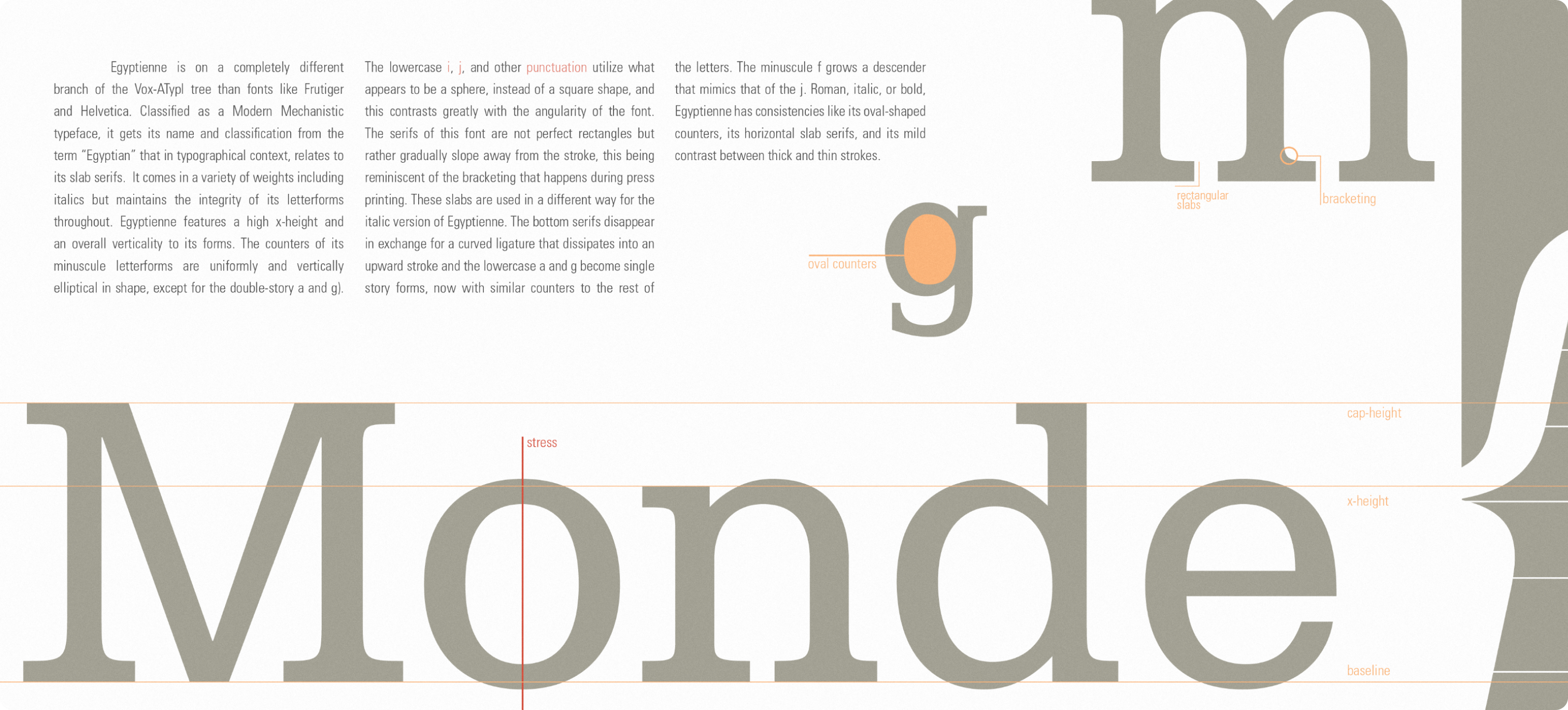
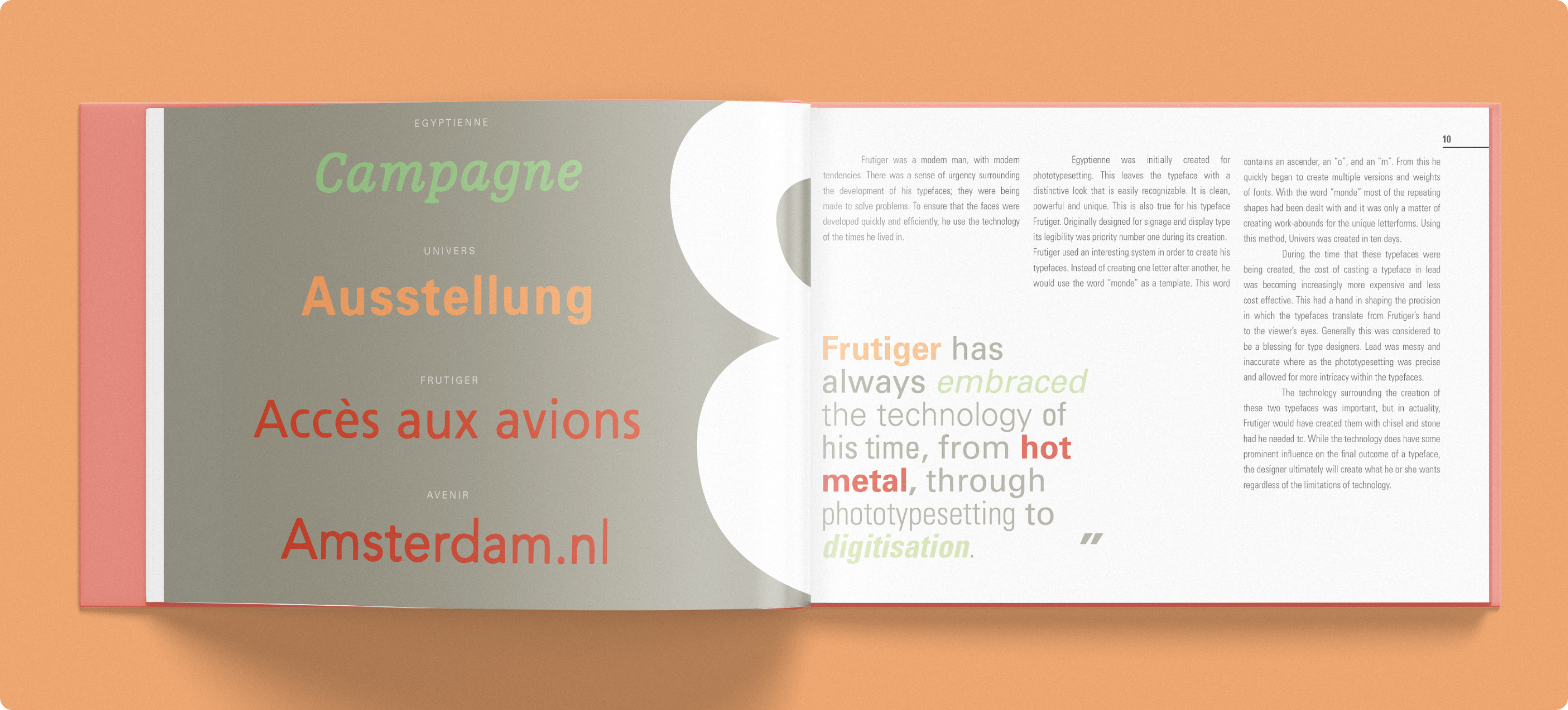
Distill font forms to their anatomical elements to help capture the beauty and intention of Frutiger's works. Diagrammatically dissect and compare the fonts Frutiger and Egyptienne to reveal a world of precision and geometry that still informs modern day design.
✁
How might we celebrate an icon of typography and their lasting effects on graphic design through the ages?


A FOCUS ON ANATOMY
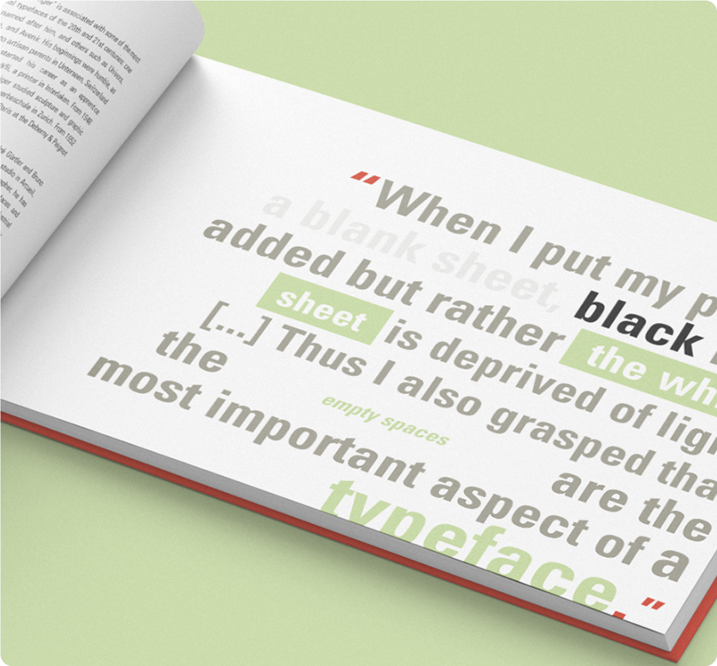
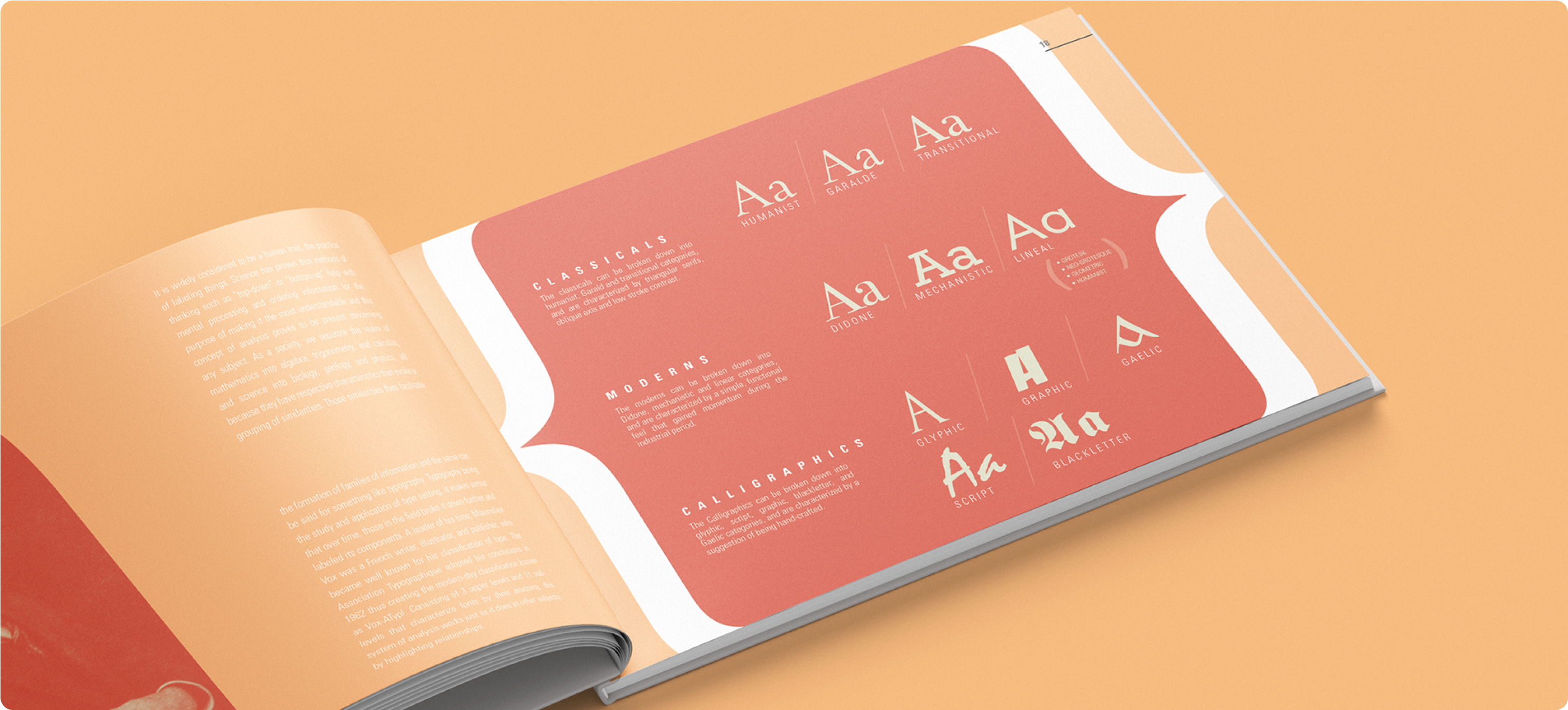
The quirks of each font are revealed in graphic comparisons, utilizing methods suggested by Frutiger himself and highlighting the care that went into each letter in terms of usability and style.
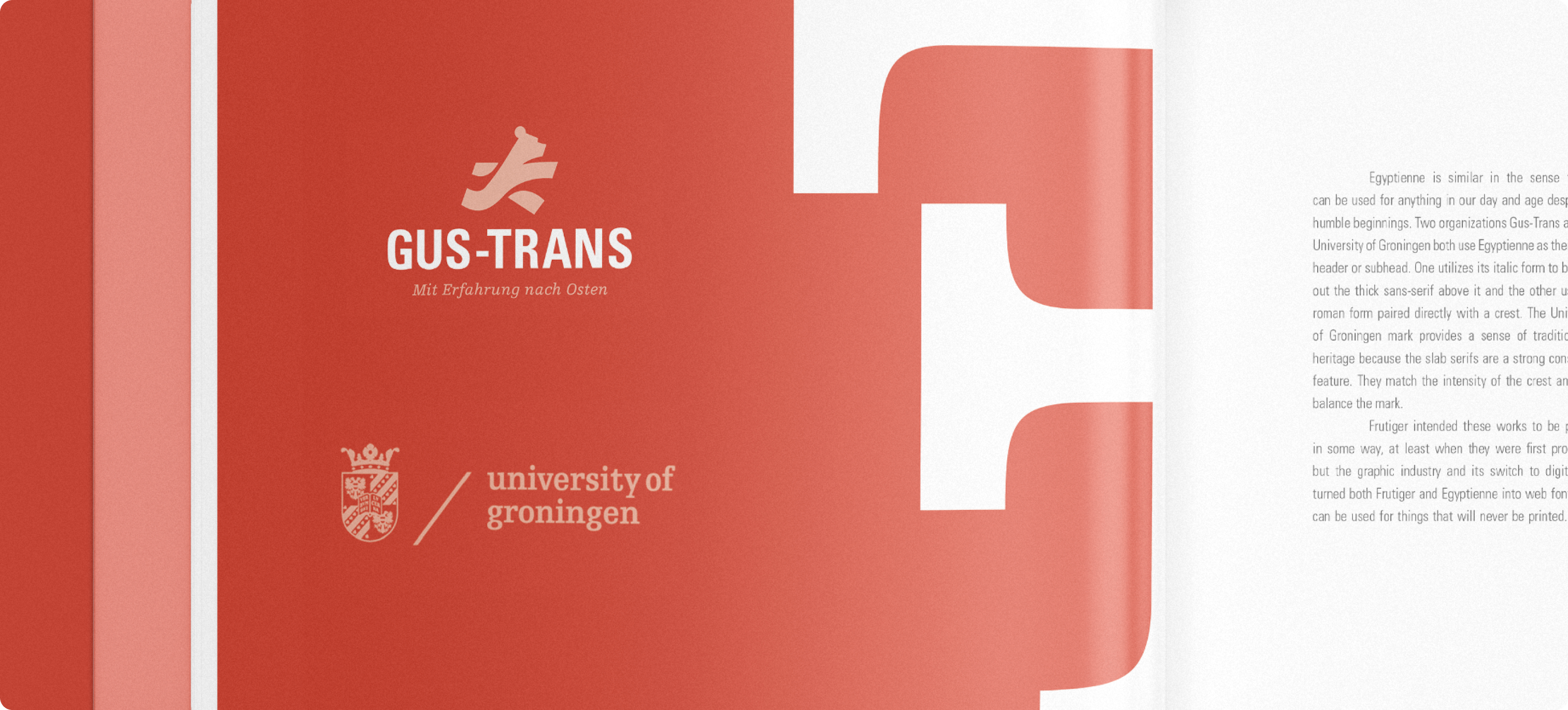
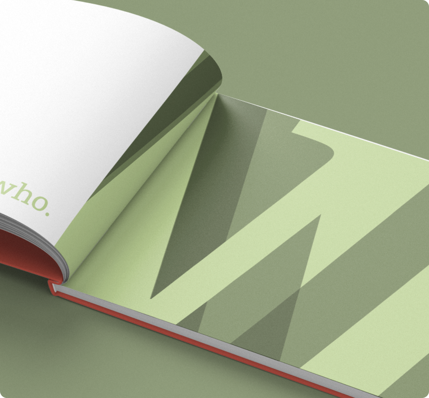
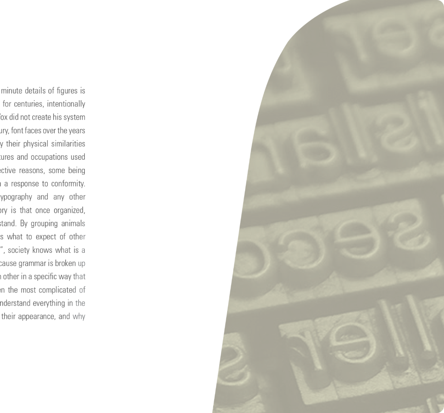
Designed to mimic aspects of the Swiss-style, this specimen book evokes a true appreciation for details and analysis, and how we as a community can continue to put the same level of care into modern works, in order to preserve the legacy of good design.

LET'S WORK TOGETHER

COLOPHON
This site uses Spline Sans and Spline Sans Mono for headlines and body. Chromate Roman and Italic are used for display.
ALL RIGHTS RESERVED
Régine Carreras
Design + Direction
Made with 🤍 in Maryland
© 2025
Never tell me the odds ⏺
