Leveling Up The World of Game Reviews and Community with Sandb0x
BRAND, EXPERIENCE, USER RESEARCH
CLIENT
Maryland Institute College of Art
SERVICES
Research + Analysis
Brand + Identity
Design System Development
Visual Design
Project Management
Presentation Design
Motion Design
BACKGROUND
Video game enthusiasts flock to consoles and platforms that host their preferred content and often have to review a variety of sites, apps, and publications for the information they need to decide what to play next.
CHALLENGE
The lack of a console-agnostic platform for gamers hinders their ability to make informed purchases about new games that best align with their preferences.
APPROACH
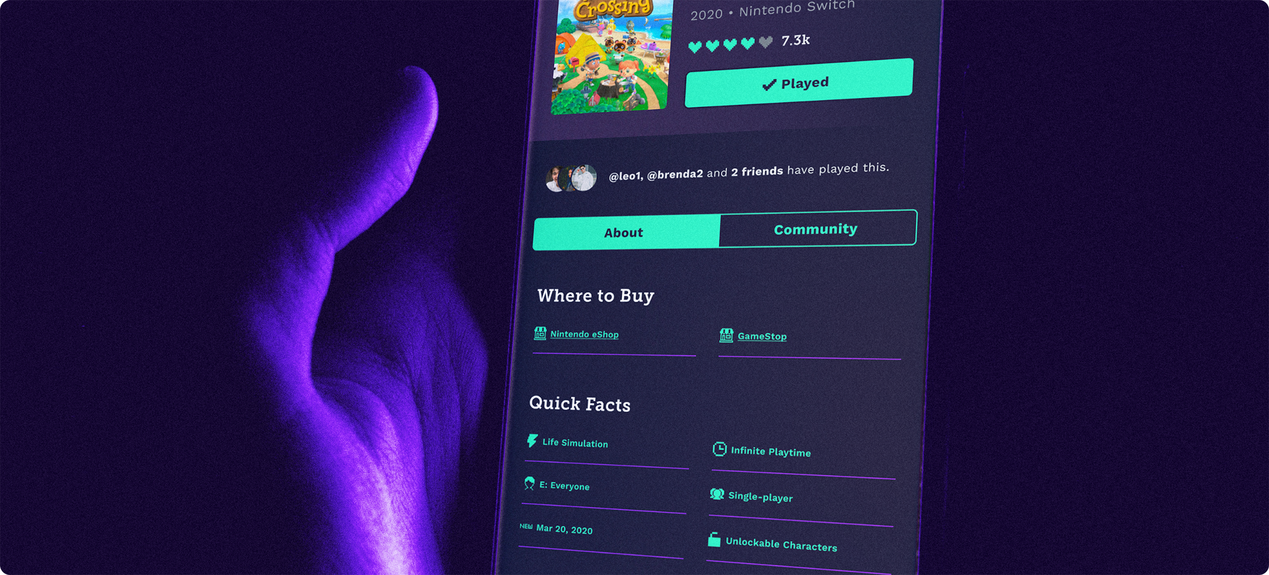
Devise a social cataloging platform for gamers to review games they’ve previously played, find new ones in their preferred genres, and digitally connect with other players.

✁
How might we invent a single platform that allows gamers to catalog their played games, access personalized recommendations, read authentic reviews from other users, and socialize with like-minded players all in one place?
PROCESS
While working on a small team of five, I steered the development of the platform's identity, visual/interface design, and design system while also heavily supporting research analysis and project management efforts throughout the project.
Miranda Berg – Research, Copywriting
Tiffany Berry – Research, Prototyping, Presentation Design
Caelidh Liddell – Research, Data Analytics, Content Strategy
Sarah Thickett – Research, Wireframing, Visual Design, Content
OBJEC
TIVES
Capture diversity of thought and gaming experience across a variety
of genres and play styles
Focus: Monthly Active Users
Provide ongoing merit for longterm use through meaningful and informative content
Focus: User Retention Rate
Nurture a community that adds value and authenticity to users’ experiences
Focus: Groups + Threads Created
Simplify the content creation and perspective sharing process
Focus: Game Ratings and Reviews
01 / INVESTIGATION
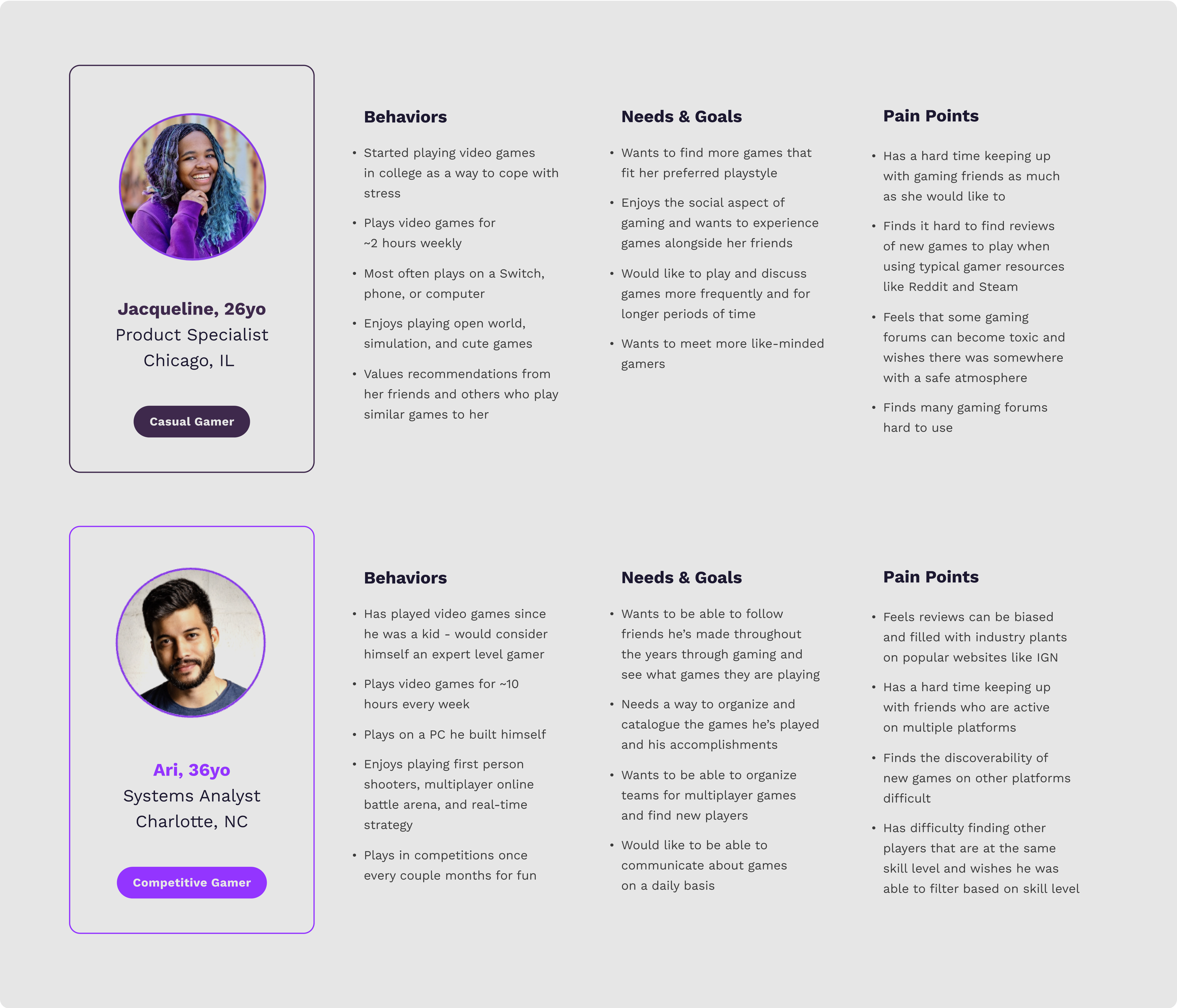
We began our project with an assessment of the competitive landscape and a formative research study that quickly defined the priorities and goals of our two user types of focus, Casual and Competitive Gamers. Knowing that their past experiences and needs would differ, we sought to think ahead and solve for a balanced experience that would benefit the two.
Insights revealed a greater focus on finding community than we originally anticipated — and that emphasis helped shape the platform's features into something that celebrated gaming in more social ways.
02 / UX STRATEGY
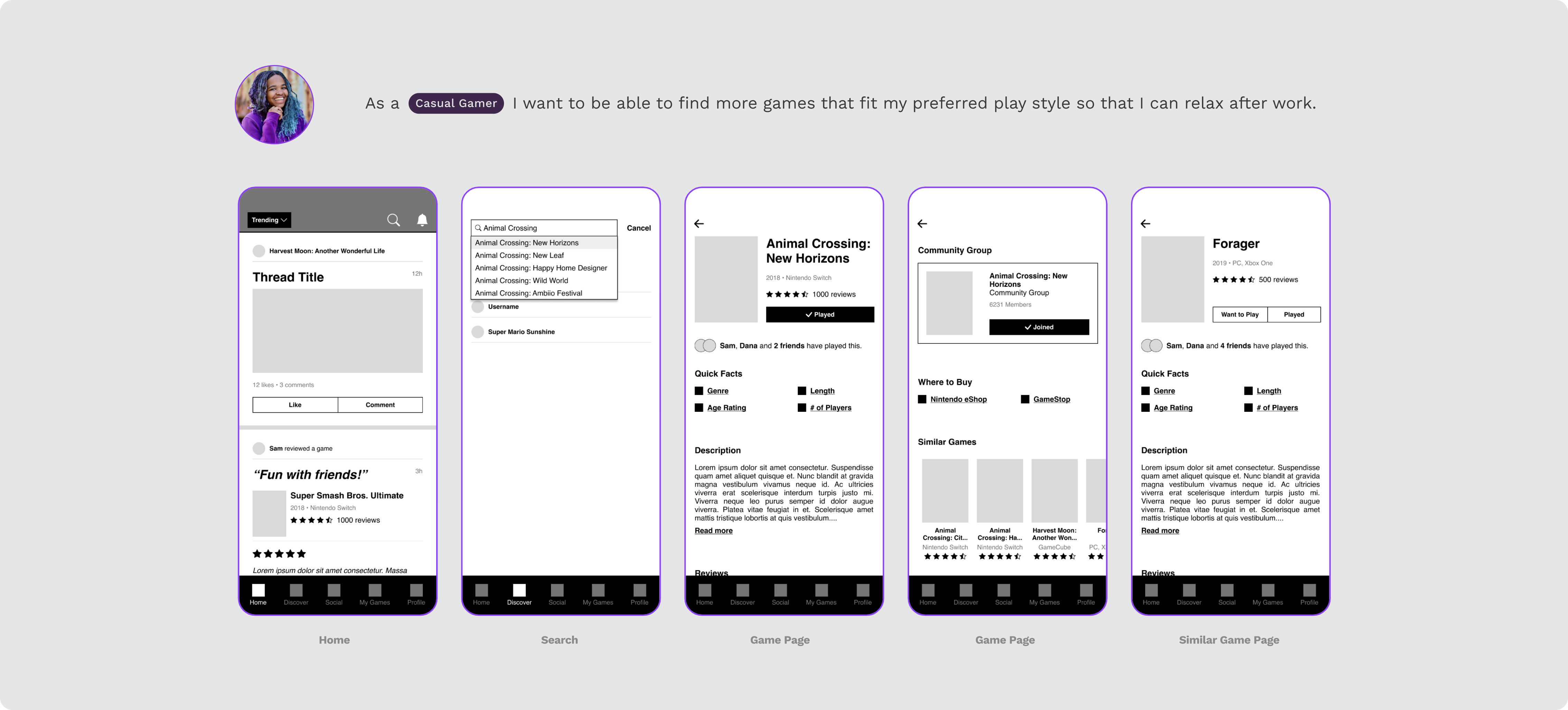
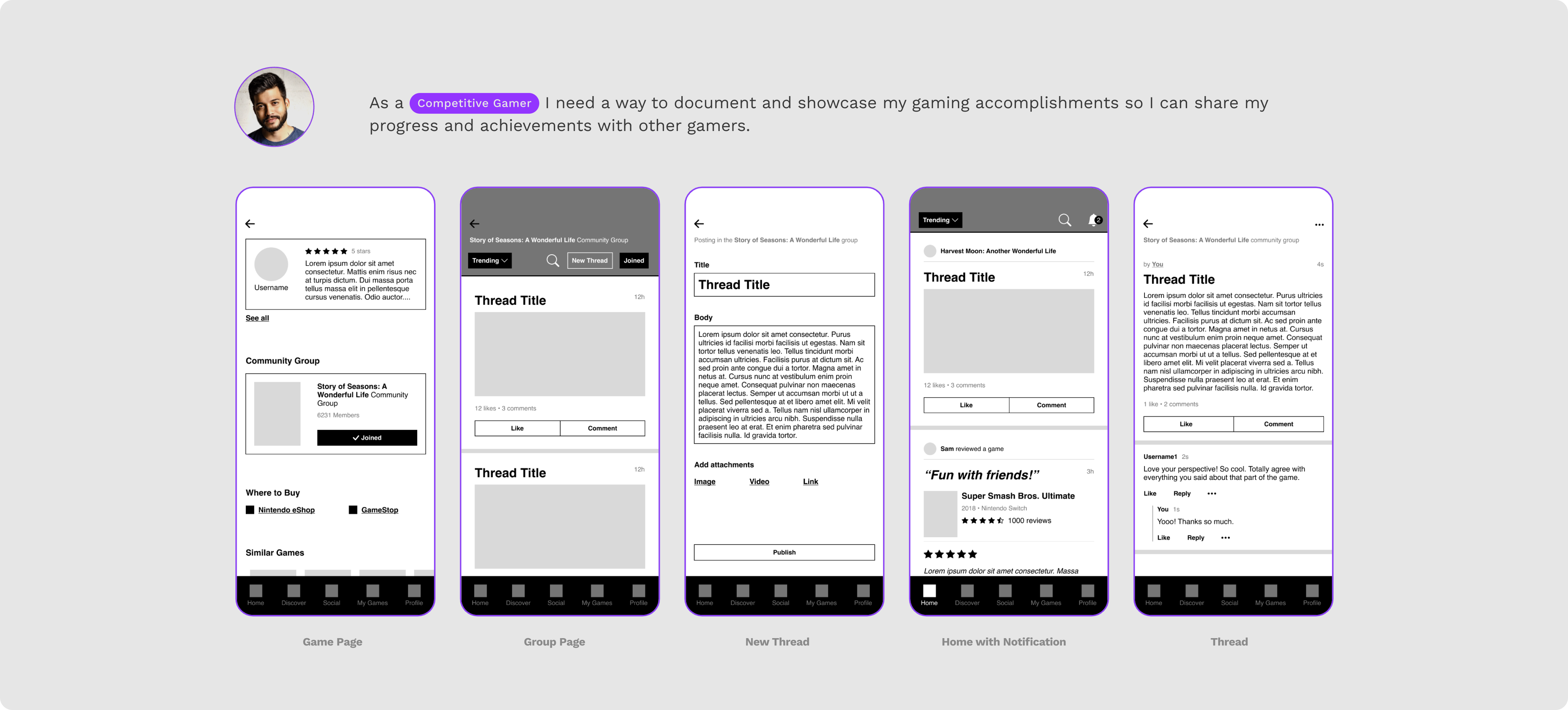
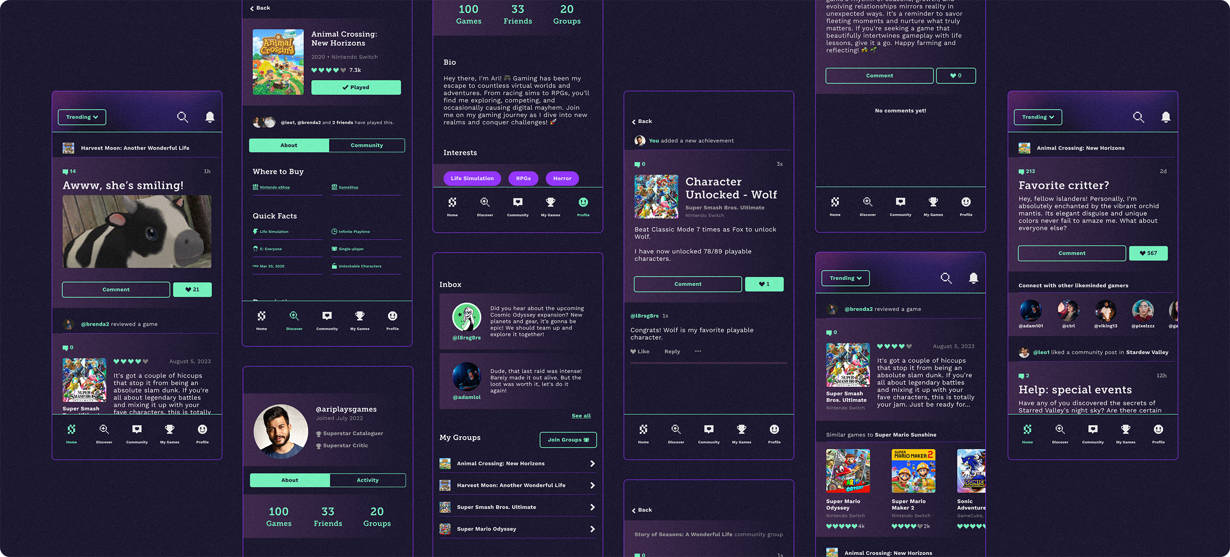
Key priorities moving forward centered on building a trustable and intuitive platform that captured as much helpful information as possible to aid in decision-making. We built user scenarios and flows that best captured these features: (1) Finding similar games for a specific play style using a sophisticated algorithm and community reviews, (2) engaging in community threads with likeminded players, and (3) documenting gameplay accomplishments and progress as part of the platform's cataloguing mandate.
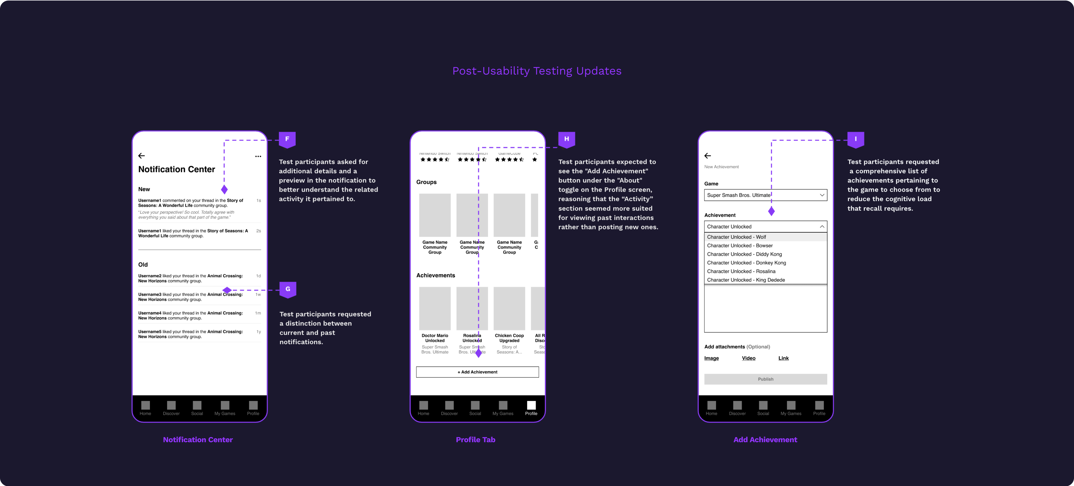
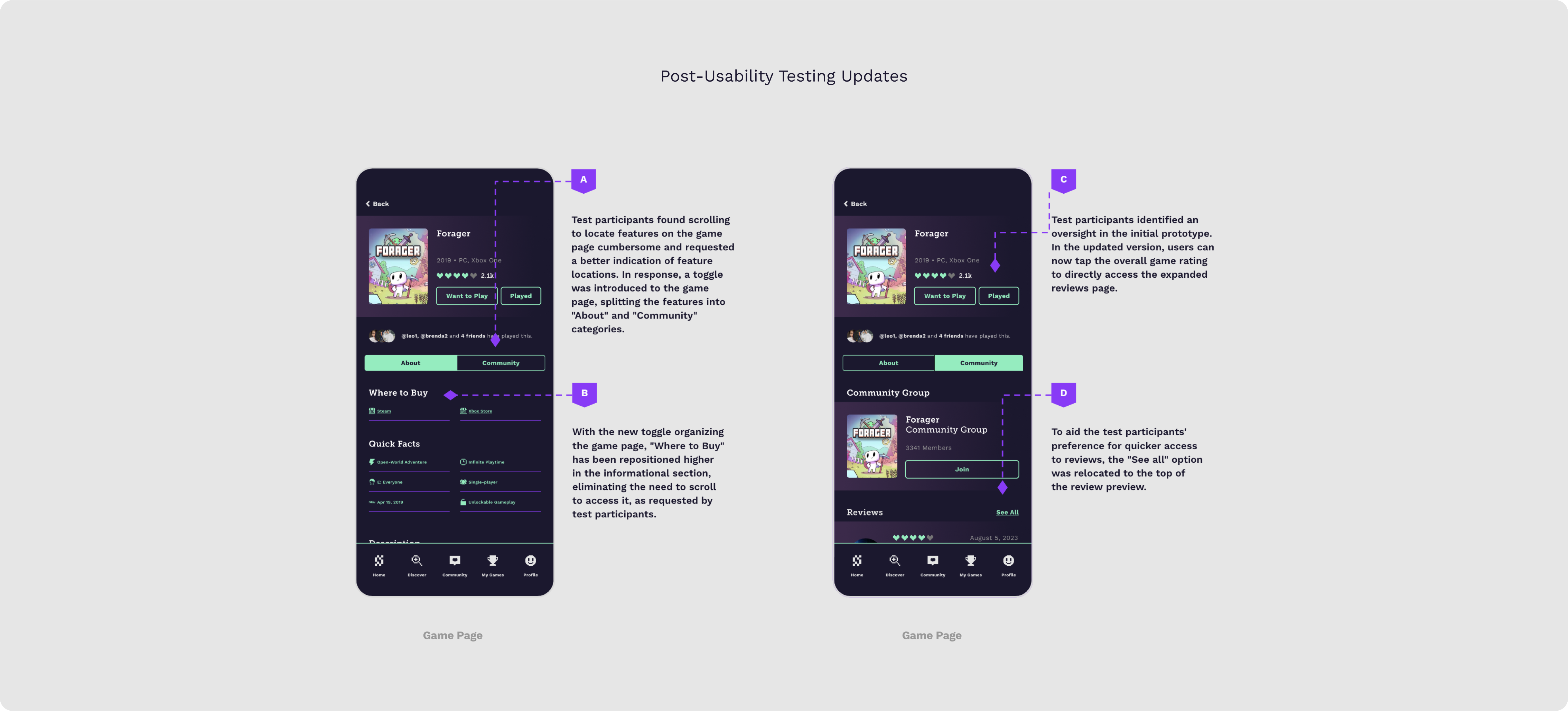
We crafted mid-fidelity wireframes for a round of unmoderated user testing that uncovered lapses in our original strategy — resulting in some pivots in terms of information hierarchy and a stronger high-fidelity platform.
03 / VISUAL STRATEGY
A key finding from our formative research was that 97% of the gamers we surveyed had been playing video games for 10+ years. Other findings revolved around the idea of parallel play and niche communities. Though most of our survey pool weren’t playing multiplayer games, there was a need to encompass togetherness and nostalgia as part of our name and identity development.
Several rounds of research, synonyms, translations, and logo marks later, I landed on the concept of “everyone plays in the sandb0x”, with the idea that individually or as a collective, everyone gets to celebrate what they build. I crafted an icon that embodied pixelated unity and paired it with our wordmark set in Space Grotesk with a zero for the O. In this way, we allowed Sandb0x to be differentiated and positioned as demographically-neutral, console-agnostic, and community-powered.
Our mood board inspiration came from mixtures of retro elements like pixel art, RGB, and neon signs, to modern typefaces, dark mode interfaces, and a sense of playfulness.
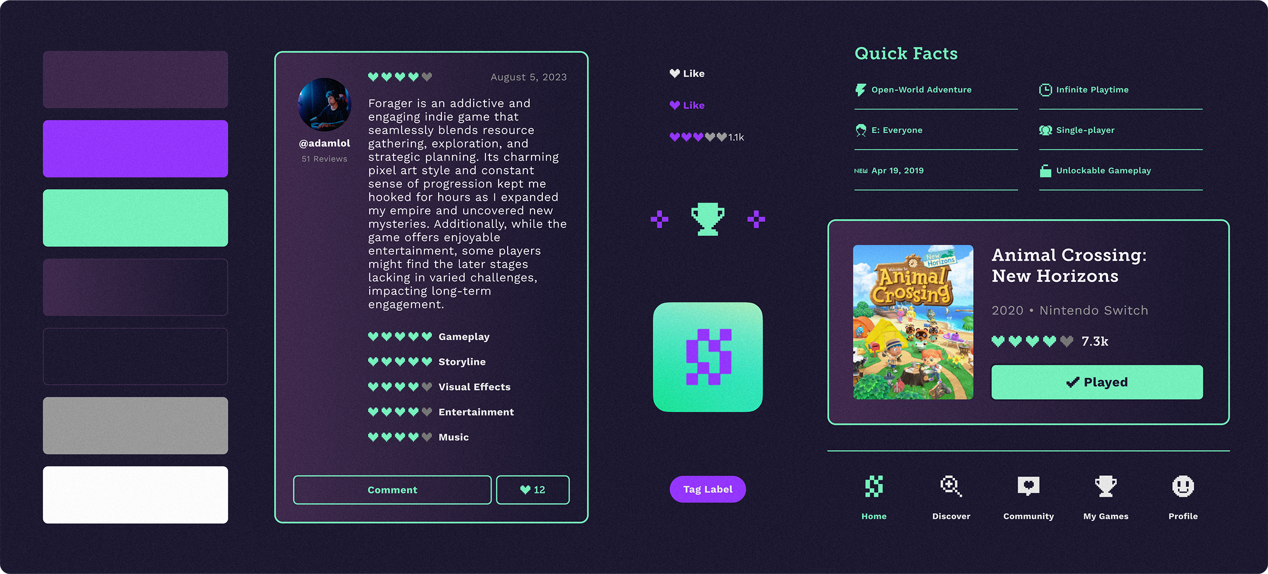
These inspirations and our user research informed the design system we developed for Sandb0x, where we prioritized clean darkmode interfaces, bold typography, and color. We wanted our system to provide a platform on which video games of all types could be celebrated and take the visual center stage, without leaning towards any one demographic specifically.

04 / ITERATION
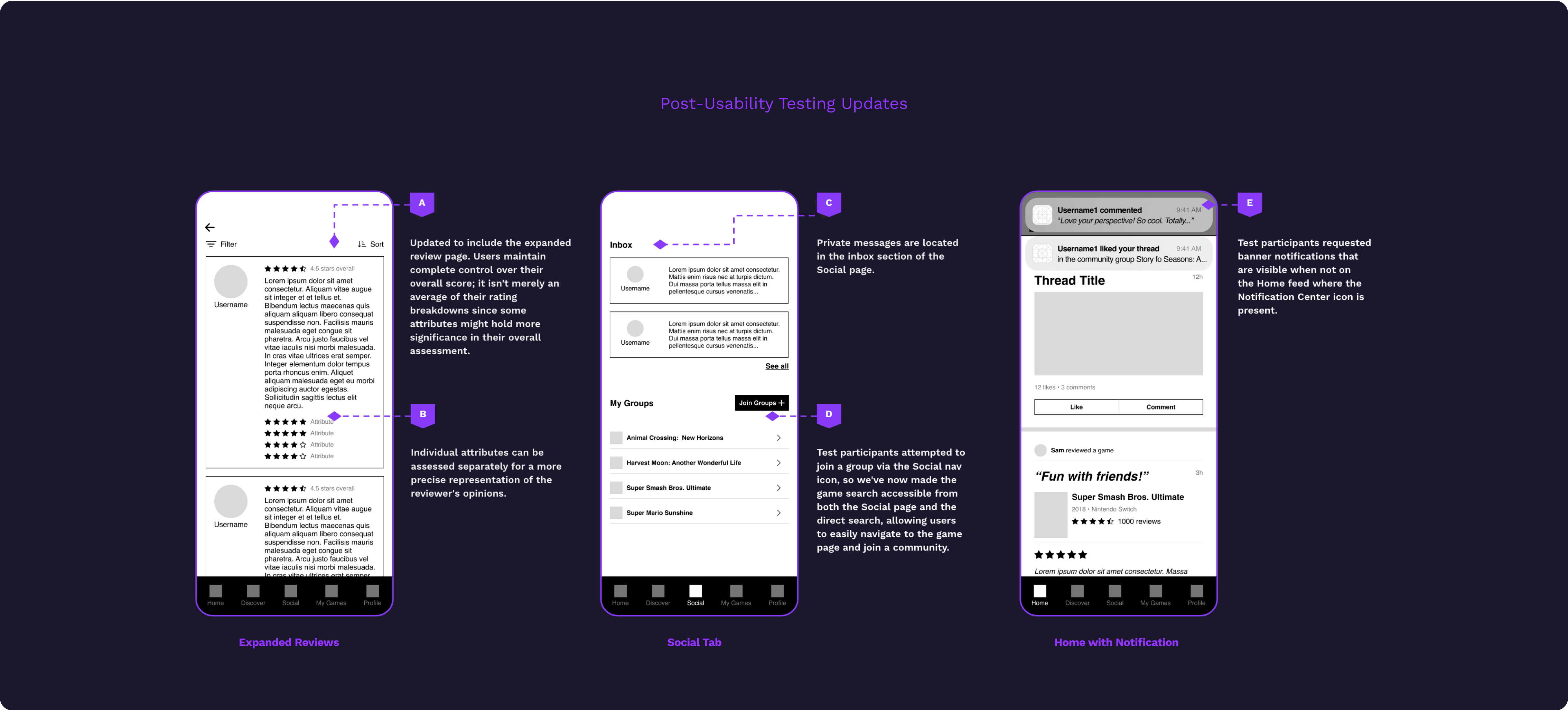
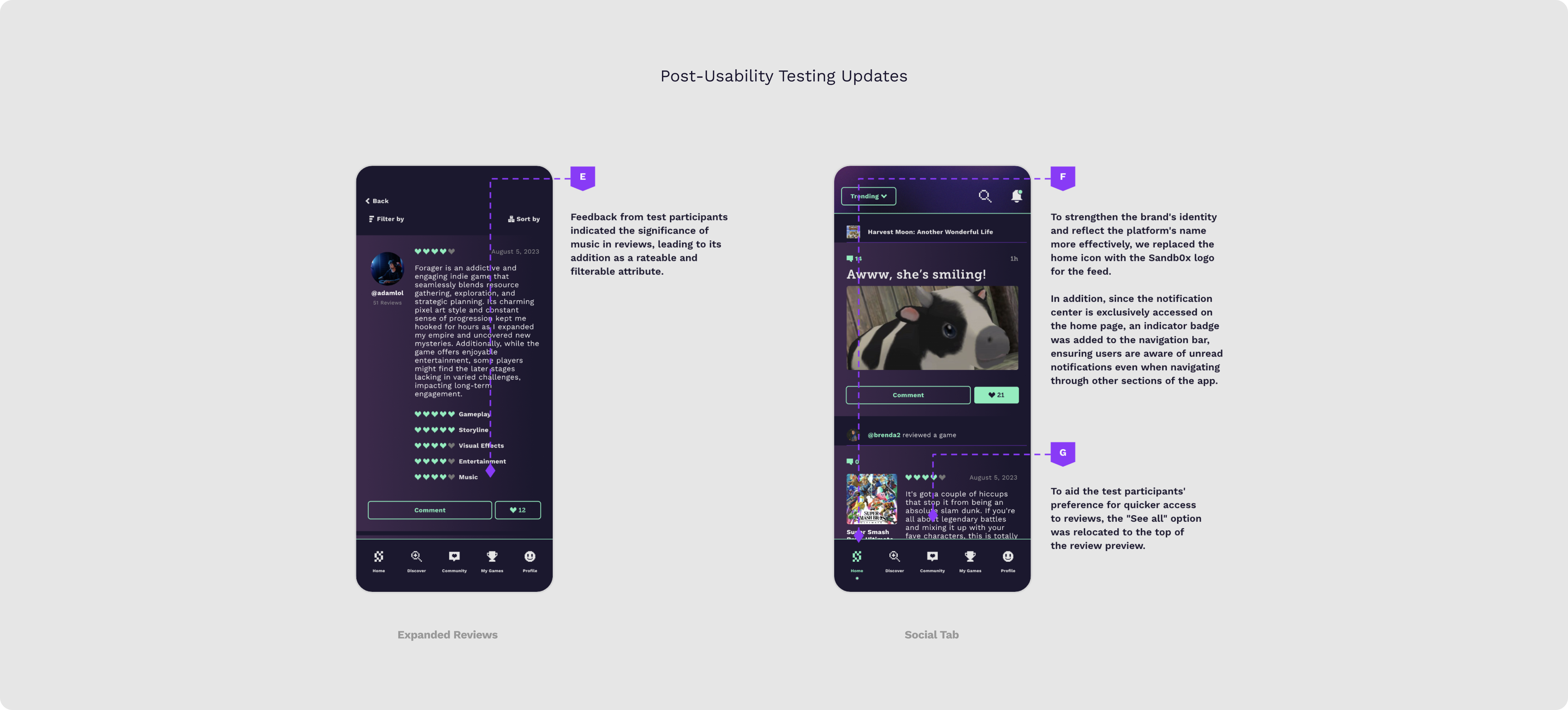
Developing a dimensional design system enabled our high-fidelity build to be cohesive and immersive. We hosted another usability testing round to further validate our flows and iterated on features for a greater user-centric solution.
We hosted another usability testing round to further assess our flows and iterated on features for a greater user-centric solution.
IMPACT
90%
of gamers would find this product to be at least somewhat useful based on the features it offers
>86%
of gamers rated the product ‘likely’ to be used in their future gaming
LET'S WORK TOGETHER

COLOPHON
This site uses Spline Sans and Spline Sans Mono for headlines and body. Chromate Roman and Italic are used for display.
ALL RIGHTS RESERVED
Régine Carreras
Design + Direction
Made with 🤍 in Maryland
© 2025
Never tell me the odds ⏺
