Motivating Customers to Make a Confident Switch with Identity Rescue
INTEGRATED, BRAND
CLIENT
Ping Identity
SERVICES
Research
Art Direction
Visual Design
Wireframing
Testing + Analysis
BACKGROUND
Identity Service customers experience drastic price hikes at the time of renewal with competitors and need a fast and secure alternative for their businesses that also caters to their specific needs.

CHALLENGE
Customers often learn too late or not at all about Ping’s ability to help them switch Identity Service Providers within 90-days.
APPROACH
Disrupt the renewal market by crafting an Identity Rescue “witness protection” campaign that inspires urgency and trust through a valiant, integrated visual experience across digital and live platforms.

✁
How might we motivate customers to take control of their future by switching to a provider that provides transparency and integrity?
OBJEC
TIVES
Strategically target potential customers with an immersive campaign that is empathetic and action-driven
Focus: Leads + Conversions, Ad Interactions
Strengthen awareness of the Ping brand and solutions/offerings
Focus: Page Interactions + Session Duration
INVESTIGATION + STRATEGY
An initial phase of desk research and competitive analysis revealed a need for an empathetic approach to the plight of customers but more importantly, confidence-building. Working hand-in-hand with Campaign and Solution Marketing teams, we set out to hone in on championing a fair customer experience in campaign form.
After pitching eight experiential approaches that ranged from direct mail to custom hotline numbers for leads, Identity Rescue was conceived with the goal of taking customers seriously and motivating them to make confident decisions, while leaning into the audacious and bold.
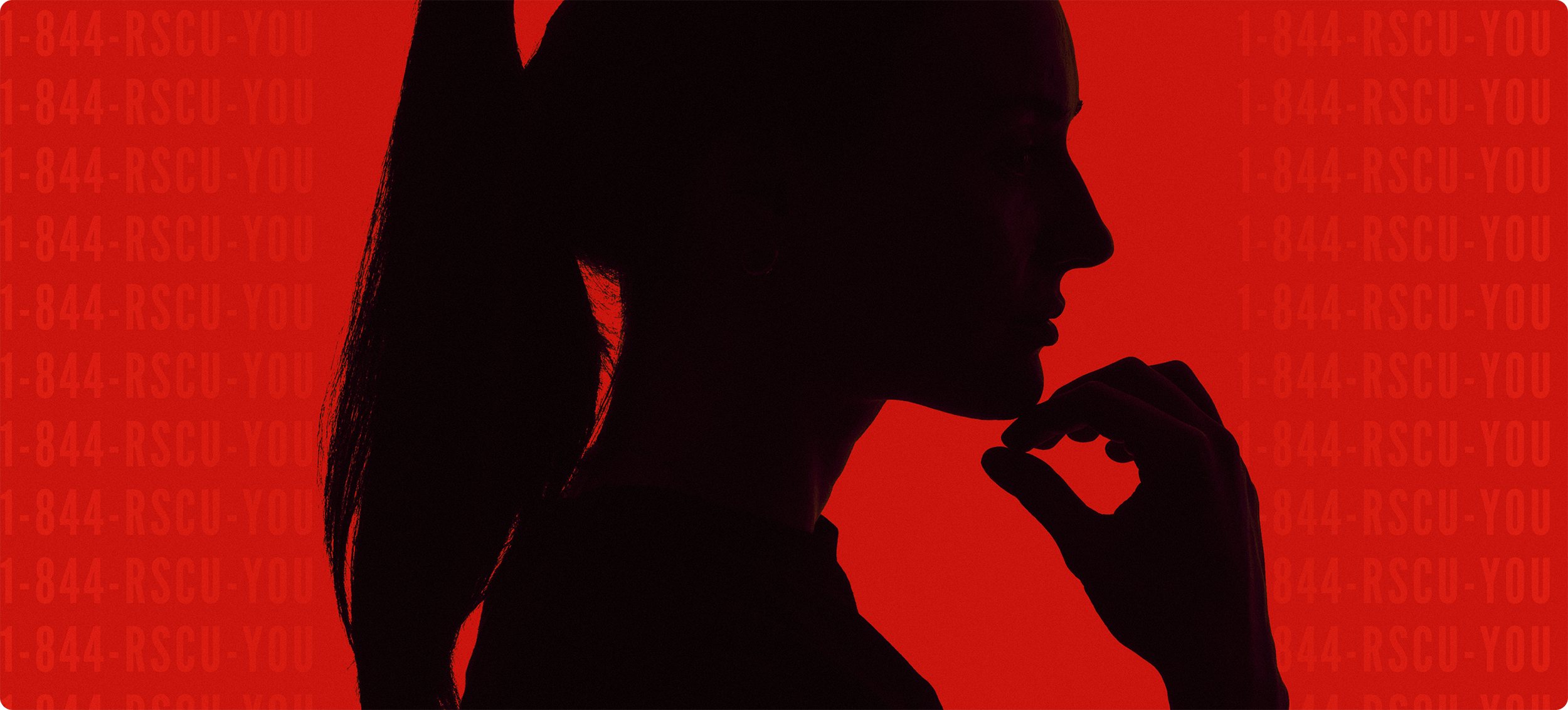
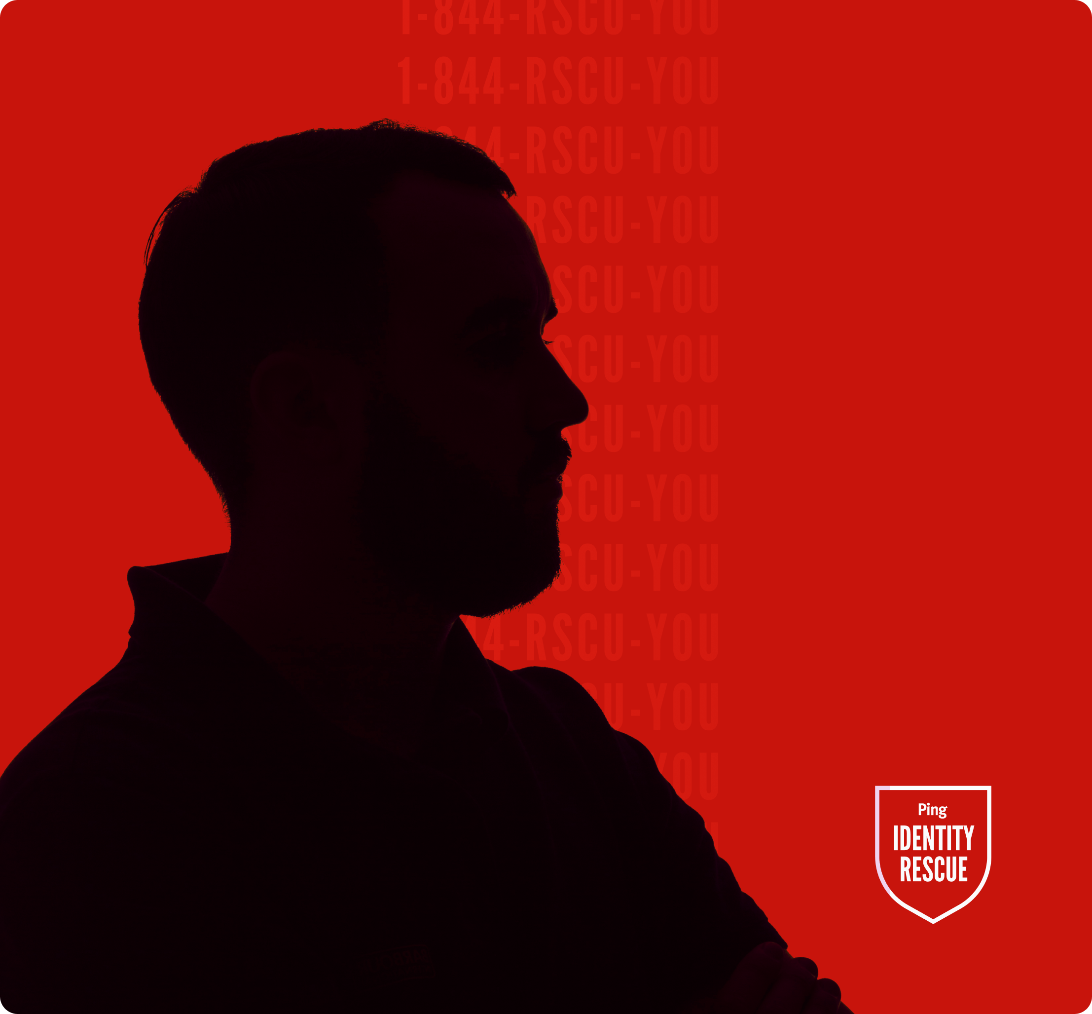
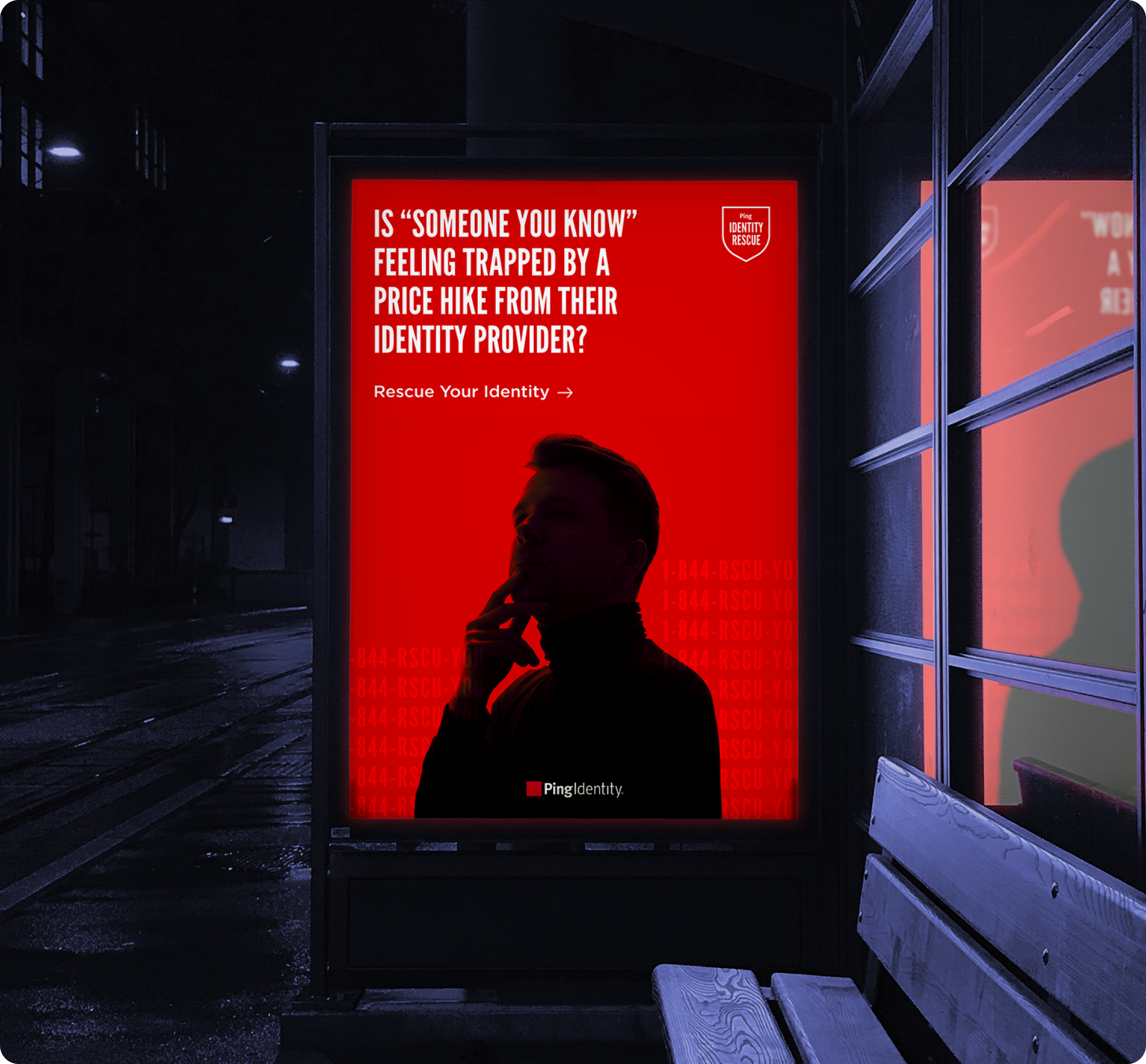
Committing to the urgency and emotions of decision-making, I created an identity for Ping’s metaphorical Identity Rescue Service that embraced anonymity and stoicism, but still captured the frustration of real people, so as to humanize the struggle.
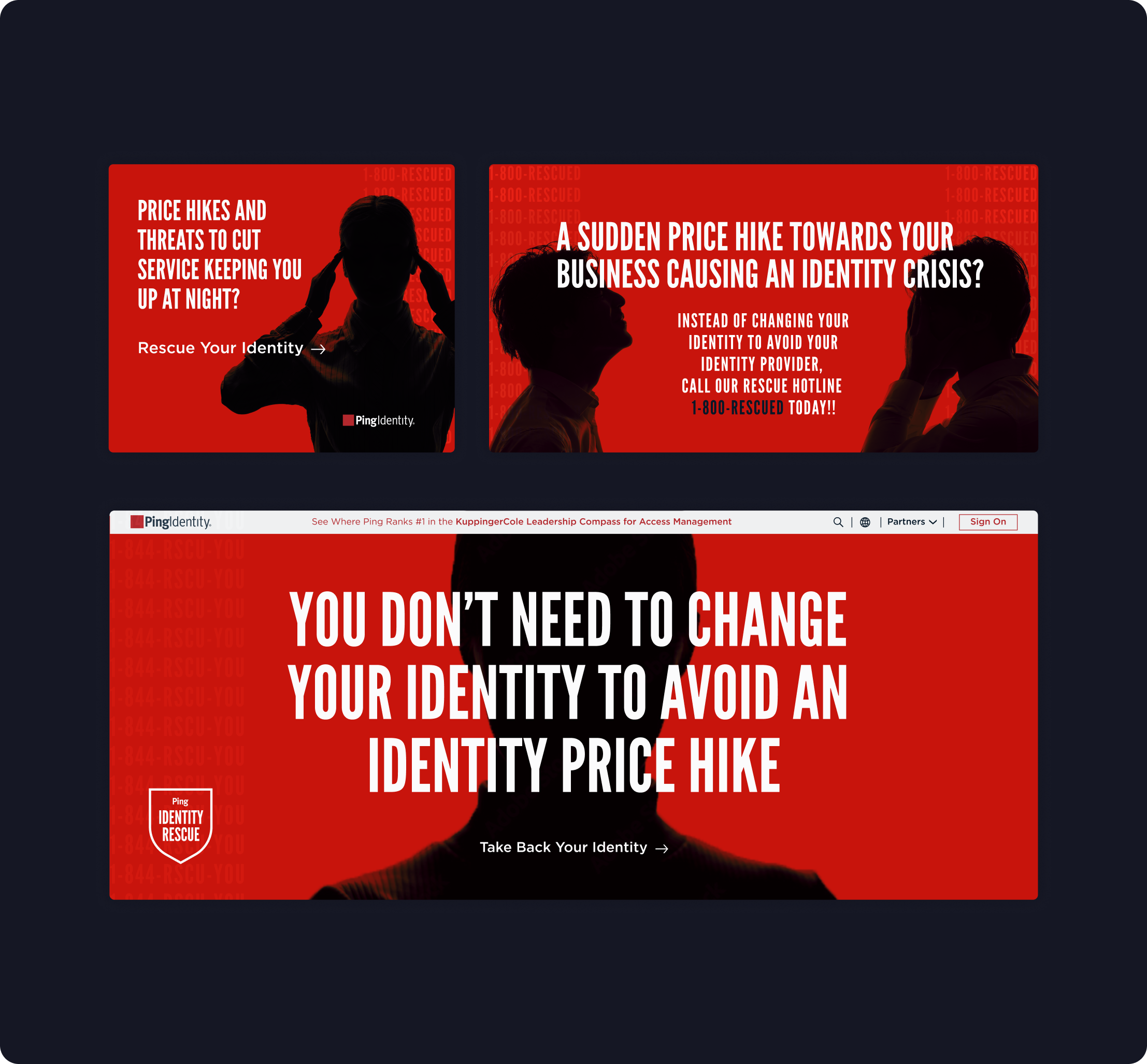
VALIDATION + ITERATION
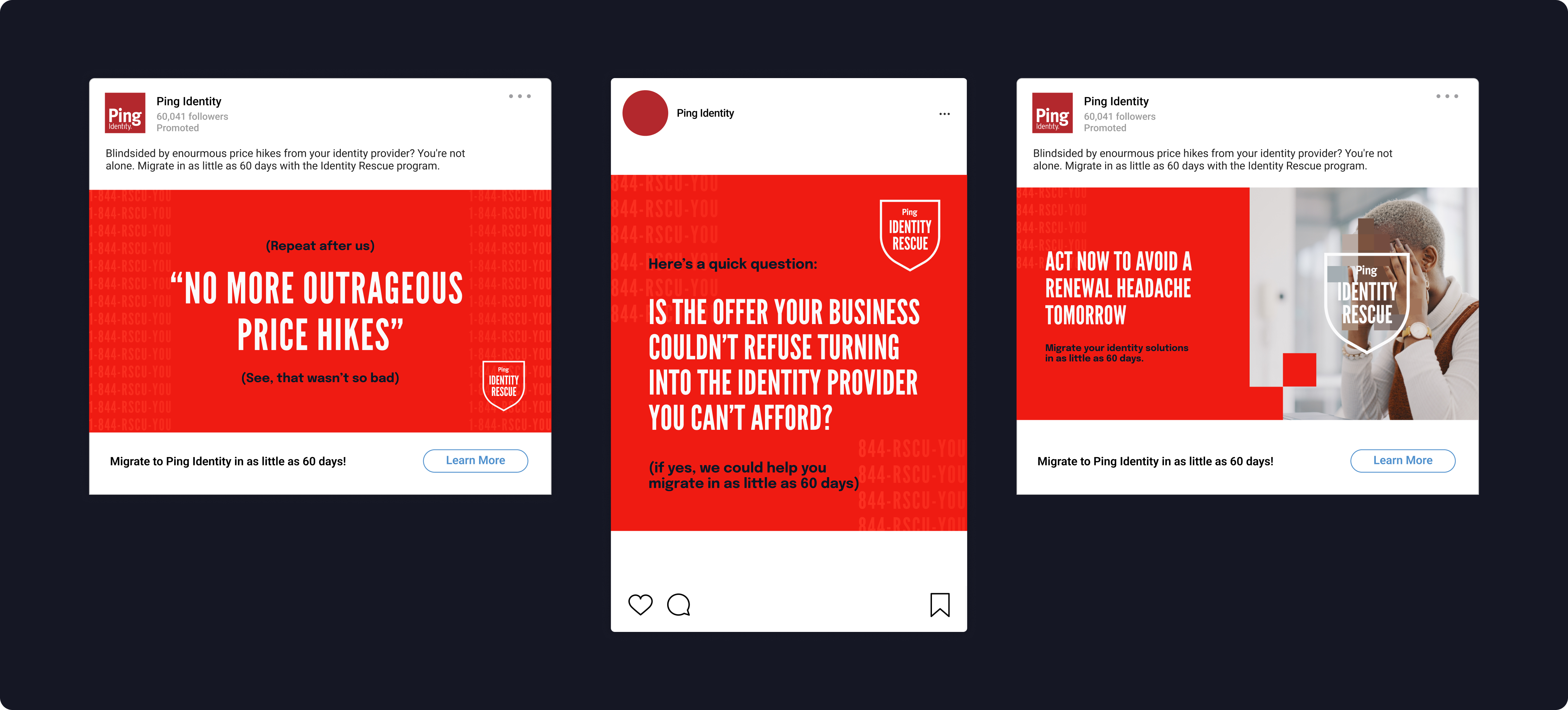
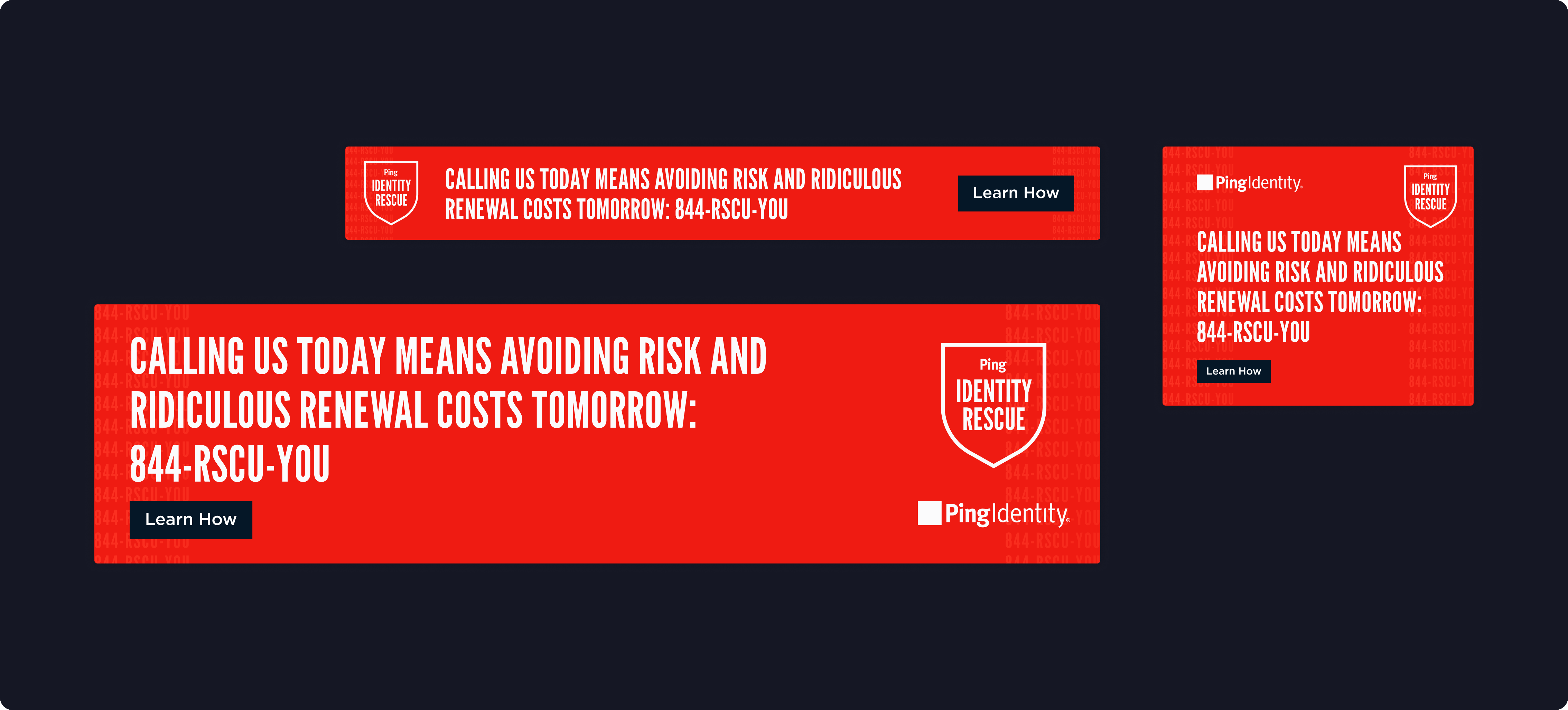
After conferring with a focus group of stakeholders and trusted partners, we decided to test the success of image-led ads alongside a simplified but impactful type-led design in our media spots. In simplifying the visual load, we aimed to assess how messaging could be cheeky and helpful at the same time while achieving the greatest amount of clarity possible. We called this our "between you and me" direction because it employed punny advice from a "friend" who wants the best for you.
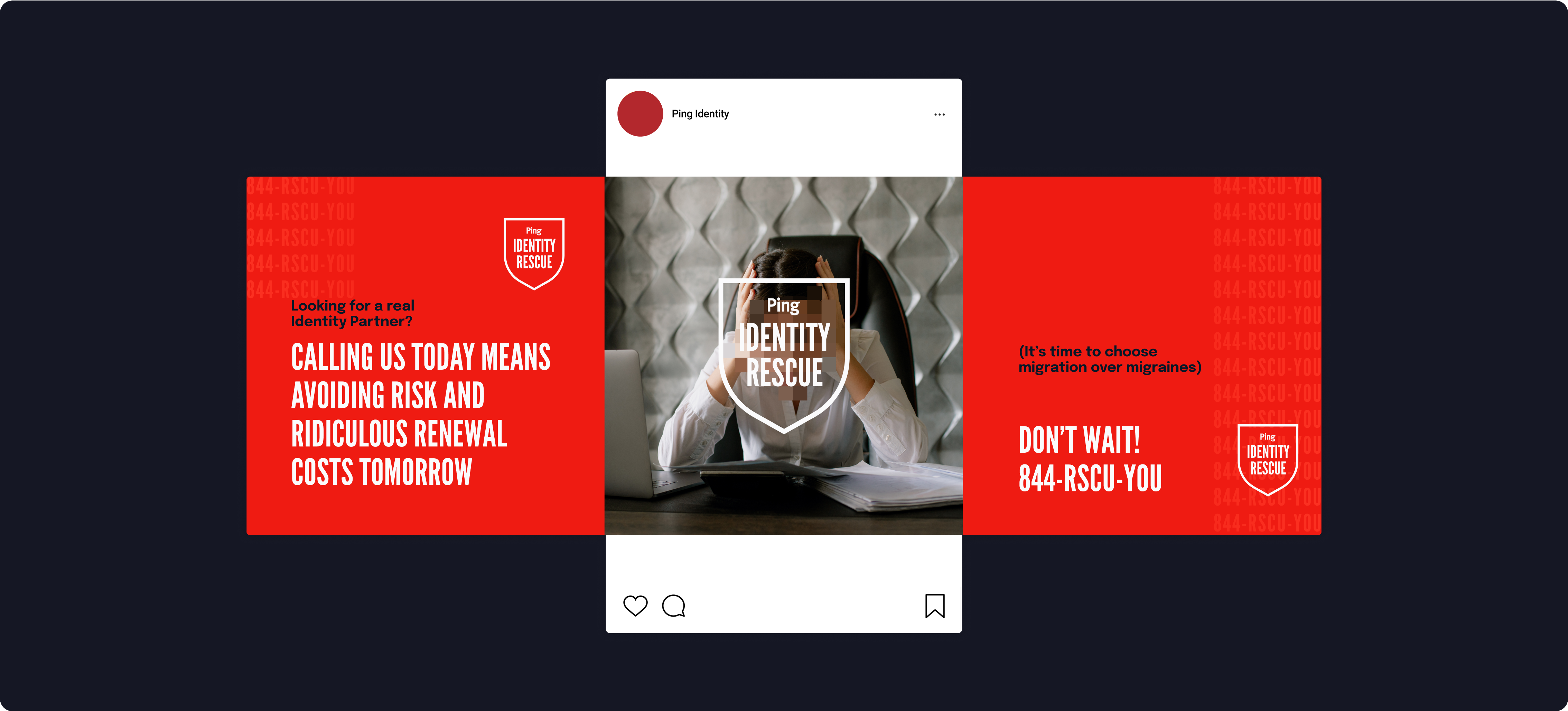
In another round of creation, I crafted another motif meant to evoke the facial pixelation of Witness Protection while adding in an elevated level of humor and meme-culture to the campaign. The silhouetted individuals in the first phase were powerful and eye-catching but I wanted to experiment in showing more emotionally-charged situations that a prospect could identify with.
IMPACT
85%
Reach Rate
20+%
Average Engagement Rate
10+%
Average Impact Rate
(Increase accounts + new accounts)/total accounts reached)
42-75k
Average Weekly Impressions
LET'S WORK TOGETHER
COLOPHON
This site uses Spline Sans and Spline Sans Mono for headlines and body. Chromate Roman and Italic are used for display.
ALL RIGHTS RESERVED
Régine Carreras
Design + Direction
Made with 🤍 in Maryland
© 2025
Never tell me the odds ⏺
