Preserving Cultural Context and Storytelling with Patchwork
BRAND, EXPERIENCE, USER RESEARCH
CLIENT
Maryland Institute College of Art
SERVICES
Competitive Research + Analysis
User Research + Testing
Brand + Identity
Art Direction
Design System Development
Wire-framing
Prototyping
Copywriting
Motion Design
Campaign Design
Project Management
BACKGROUND
Conservative estimates suggest that more than half of the world’s languages will become extinct by 2100* and along with those languages are traditions, lore, cuisine, crafts, art, and people who will be lost to time.
*United Nations
CHALLENGE
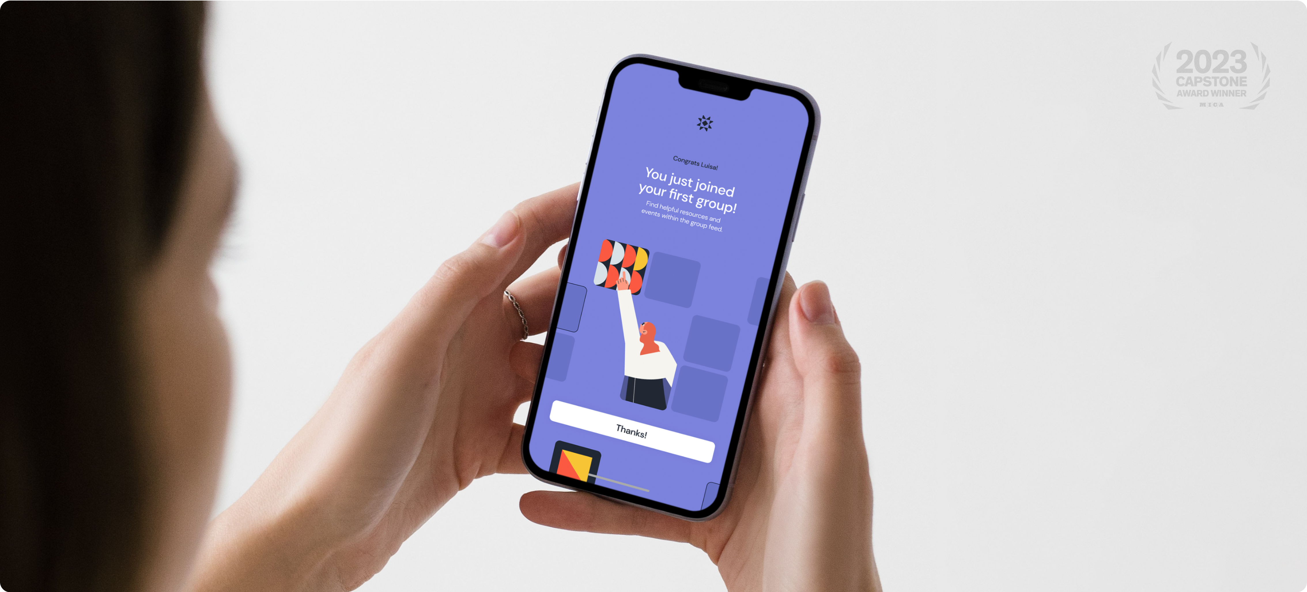
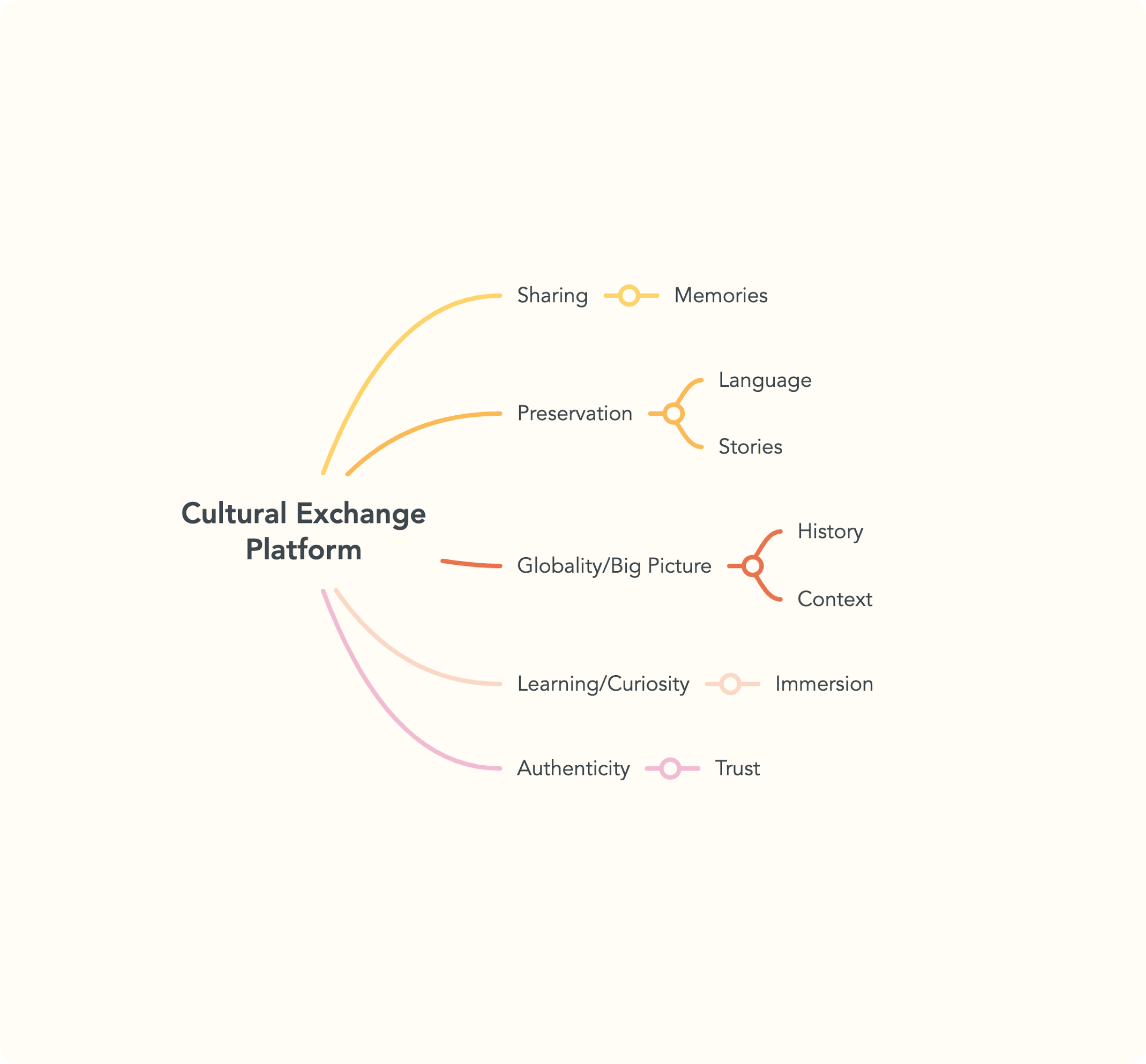
Global citizens need a platform that consolidates authentic cultural exchanges of all types into one place, to aid in meeting their learning goals while also acting as a hub of cultural preservation and celebration.
APPROACH
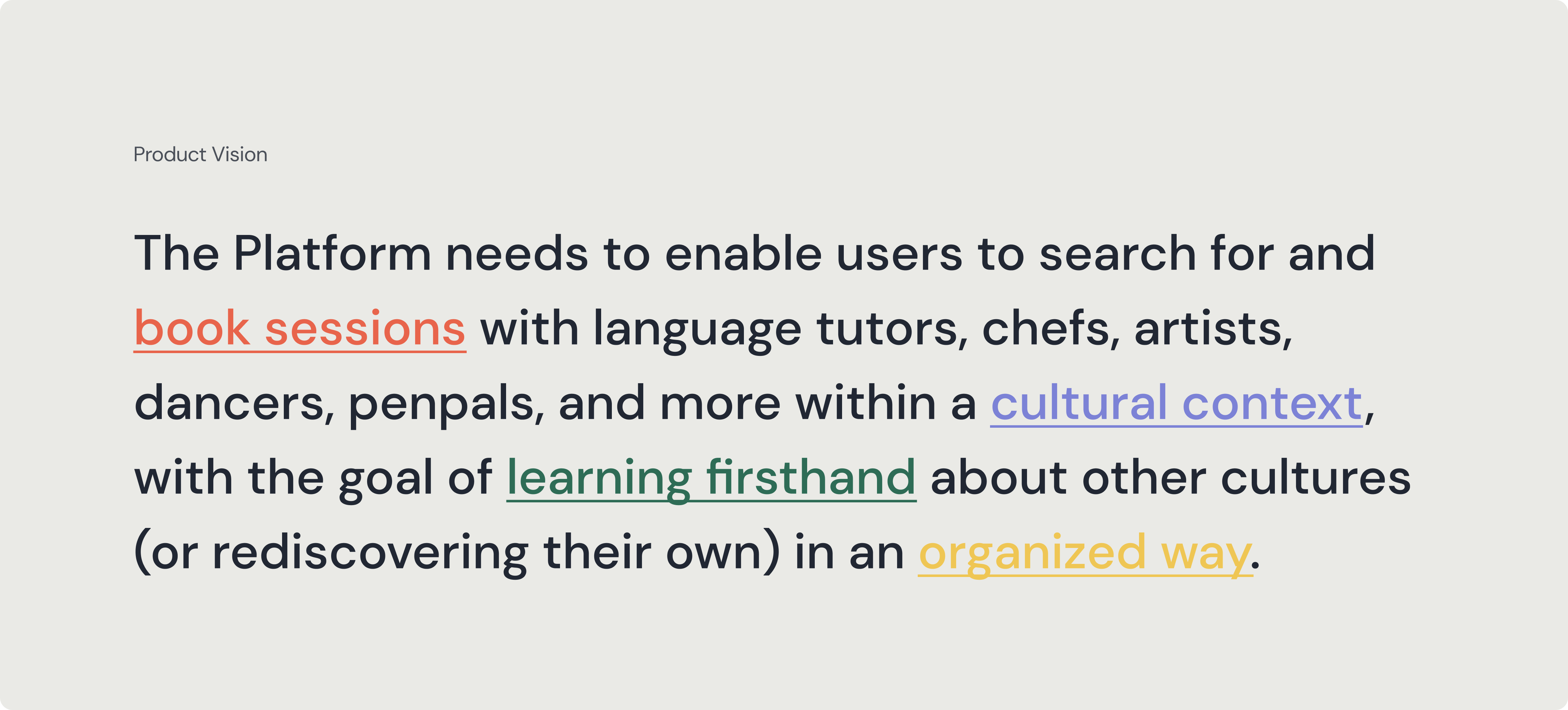
Enable users to search for and book sessions with language tutors, chefs, artists, dancers, penpals, and more within a cultural context, with the goal of learning firsthand about other cultures (or rediscovering their own) in an organized way.

How might we unify all aspects of cultural exchange into a marketplace for discovery?
✁
PROCESS
As the sole researcher and creative on this project with a turnaround of 8 weeks, I proposed a timeline that prioritized the exploration and validation of user needs at every stage.
OBJEC
TIVES
Catalyze authentic and accessible cultural immersion by connecting learners and sharers around the globe
Focus: Monthly Active Users
Capture anthropologic data patterns around the movement of people and the sharing of their cultures
Focus: Monthly Downloads and Activity
Link users with a diverse catalog of curriculums on niche topics that relate to their individual goals
Focus: Lessons/Instructors Offered + Booked
Inspire international travel and greater awareness of foreign affairs
Focus: Completed Plans + Group Activity
01 / INVESTIGATION
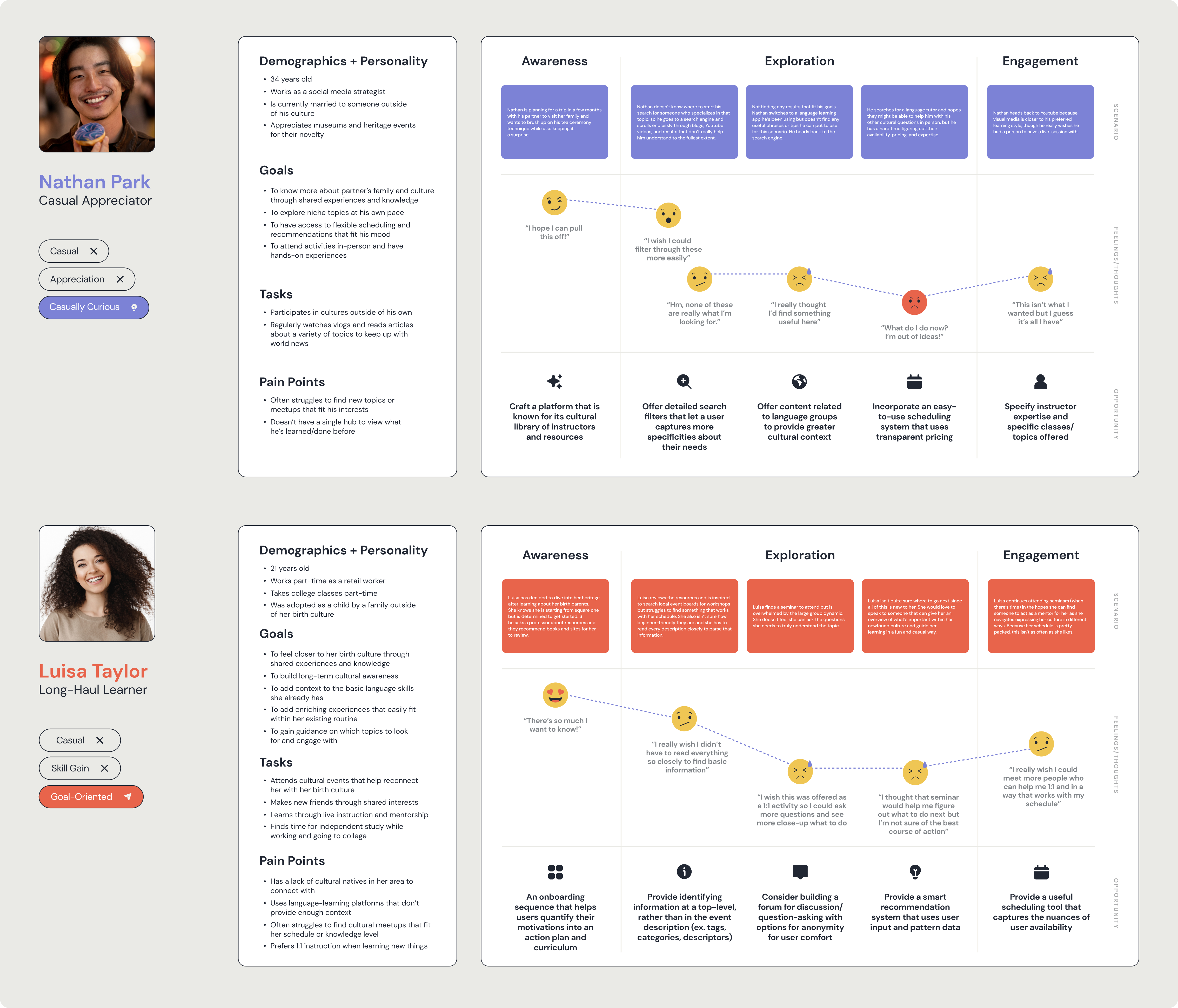
I led the project kickoff with a significant phase of desk research, competitive and comparative analysis, and a formative user study that helped validate assumptions about how users might perceive value and trust in exchanges they find useful. I screened for individuals with a distinct interest in cultural appreciation with habits that ranged from monthly dabbling to daily activity. The study focused on the “Learner” community of the proposed platform with plans for the “Sharer” community at a later date, given the assumption that their motivations and experiences would be drastically different.
In synthesizing insights, I discovered five key areas that would ultimately drive the product's experience: how participants frame their role in cultural expression, what motivates them to engage with others, how they best learn, what they need to feel the most secure, and what benefits they seek in creating lasting habits. I used both quantitative and qualitative data from the study to inform Personas and Journey Maps, with a focus on empathetically solving for the pain points they collectively faced.
02 / UX STRATEGY
With all of this in mind, the question arose: What kind of platform needs to exist to solve for the initial market gap, validate user expectations, and deliver on building cultural context? As competitive analysis revealed a lack of start-to-finish immersion and journey maps highlighted possible opportunities for innovation, I developed a Product Vision that would act as our North Star moving forward.
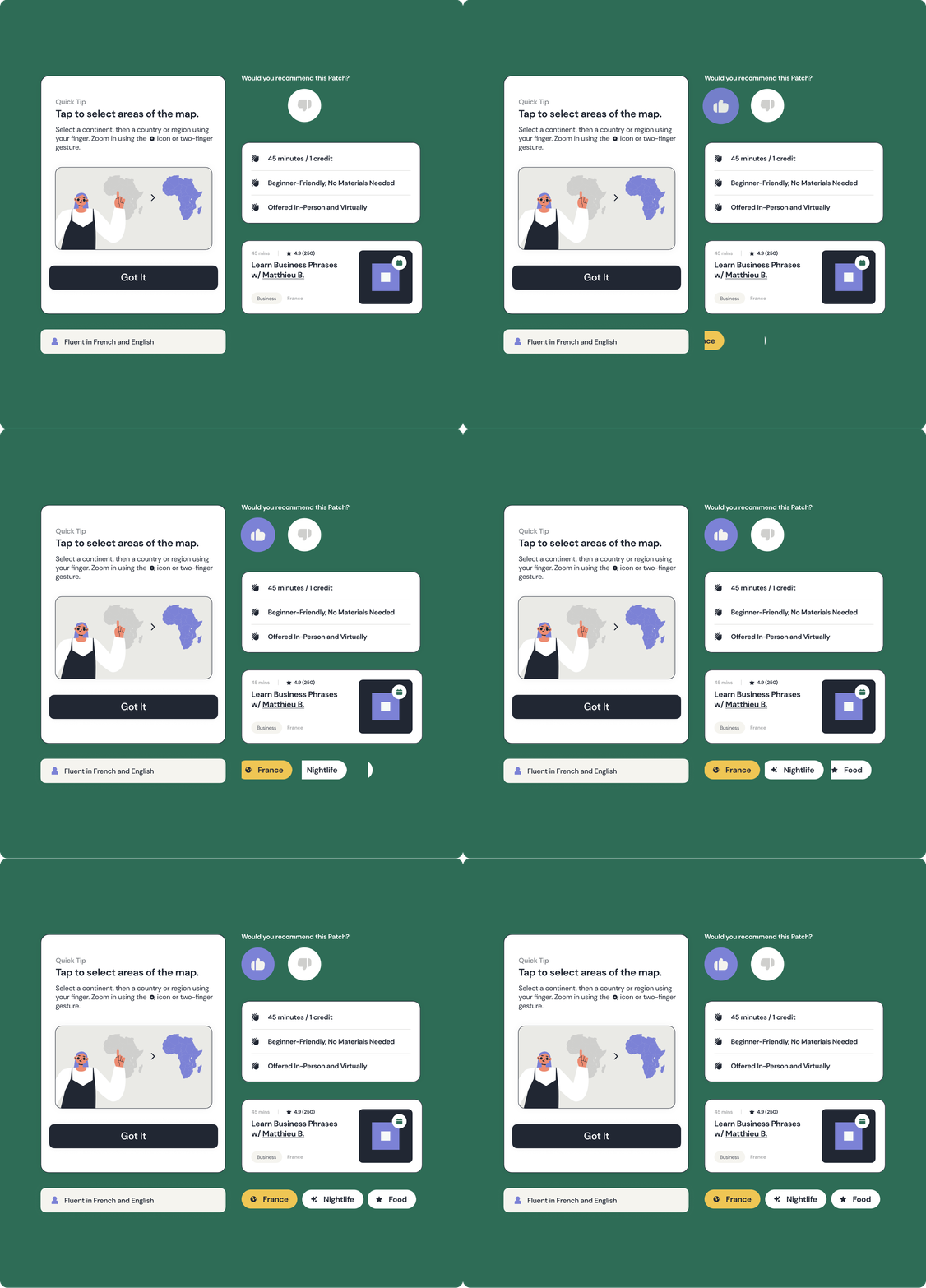
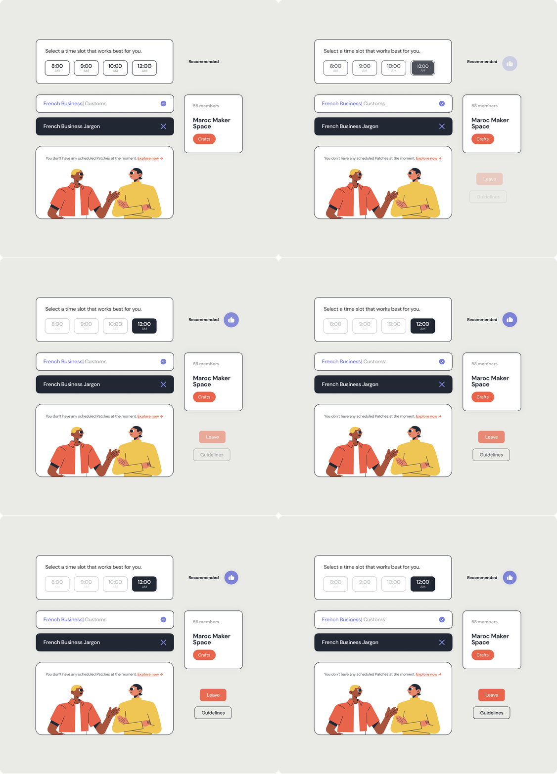
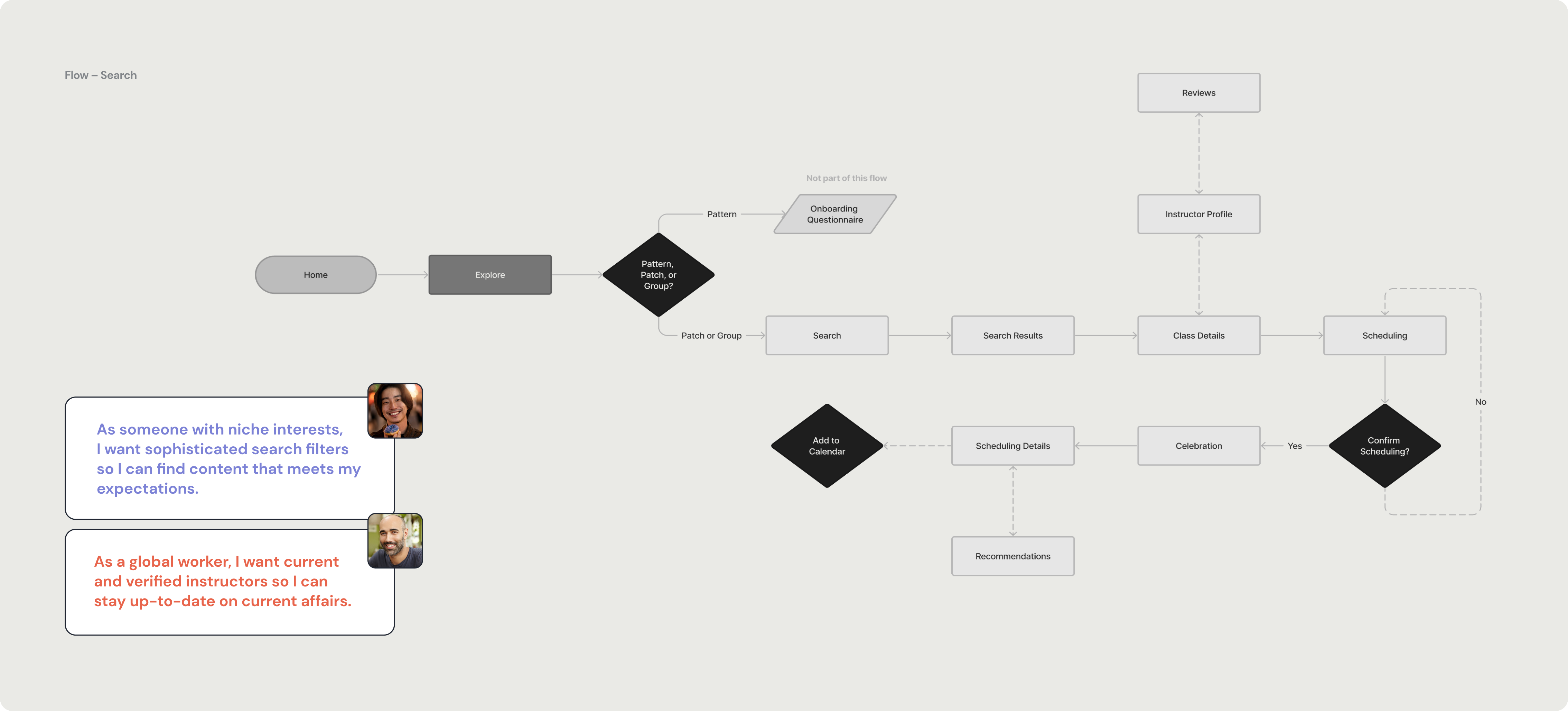
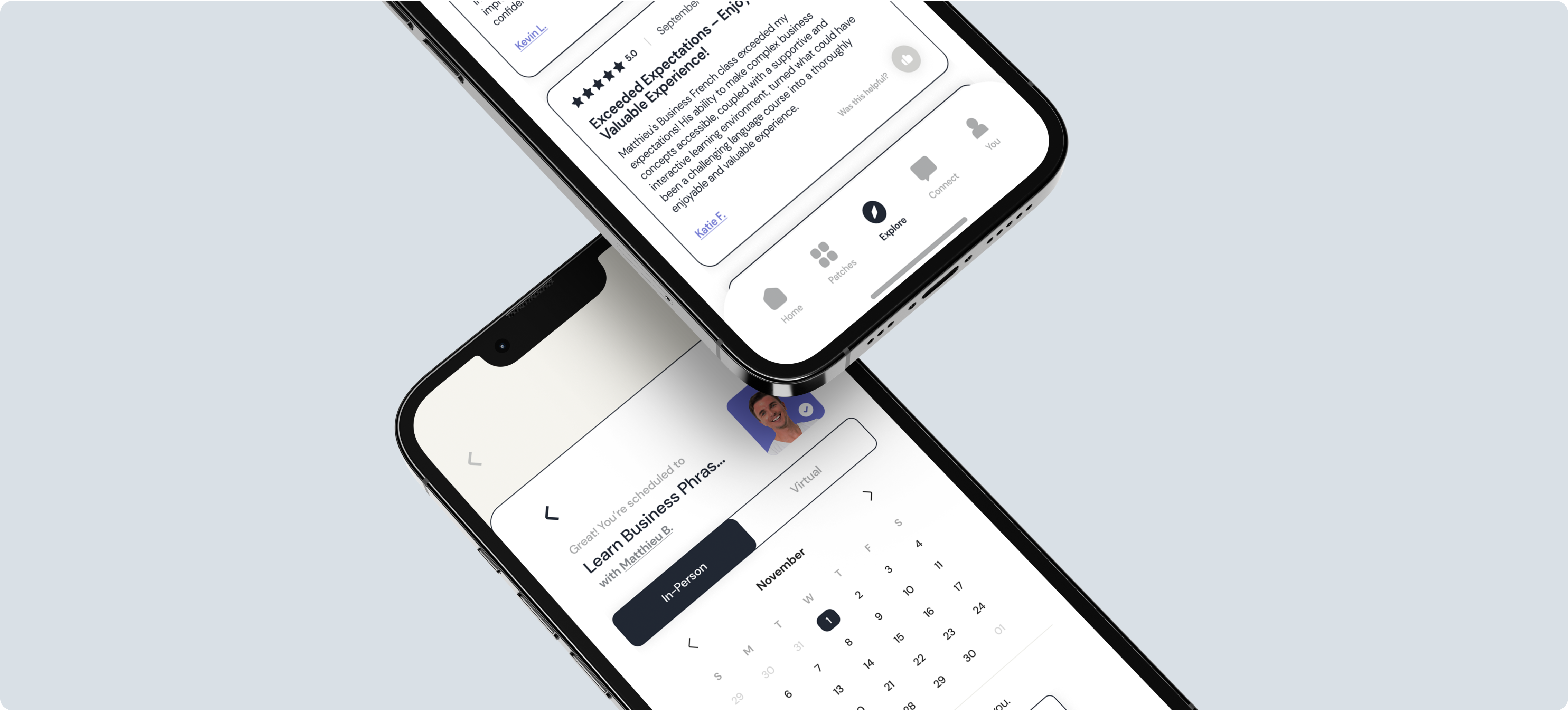
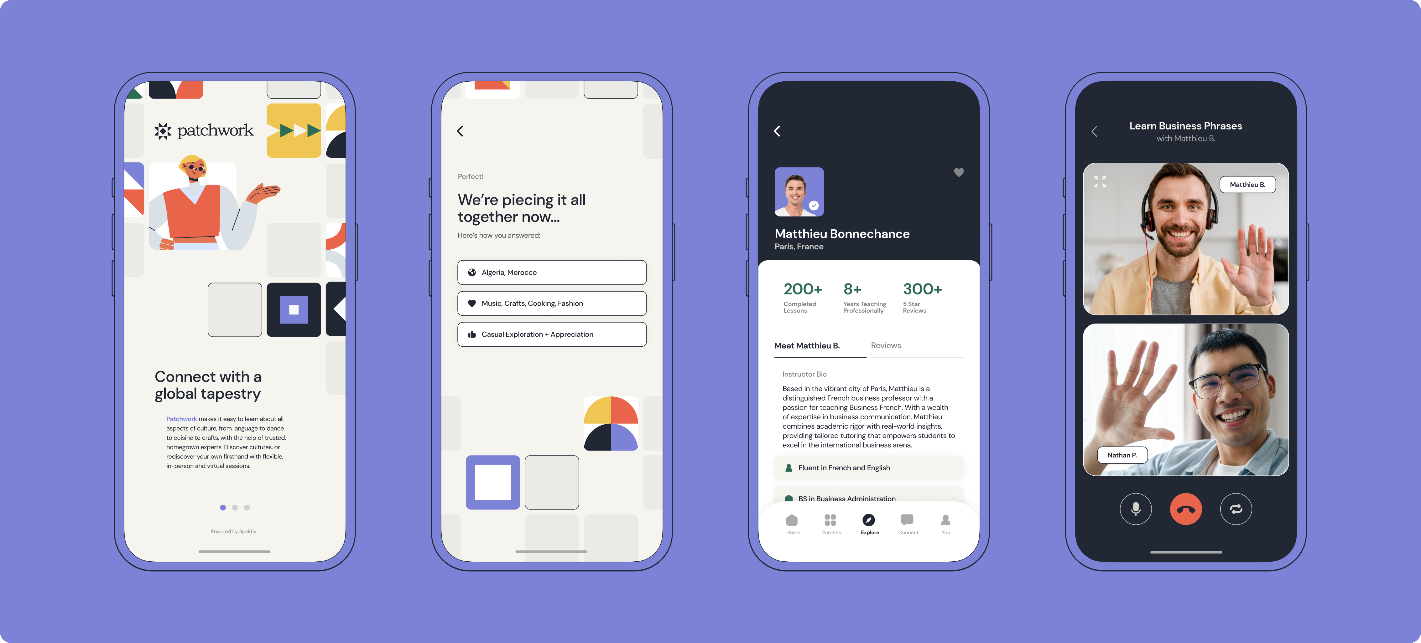
User stories and flows based on study data and guidance from each Persona were used to create three essential experiences: (1) Onboarding and curriculum building, to help novice learners easily gain access to smart recommendations and community groups, (2) Organic search to capture the nuance of specific topics, an easy scheduling system, and instructor validation, (3) and a fun way to quantify your interests and journey.
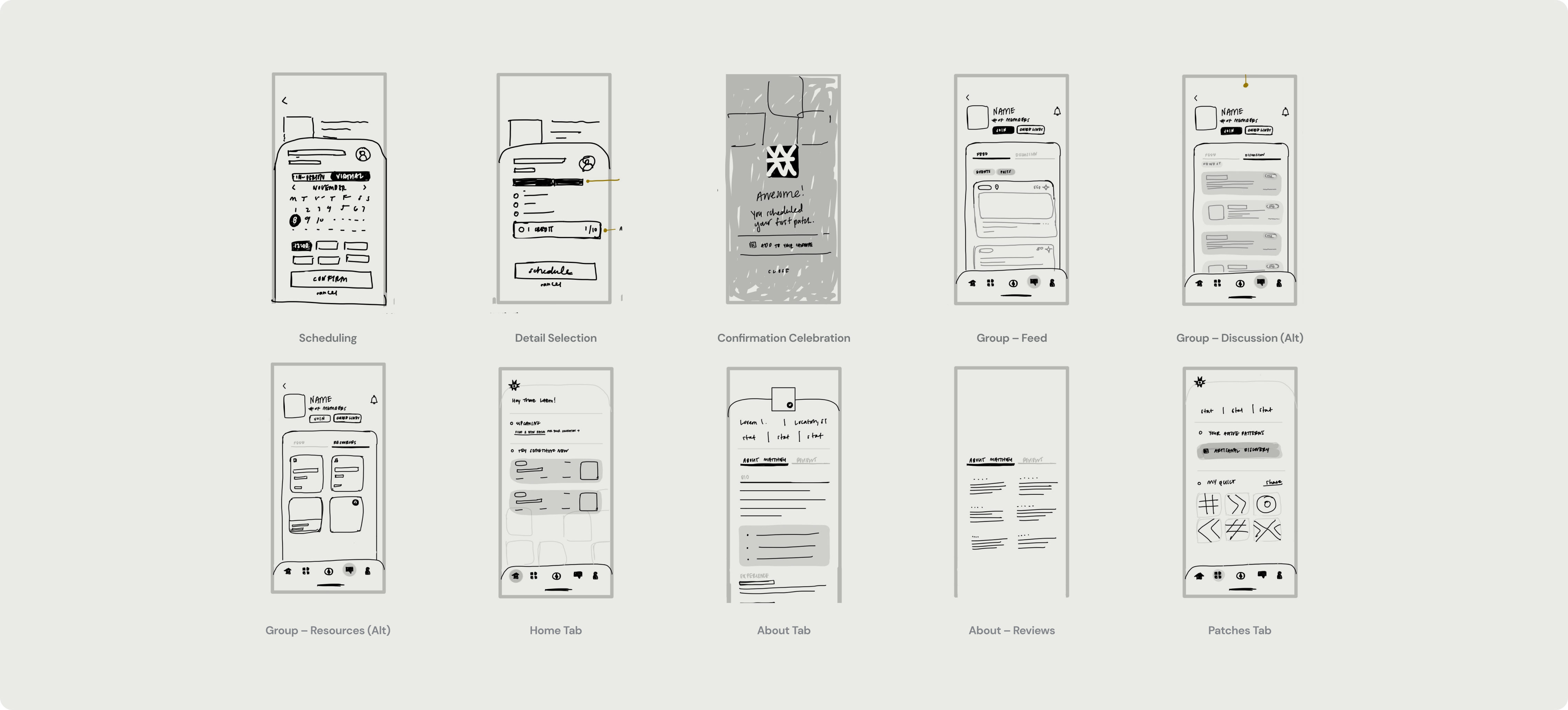
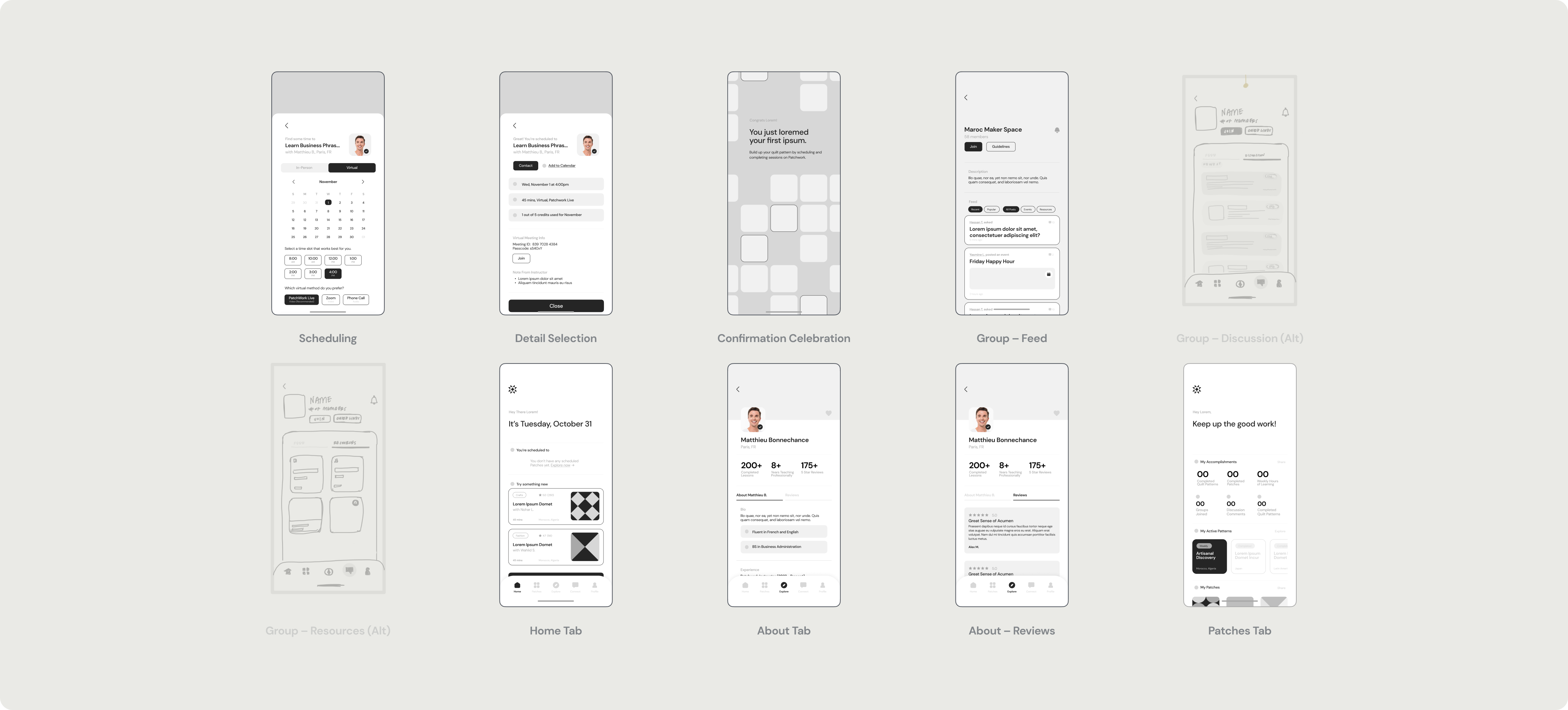
After the mid-fidelity phase of wireframing, I had the opportunity to administer a round of moderated user testing where the focuses were to assess visual priorities, record expectations around information hierarchy, and stress test the value the platform claimed to provide, resulting in affinity-mapping and thematic analysis that I then performed in FigJam.
03 / VISUAL STRATEGY
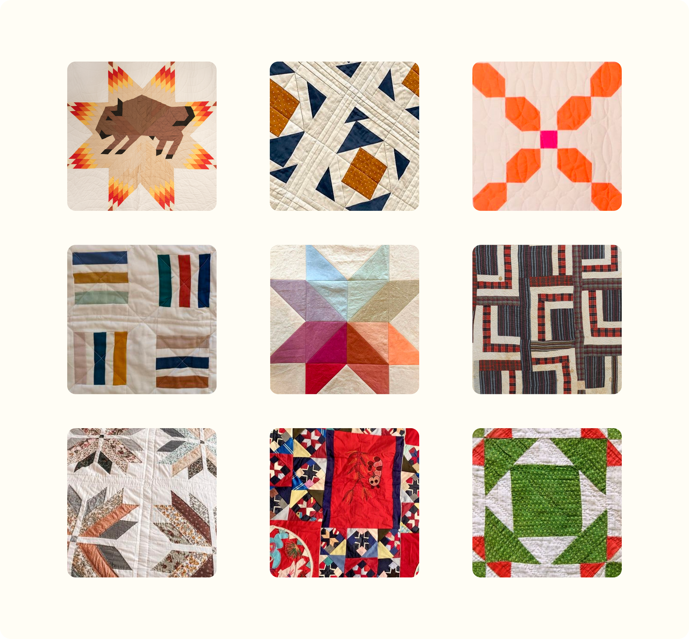
After almost 60+ proposed names, icons, and wordmarks that didn't meet the mark — Patchwork opened up a new realm of possibilities in exploring the symbolism of connectivity. Many cultures around the globe celebrate patchwork in their art, history, and tradition-passing between generations, so it seemed only fitting to build a story upon a historical context that is shared with the world.
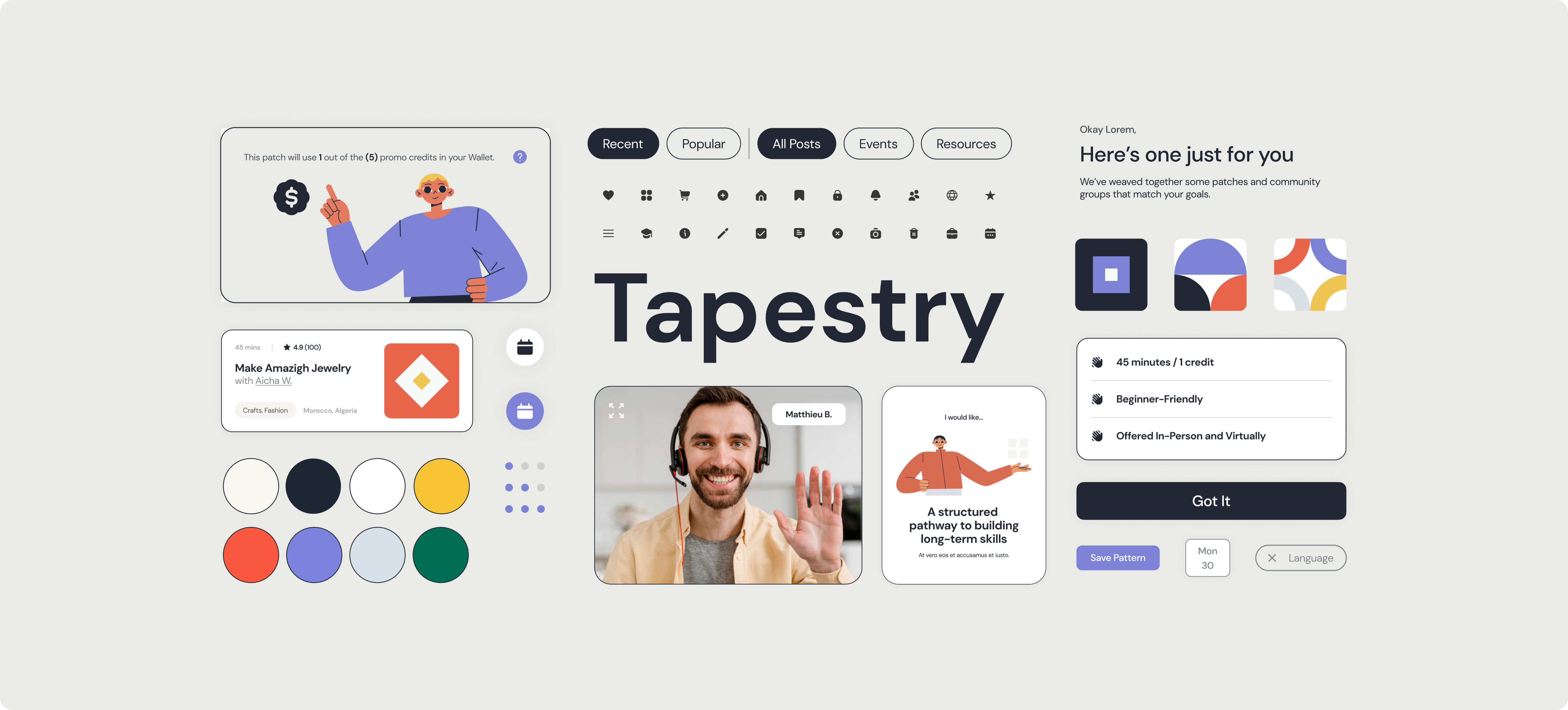
Patchwork's visual language needed to capture the fun of connecting with others, the colors and textures that make the world exciting, and the coming together of diverse minds, so I built Tapestry from scratch, the Design System behind the platform that enables learners to meet their goals without sacrificing joy.


04 / IMPLEMENTATION
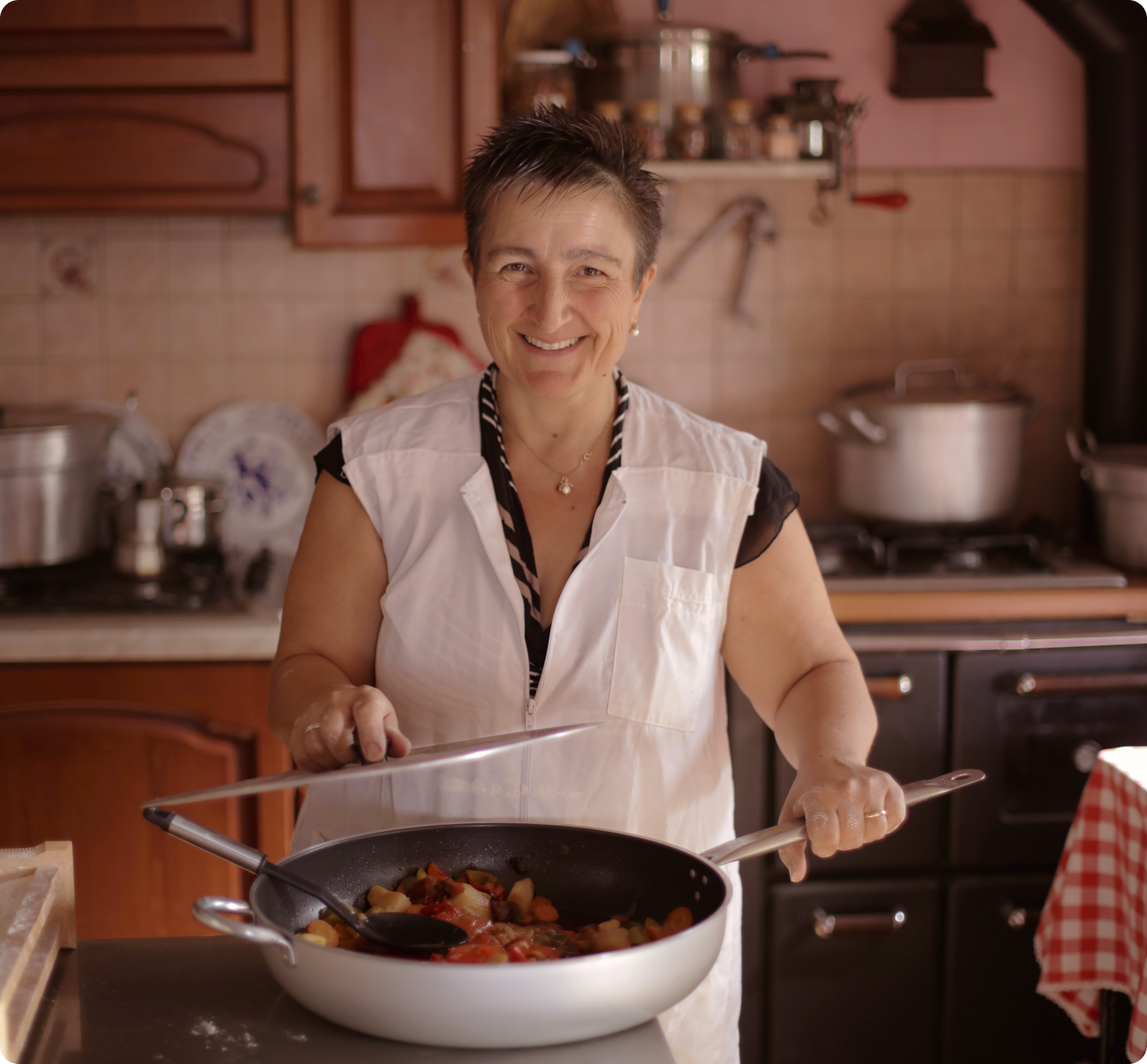
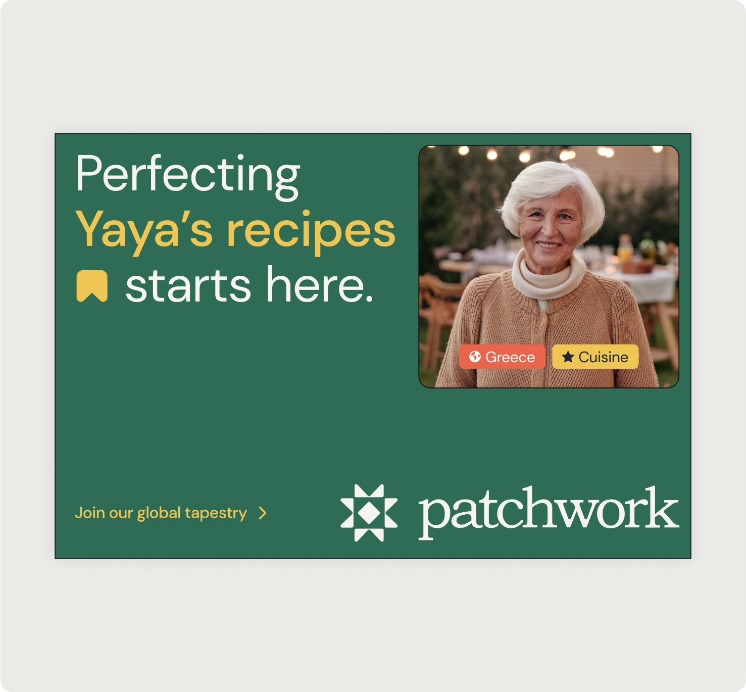
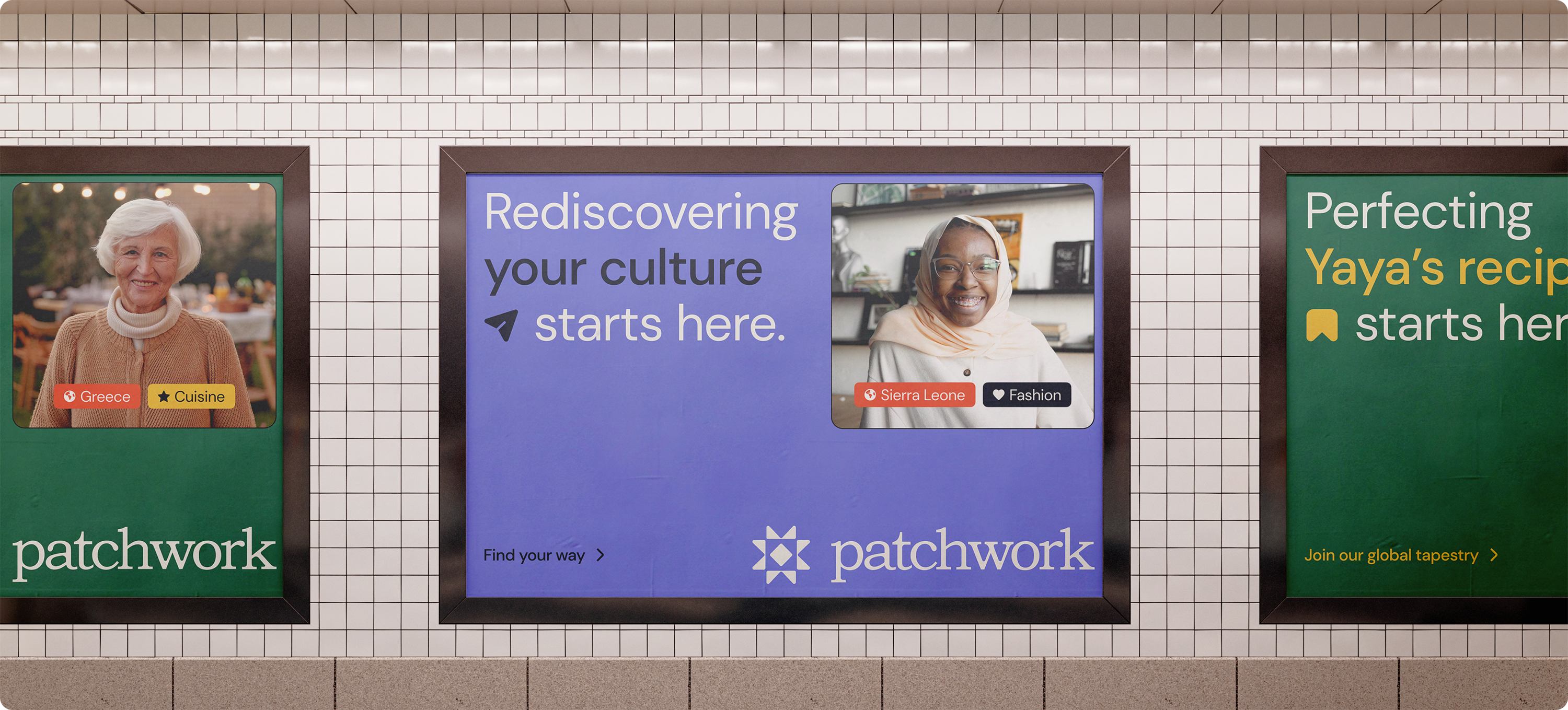
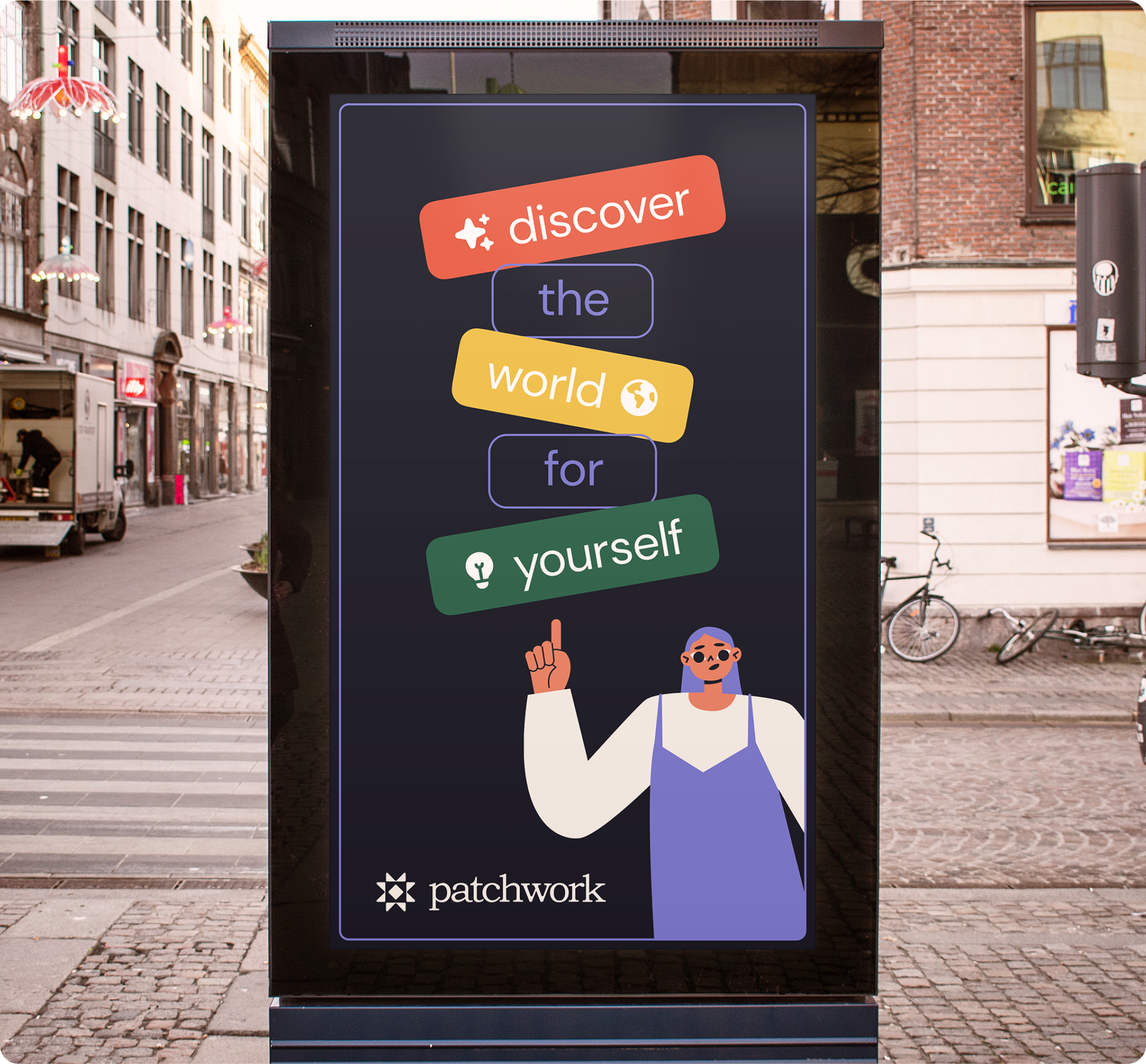
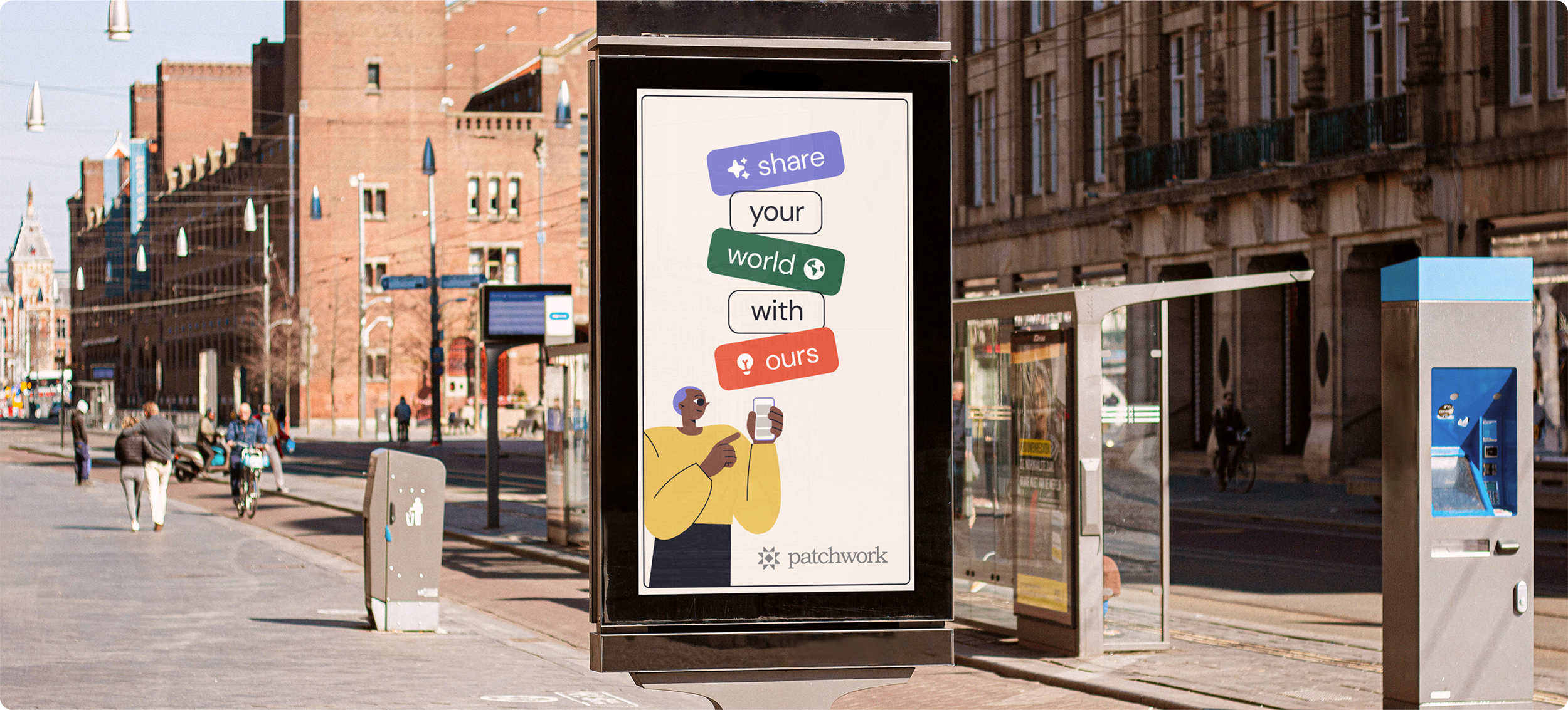
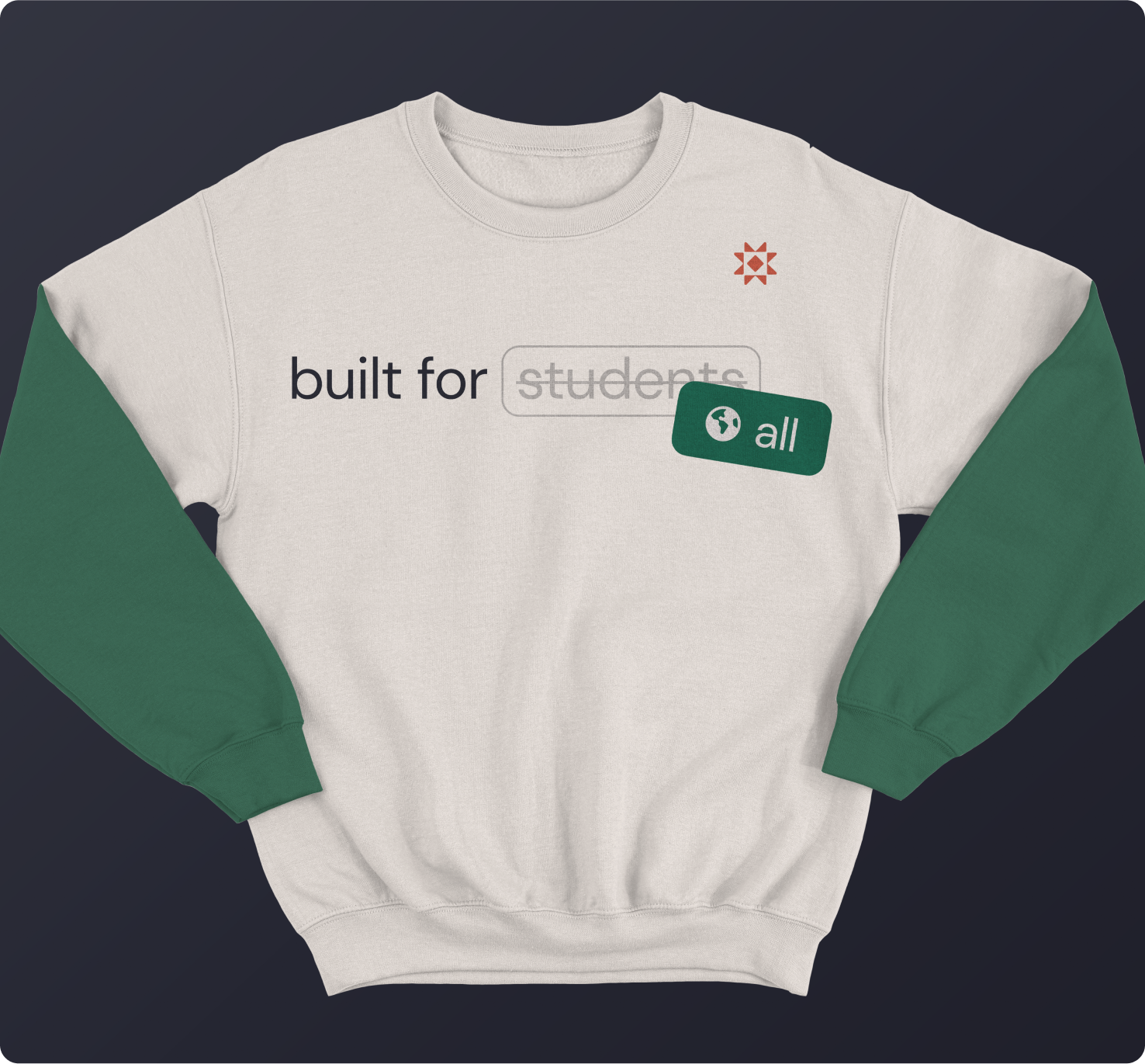
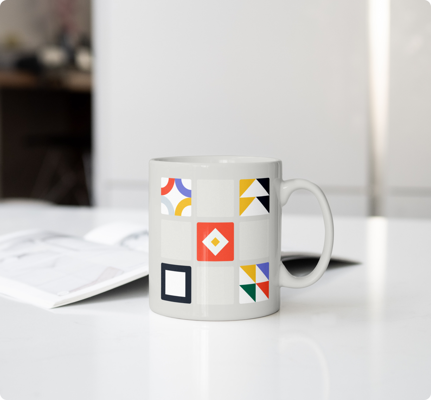
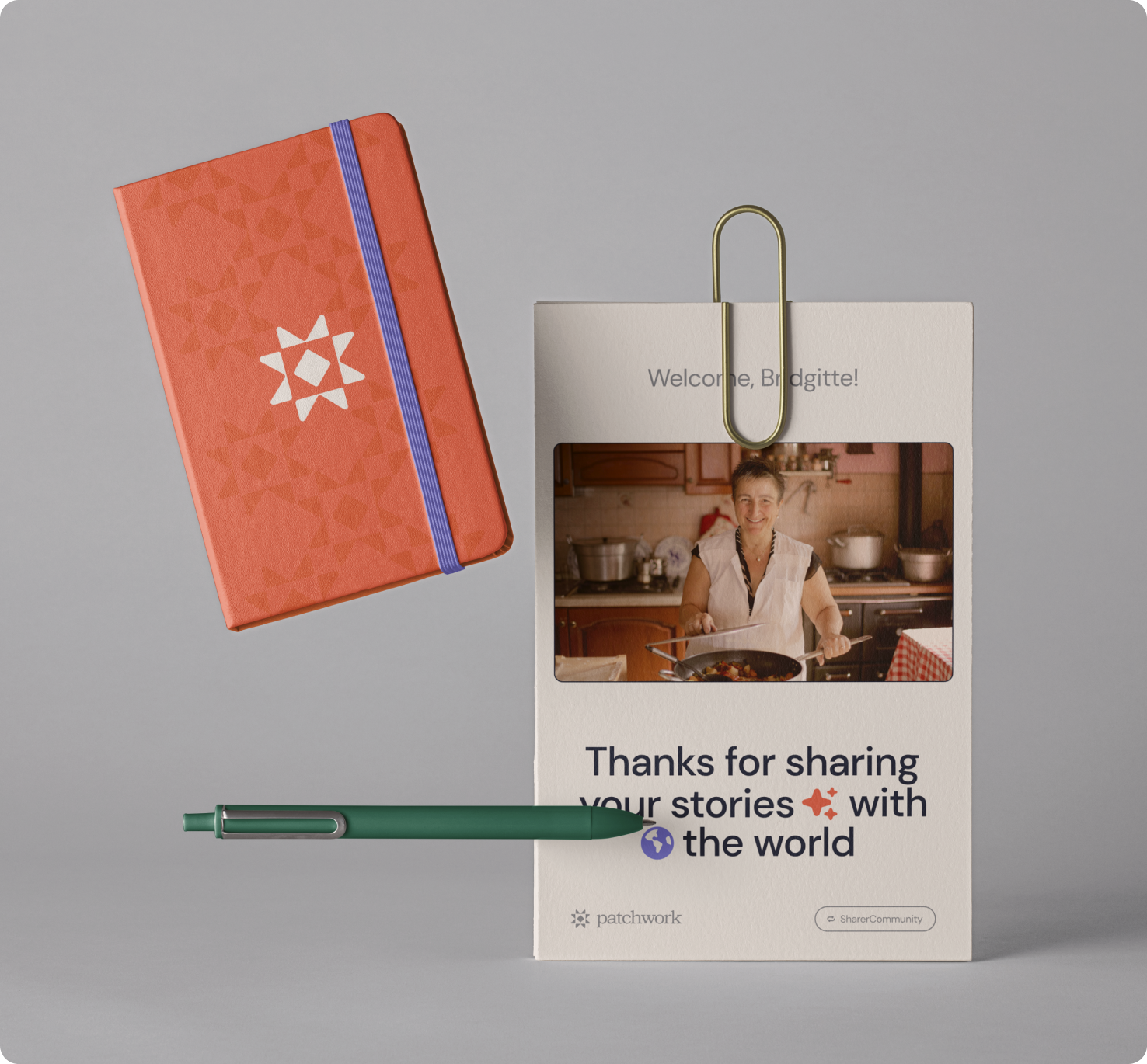
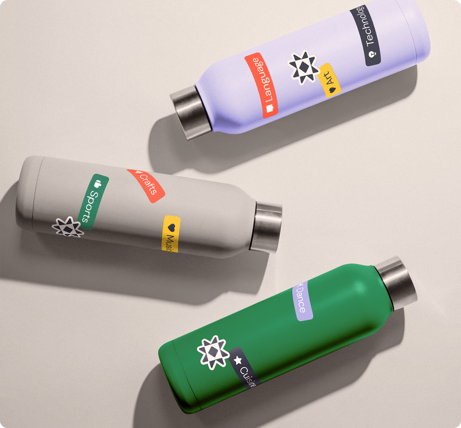
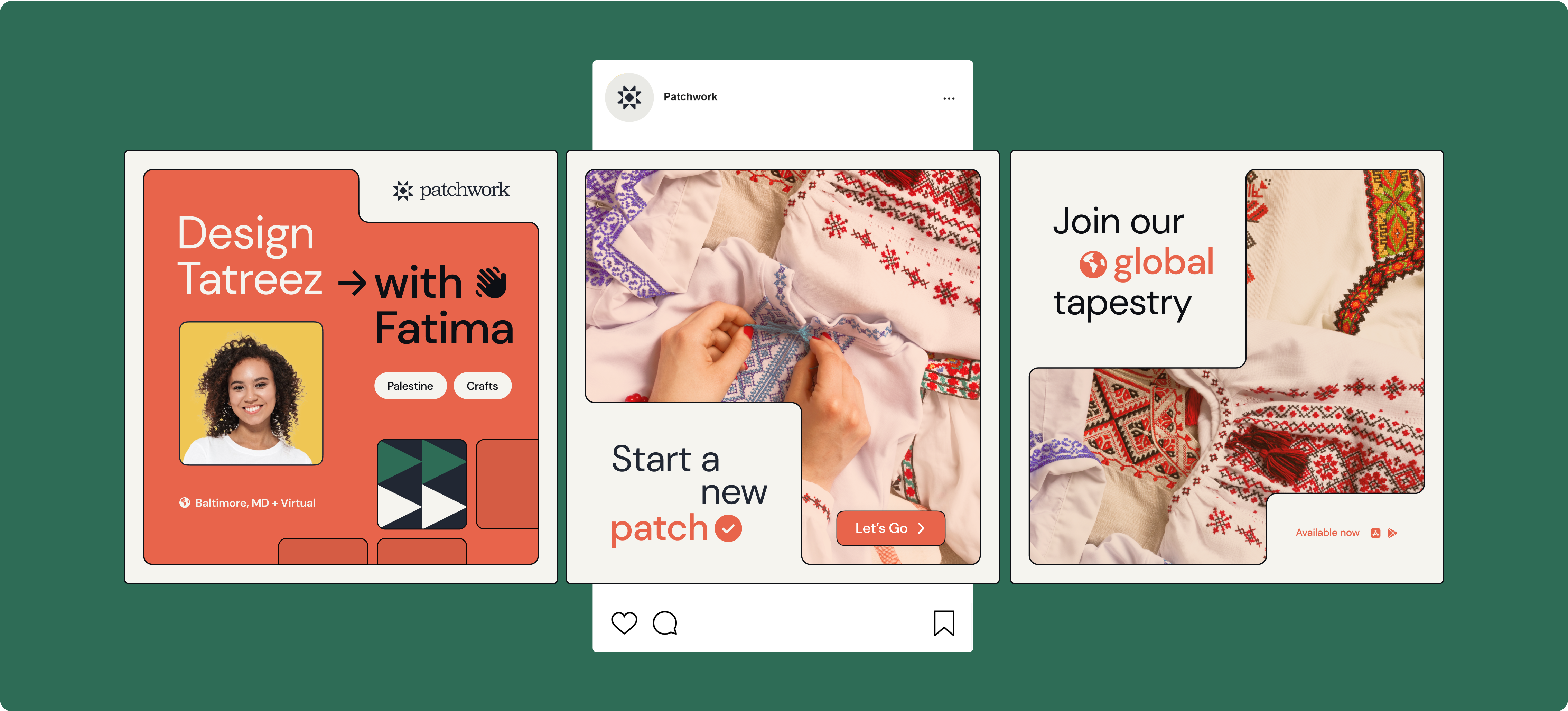
Patchwork's story of connecting Learns and Sharers all over the globe needed telling beyond mobile phone screens, so I created an ecosystem of brand touchpoints — swag, signage, a partner program — and an awareness launch campaign centered on clearly illustrating the value users would receive upon engaging with
the platform.
Taglines like "Discover the world for yourself" and "Share your world with Ours" act as calls to action — rallying users to take control of their learning and sharing journeys with potential for global connection. Messaging throughout this campaign was pivotal in capturing the celebration and ownership that Patchwork seeks to provide its users.

IMPACT
100%
of users currently do or would like to build at least a casual habit of engaging with other cultures through language, music/dance, cuisine, folklore, and more.
92%
of users are at least somewhat likely to regularly use a cultural exchange platform
Makes the product feel really purposeful, like I'm going to get something out of it other than just like passive information like I would on an Instagram or a TikTok."
Participant B
I feel like both in using this as a platform to find other groups or broadcast your group and then also using it to kind of standardize that interaction that you have with other people is super useful."
Participant A
LET'S WORK TOGETHER
COLOPHON
This site uses Spline Sans and Spline Sans Mono for headlines and body. Chromate Roman and Italic are used for display.
ALL RIGHTS RESERVED
Régine Carreras
Design + Direction
Made with 🤍 in Maryland
© 2025
Never tell me the odds ⏺
