
Driving Homegrown Professionalism and Togetherness with District Futbol Academy
BRAND, DIGITAL
CLIENT
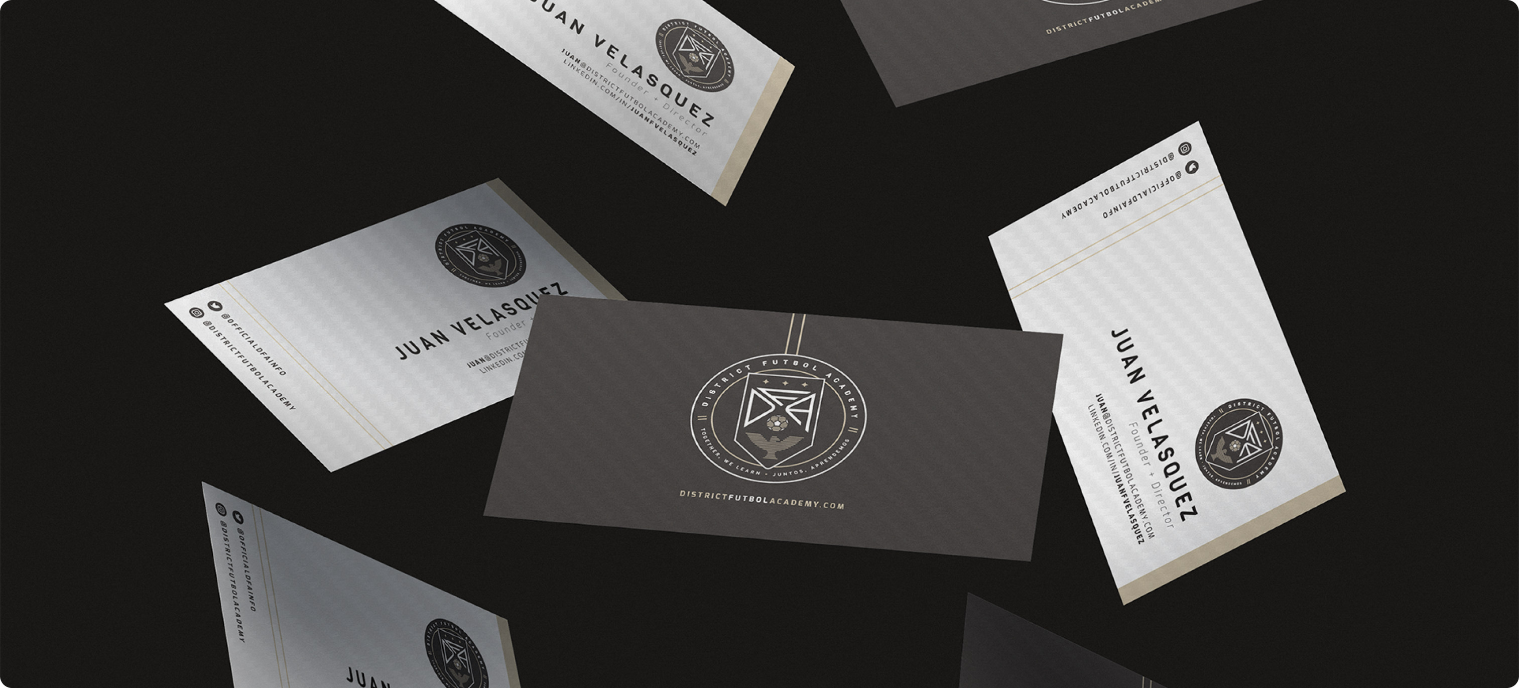
District Futbol Academy
SERVICES
Competitive Analysis
Identity
Art Direction
Project Management
Digital Design
Merchandise
Illustration
BACKGROUND
In a market clouded by gimicks and lack of visual diversity, DFA was created to focus on genuine experiences — keeping thoughftul instruction and design at the forefront.
CHALLENGE
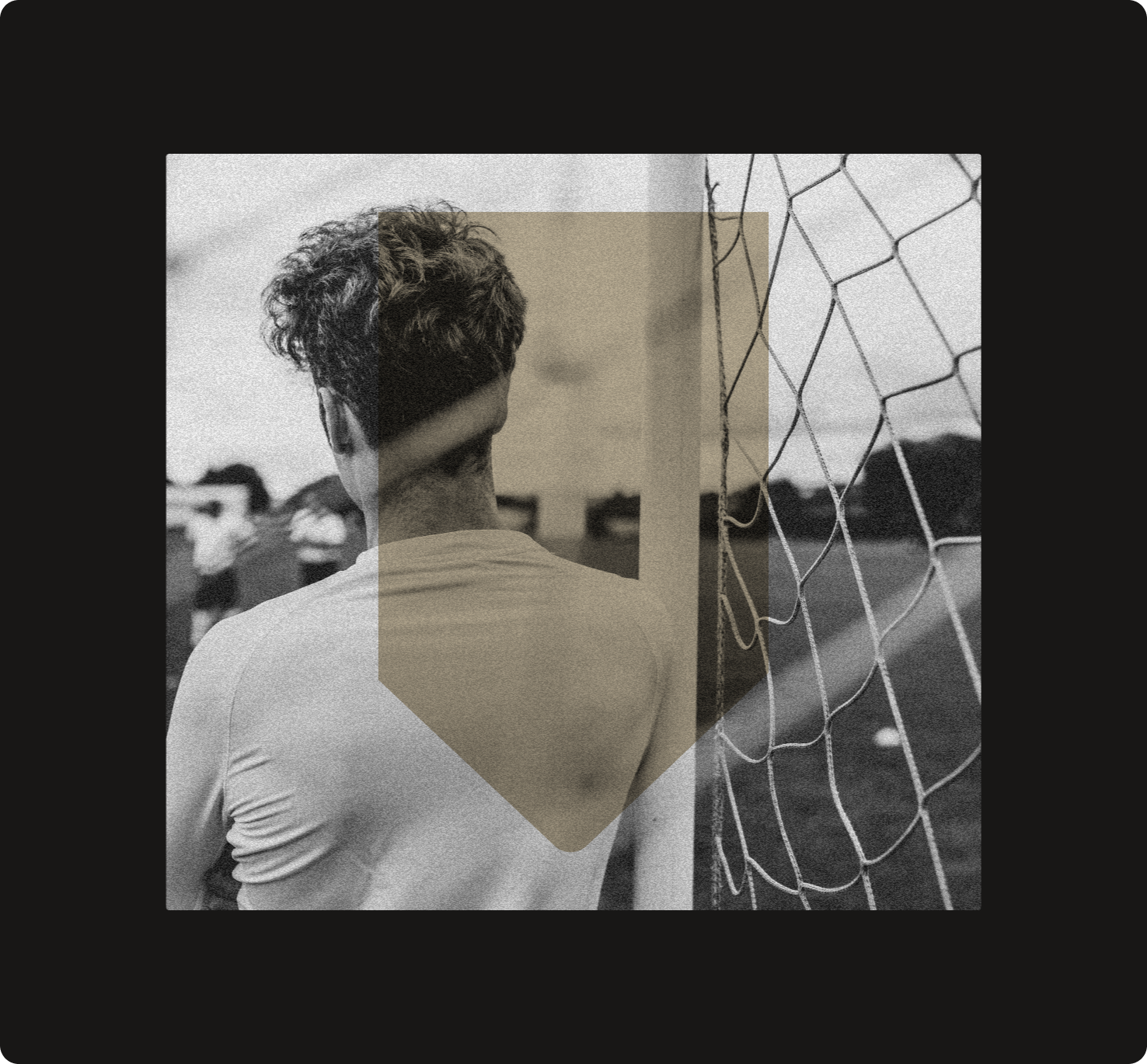
The DC community is saturated with sport programs but accessible, elite soccer training is a gap in the market.
APPROACH
Construct a brand to rally around that celebrates community and purpose
✁
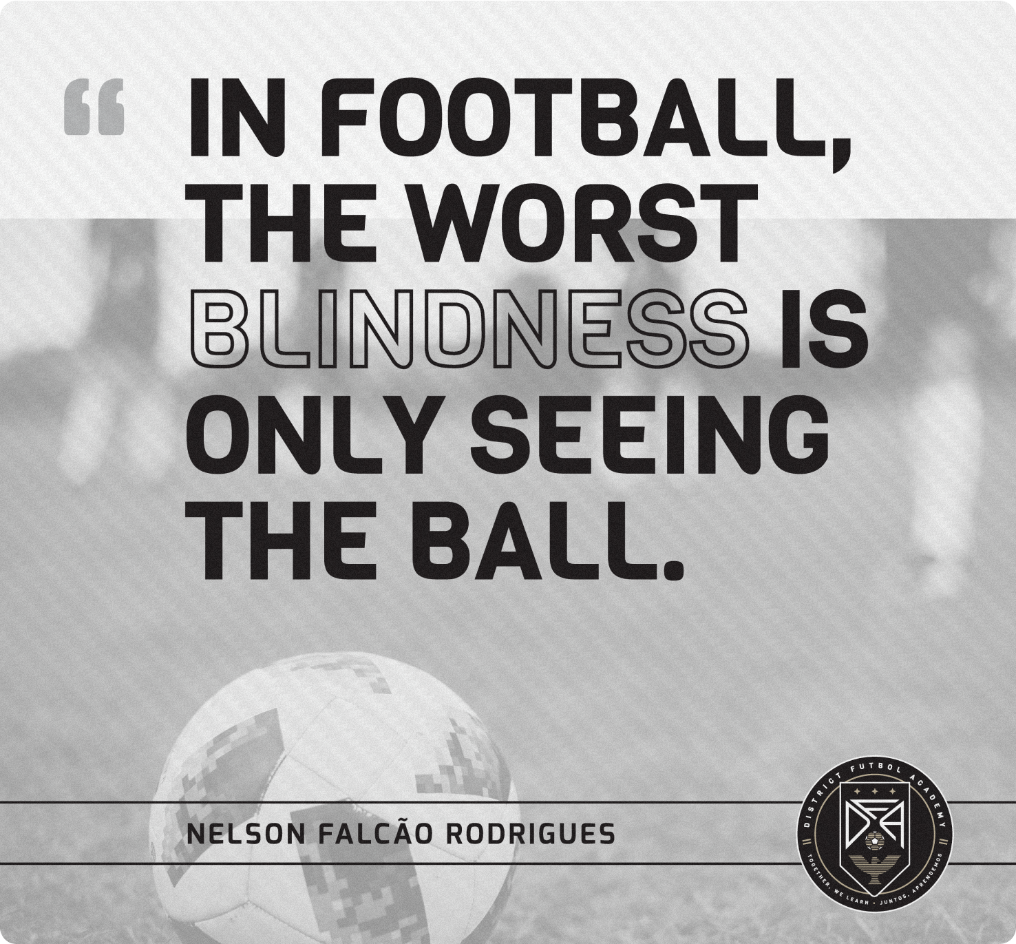
How might we highlight agile learning techniques and true competitive spirit by disrupting the recreational soccer world?
PROCESS
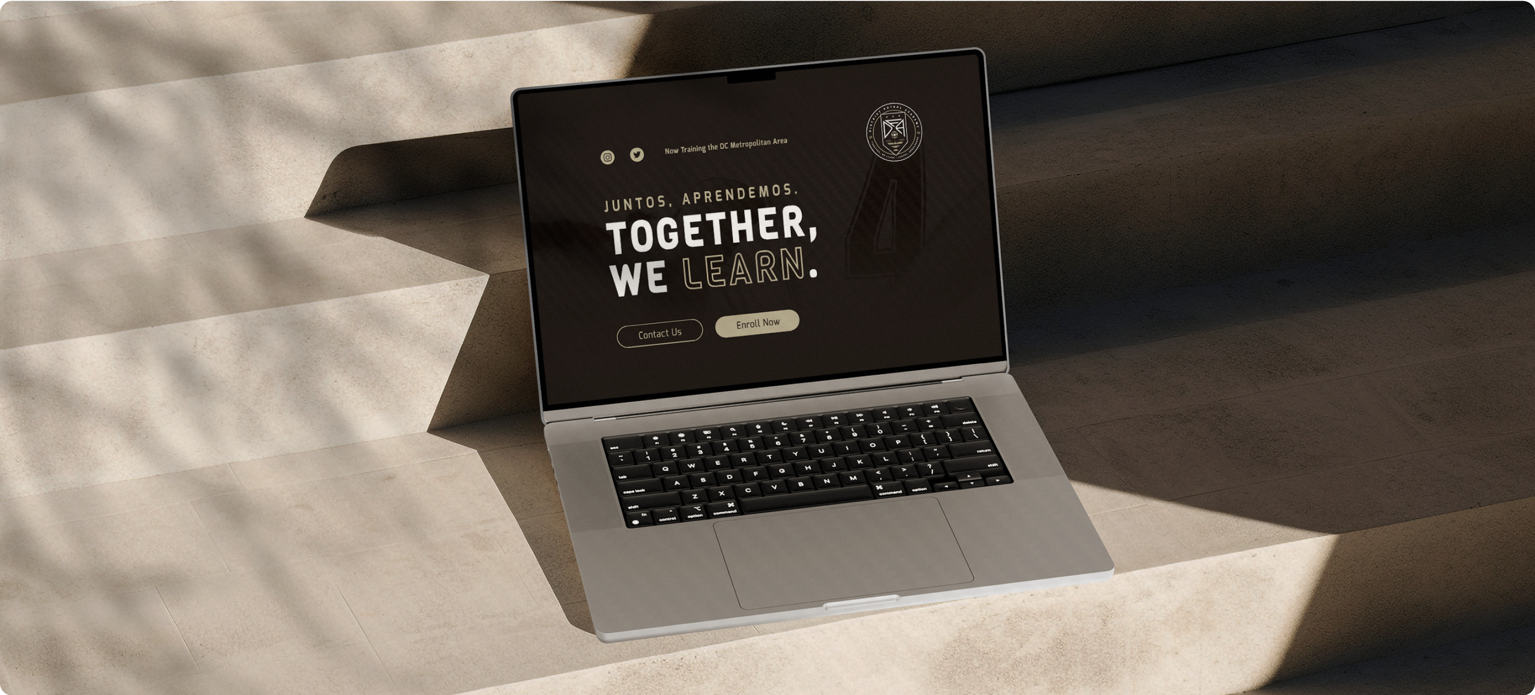
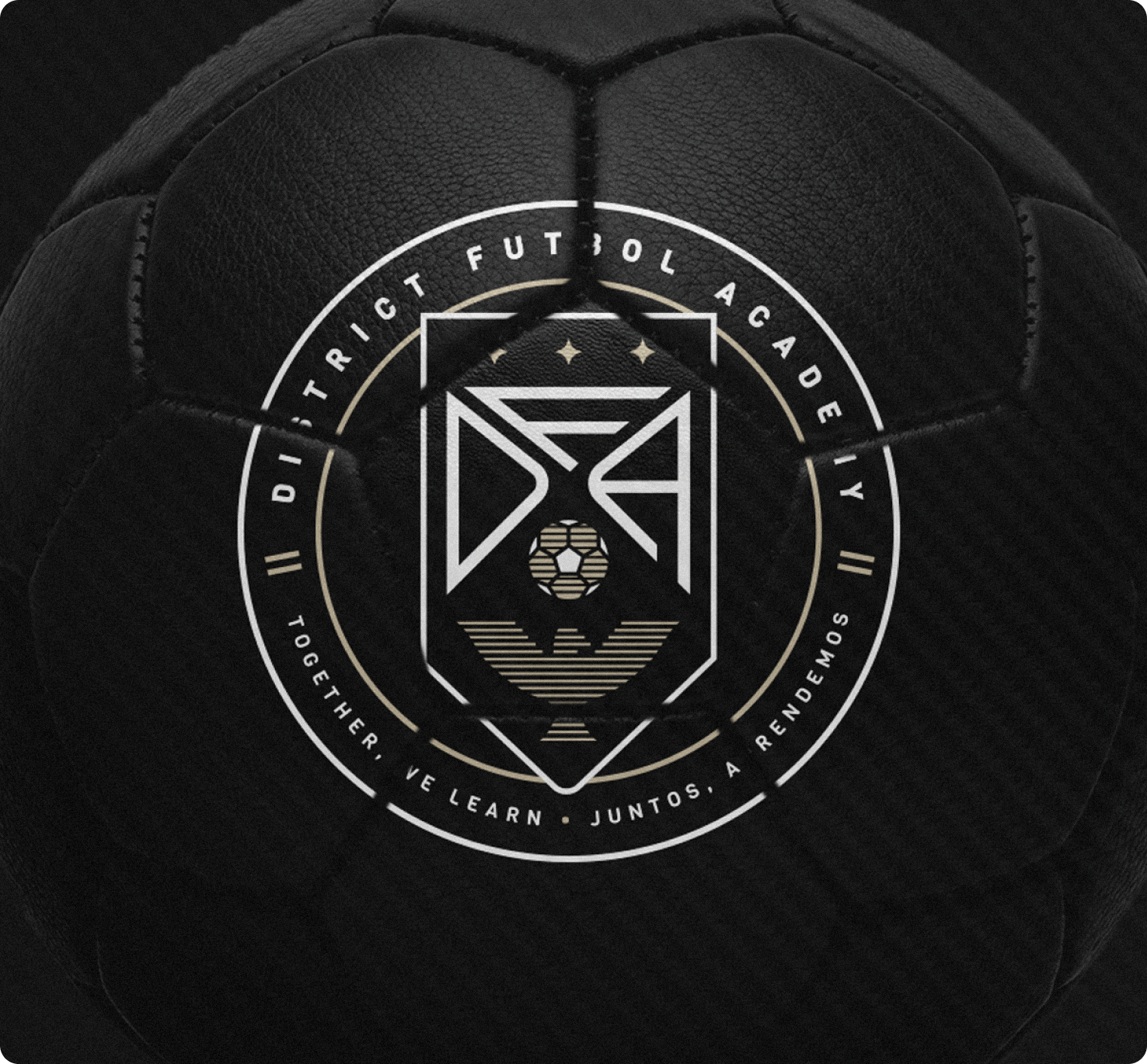
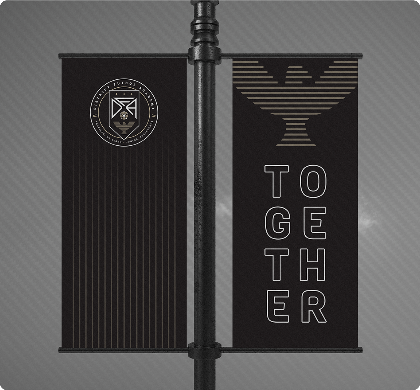
The project consisted of three main phases: brand strategy, identity design, and implementation. The Founders of the program and I spent a great deal of time honing in on values that needed to permeate all levels of the brand. One of the first pieces I developed was a rallying cry of "Together We Learn/Juntos Aprendemos" that helped inform the overall spirit of DFA.
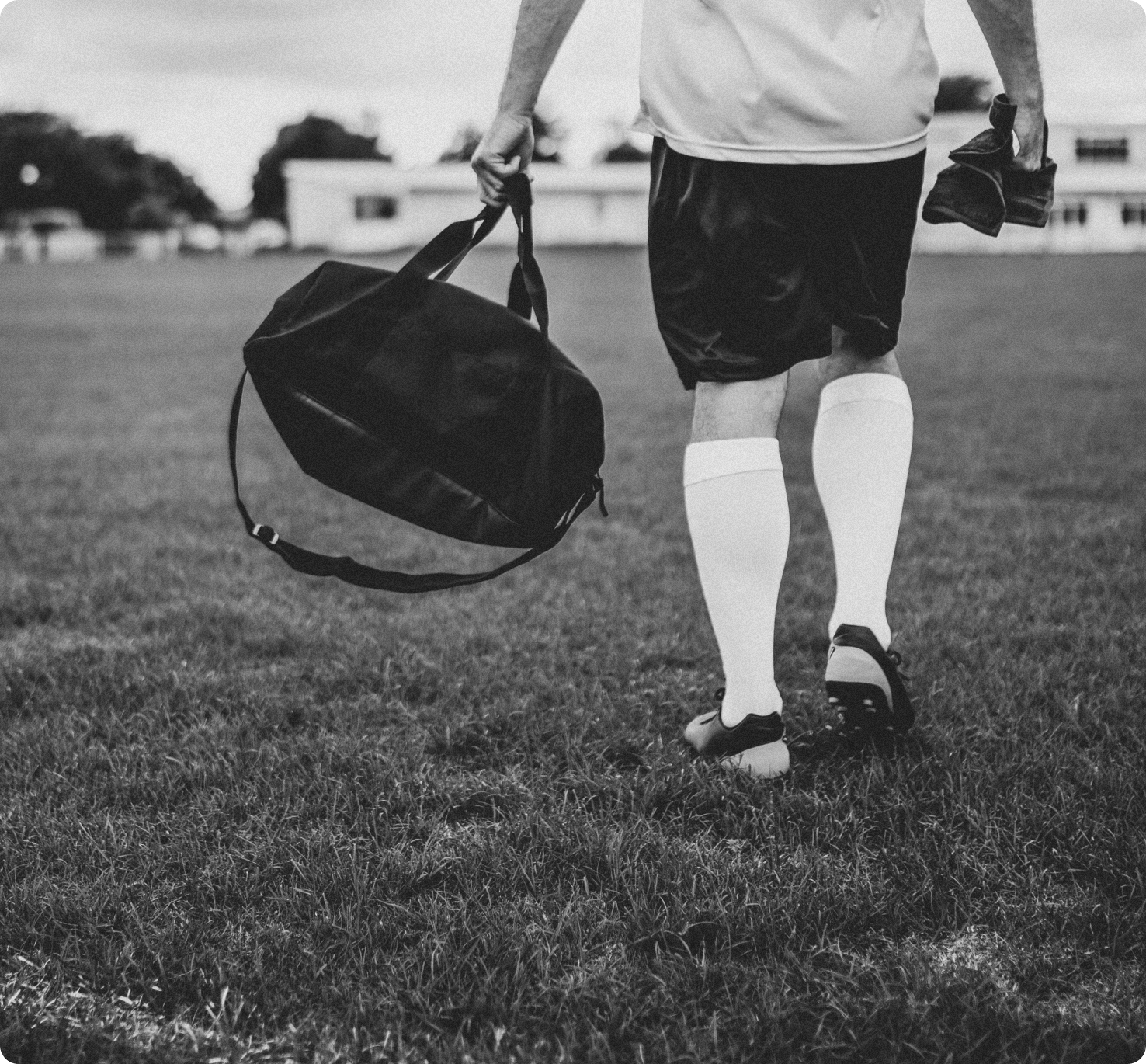
COMMUNITY LED BY PRIDE AND TEAMWORK
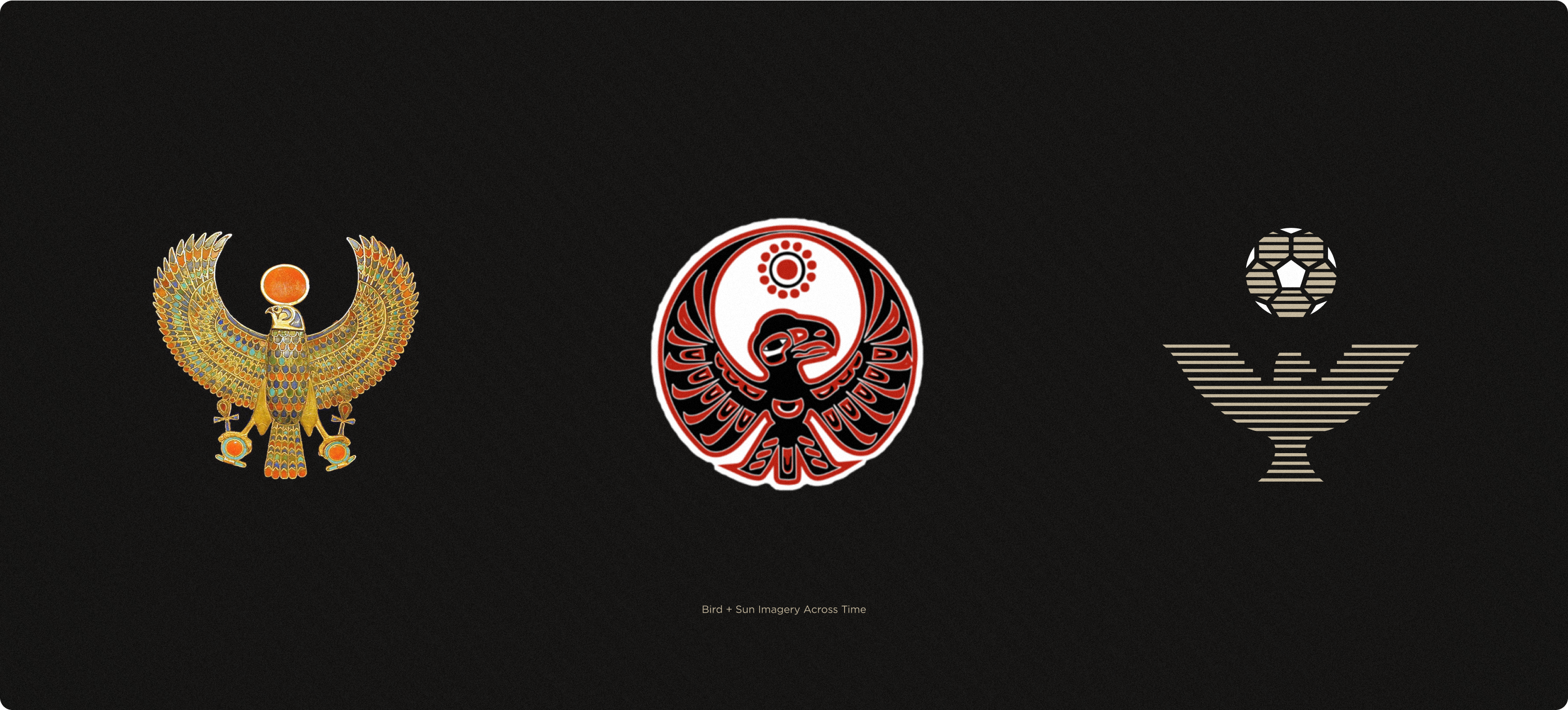
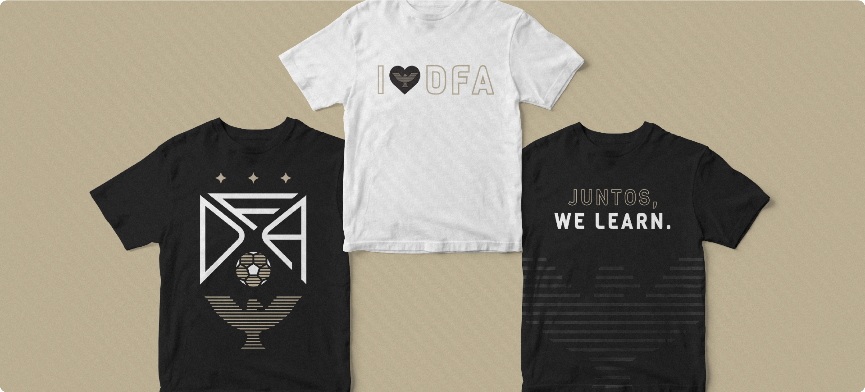
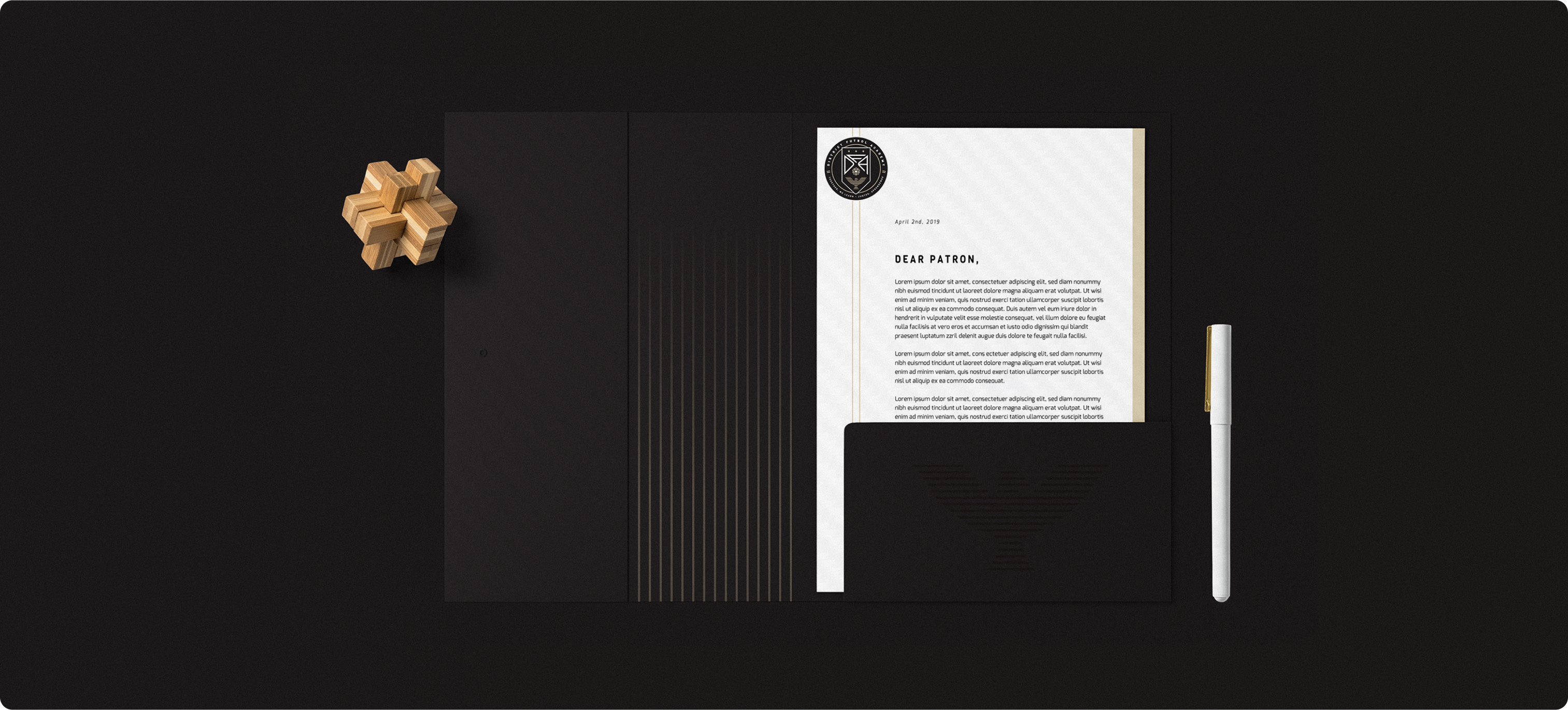
DFA provides strong symbolism for its supporters to unify around. The Eagle and Sun is a legend across cultures of mutuality and co-dependence, striking close to home for young players learning what it means to be part of a team.
SPEAKING THROUGH ANATOMY
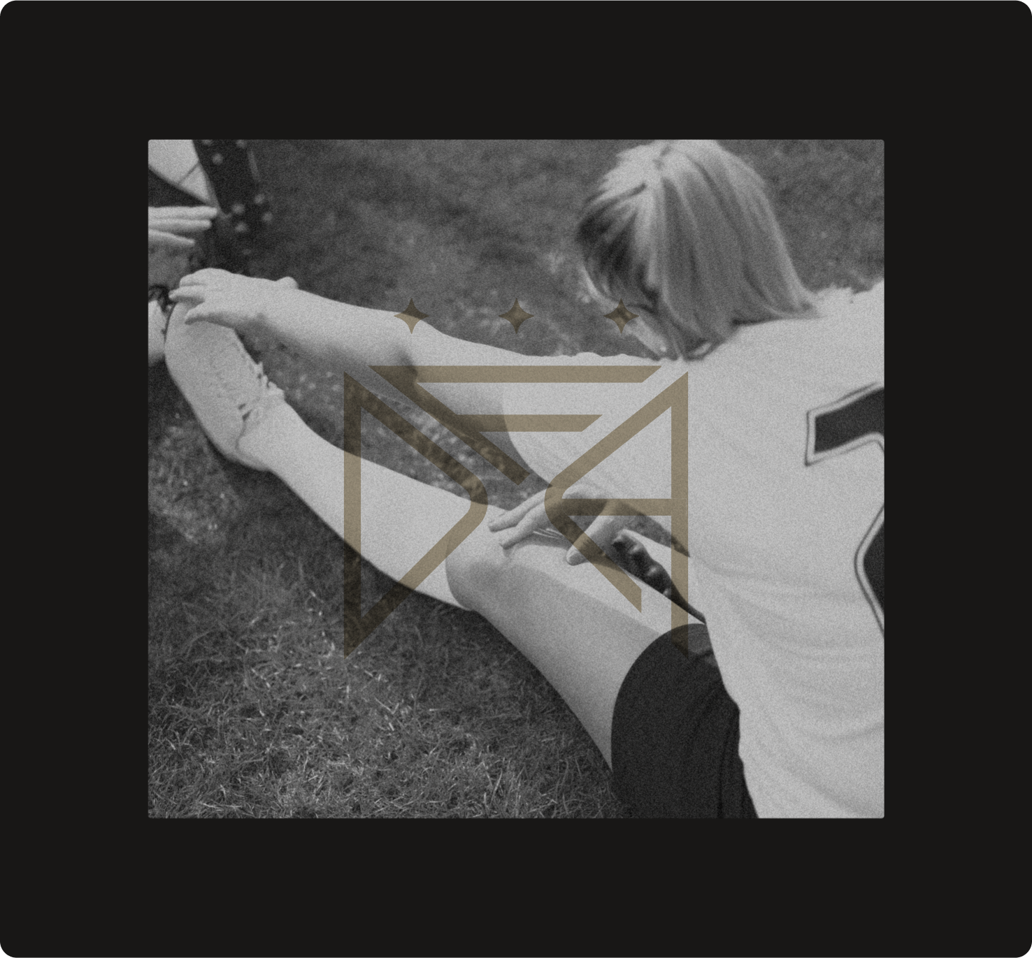
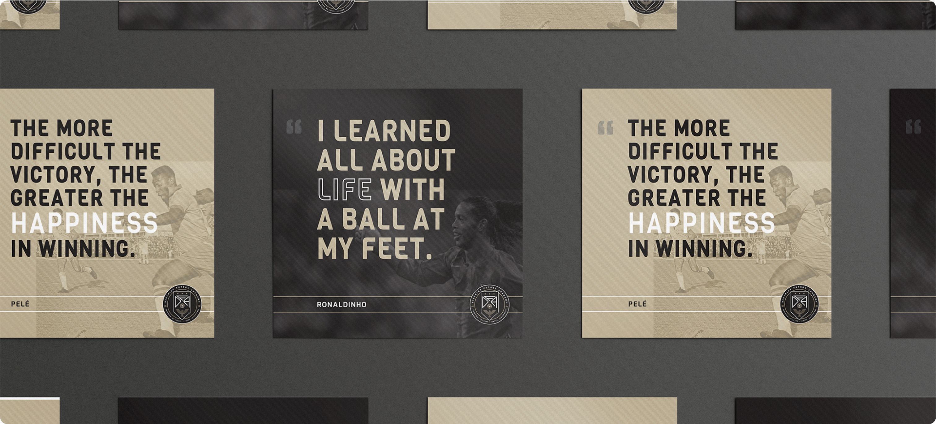
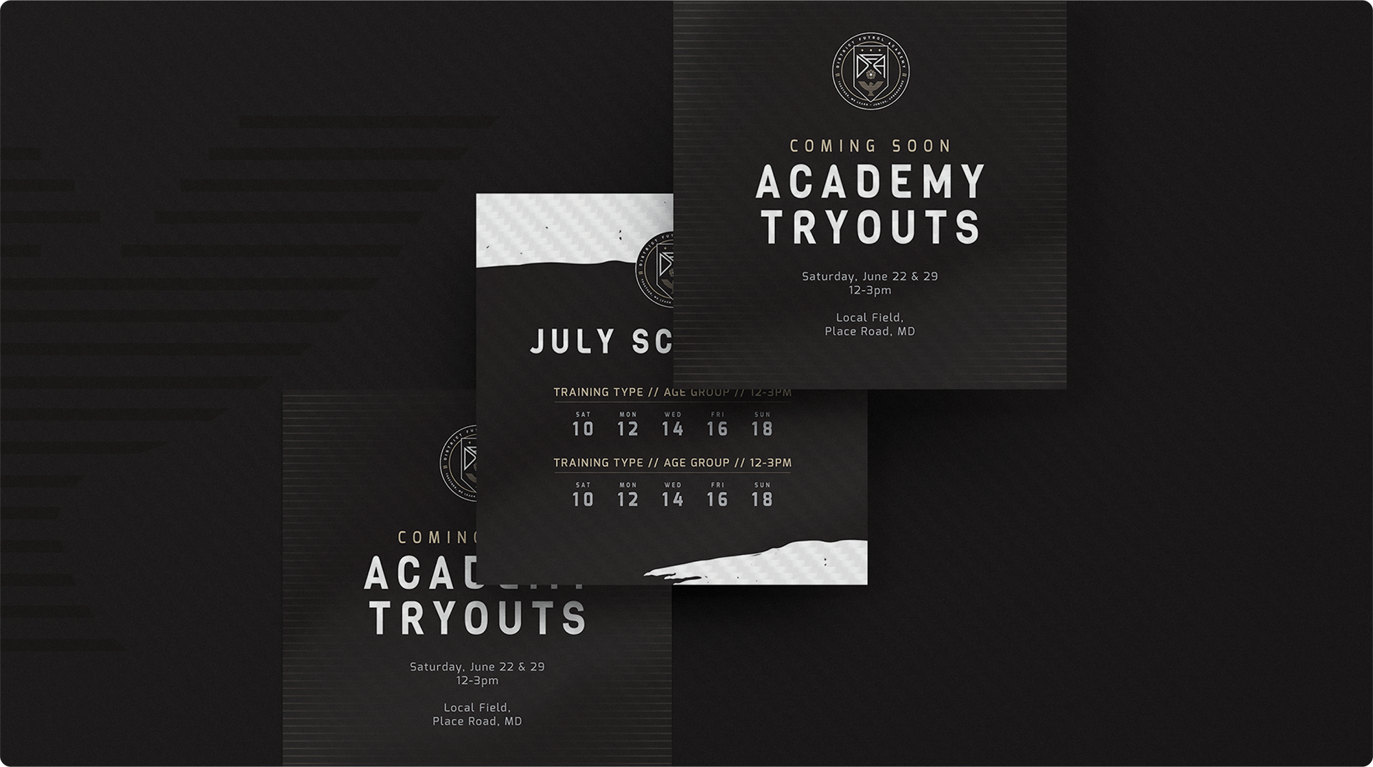
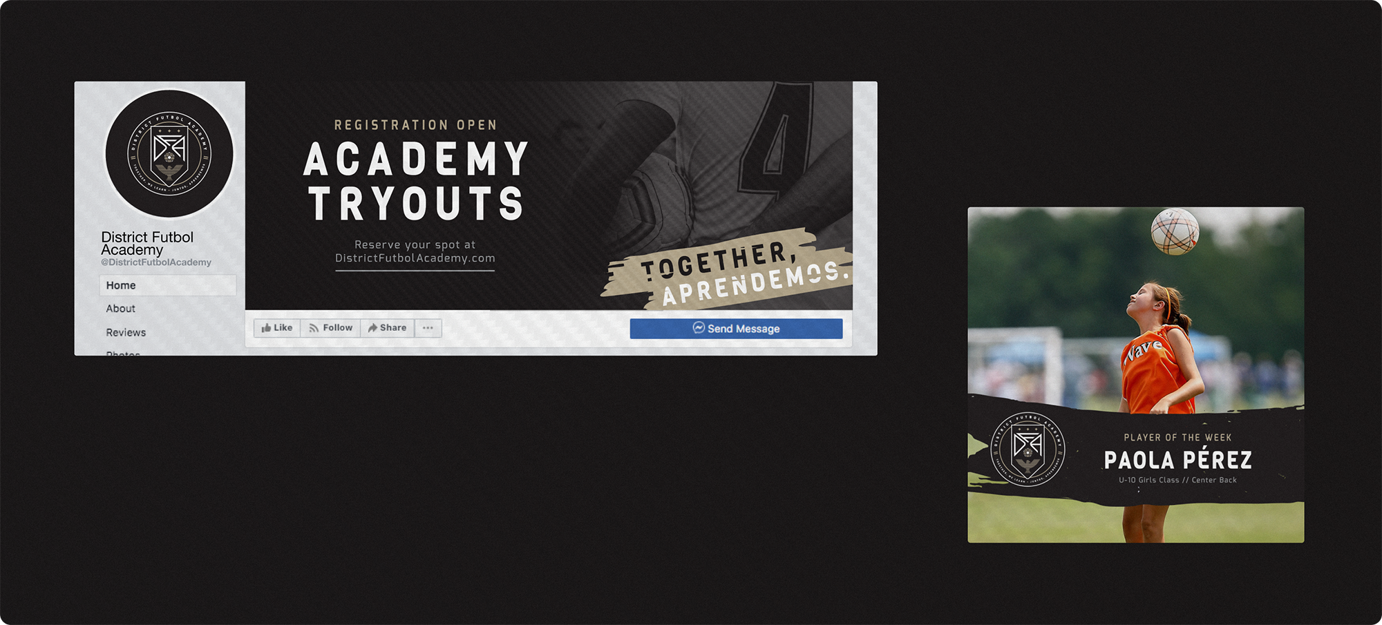
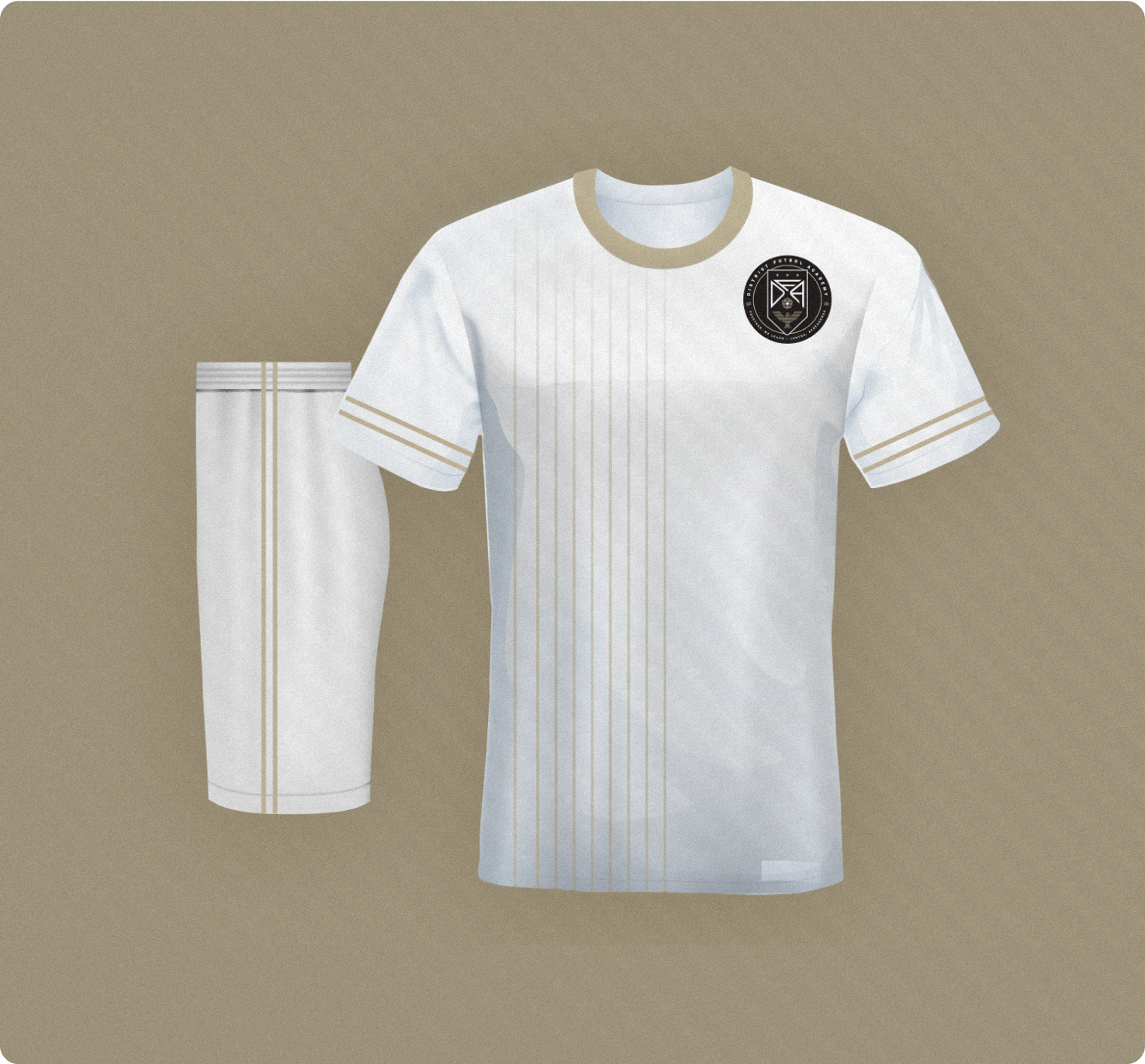
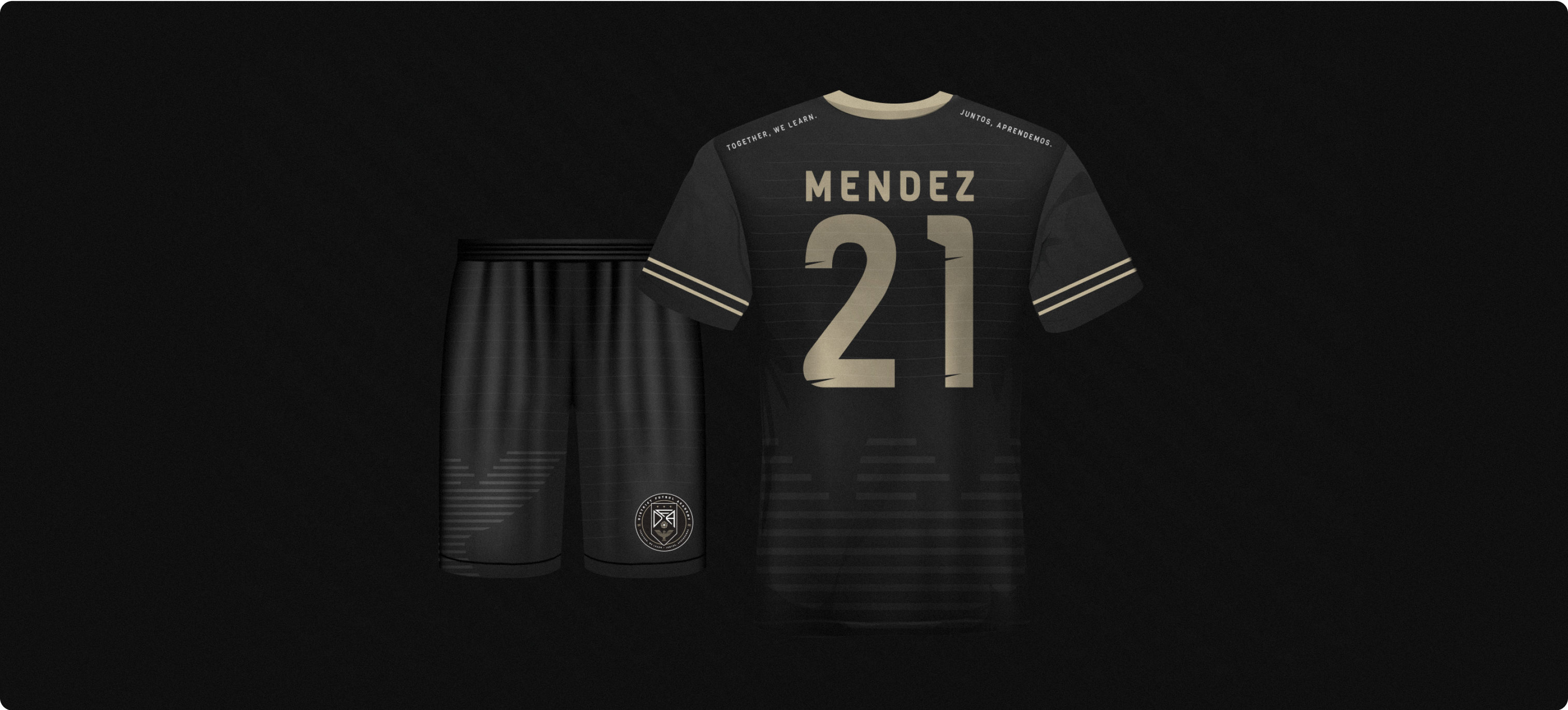
Bold shapes built with a mix of curves and sharp angles simultaneously represent the precision of the training but flexibility of the program. Texture, geometric patterns, and undulating lines express the flow and dynamism of the team, while calling attention to the individual elements that allow these motifs to collaborate—varying cultures and ages, all moving together as one.
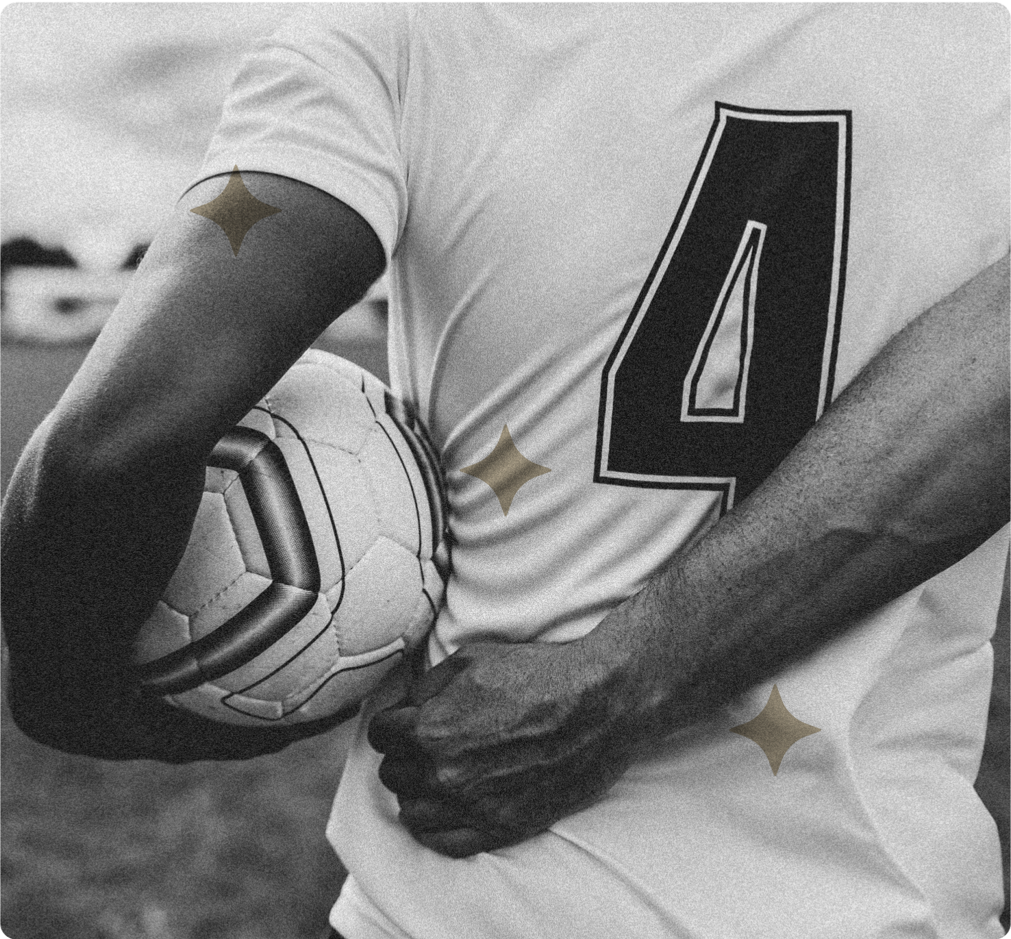
A simplified but dignified palette helps distinguish the team from the usual rainbow of adolescent sport colors and appeals to parents and fans of all ages.

LET'S WORK TOGETHER
COLOPHON
This site uses Spline Sans and Spline Sans Mono for headlines and body. Chromate Roman and Italic are used for display.
ALL RIGHTS RESERVED
Régine Carreras
Design + Direction
Made with 🤍 in Maryland
© 2025
Never tell me the odds ⏺
